

Who doesn’t love a color that’s somehow bold, cozy, moody, and sophisticated all at once? Navy blue is like that friend who always looks effortlessly cool, shows up in style, and somehow makes you feel like you also have your life together, at least for a second.
Seriously, painting with navy can completely transform a space. It’s dramatic enough to make a statement but versatile enough that it doesn’t feel heavy (with the right lighting and accents, at least).
Honestly, I’ve seen kitchens, bedrooms, living rooms, you name it, go from “meh” to “wow” just by adding a deep navy wall.
In this post, I’m breaking down everything you need to know about the best navy blue paint colors, where to use them, and how to pair them with other colors so your space feels balanced, cozy, and stylish. Oh, and I’ll share my 17 favorite navy blues that you might just fall in love with.
*This post contains affiliate links. For more details see my full disclosure.
What Are Navy Blue Paint Colors?
Navy blue isn’t just “dark blue” (though, technically, yeah, it’s a dark shade of blue). It’s more than that, it’s like the James Bond of blues. Deep, classic, timeless, and somehow always looks good no matter what.
Different navy paints can lean slightly gray, green, or even purple depending on the brand, lighting, and undertones. That’s why one navy can feel calm and cozy in a bedroom while another might feel bold and almost moody in a living room.
Basically, think of navy as the color that can go from “subtle elegance” to “look at me, I’m dramatic!” with just a little tweak. That’s what makes it fun, and also kind of tricky if you don’t test a sample first (lesson learned).
Where to Use Navy Blue Paint Colors?
Navy isn’t just for bedrooms or offices (though it does amazing things there). You can use it basically anywhere if you’re brave enough, and by brave, I mean, sometimes painting a small bathroom or a tiny hallway in navy can look surprisingly chic.
Here’s what I love:
- Living rooms: Instant cozy vibes, especially with warm wood furniture or lots of natural light.
- Bedrooms: Perfect for a moody, calming retreat. Bonus points if you mix it with soft linens and plush pillows.
- Kitchens: Navy cabinets or accent walls can look super modern and nautical, just don’t forget good lighting!
- Bathrooms: Deep navy with white trim or brass hardware = total spa energy.
- Entryways & Hallways: Make a bold first impression. A hallway painted navy? People will pause mid-step and whisper “wow.”
Honestly, navy is kind of a “choose your own adventure” color. Small spaces? It can make them cozy. Big spaces? It can make them dramatic. Just remember: lighting is your best friend here.
Colors to Pair with Navy Blue
This is where it gets fun. Navy is basically a neutral with personality, so it plays well with lots of colors, but some combos are just… chef’s kiss.
- White & Cream: Classic, crisp, clean. Makes navy pop without being too harsh.
- Gold & Brass Accents: Hello, luxury vibes. Mirrors, hardware, frames—boom, instant sophistication.
- Blush & Pink Tones: Surprisingly gorgeous, especially in bedrooms or cozy corners. Softens the depth of navy.
- Wood Tones: Oak, walnut, or even bamboo, warmth! Navy + wood = instant cozy.
- Greens: Olive, emerald, or even muted sage can give a natural, earthy balance.
- Bright Accents: Mustard yellow, burnt orange, or even teal if you’re feeling bold. Just a pop here and there.
Side note: I once paired navy walls with a mustard sofa. My living room basically became a Pinterest board overnight. No regrets.
Tips for Choosing The Best Navy Blue Paint Colors
Okay, don’t just grab the first navy you see at the store, lesson learned. Here’s what I do:
- Test, test, test: Paint a small section of your wall or a poster board sample. Colors shift depending on lighting, time of day, and even your mood (kind of dramatic, right?).
- Check undertones: Some navies lean gray, others green, some purple. Pick what complements your space.
- Consider light: Natural light softens navy; dim rooms make it feel intense. Adjust accordingly.
- Think about pairing: Navy doesn’t exist in isolation, plan your furniture, trims, and accessories.
- Go bold on accent walls first: If you’re nervous about painting an entire room, start small. Accent walls are like dipping your toe in the navy ocean.
- Don’t stress perfection: Navy is forgiving. Messy edges? Totally fine. A little variation in tone? Adds charm.
How to Know if a Paint Color Is Right for You?
The best way to see if a paint color works for your home is to test it on your wall. Look at it over a few days in different lighting; morning, afternoon, and evening, to see how it really feels.
You can do this by getting a sample from the paint store and using a brush put it up on the walls, but then you are left with a can that you can’t do anything with. Those samples are used with poor-quality paint and aren’t meant for use on your walls permanently.

Instead, I recommend going with Samplize. They are a company that will send you a 9”x14.75” peel and stick swatch of a paint color that you can stick to the wall. When you are done just peel it off and throw it away.
It’s easy and much less messy!
The Best Navy Blue Paint Colors
Here are my absolute favorite navy blues that I’ve used or seriously considered for my own home. These are the shades that make your walls pop, your room feel moody or cozy, and honestly, make you wonder why you ever settled for plain boring beige.
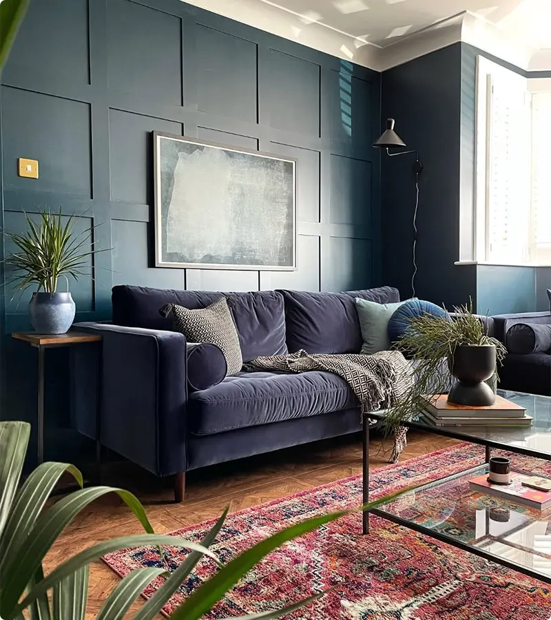
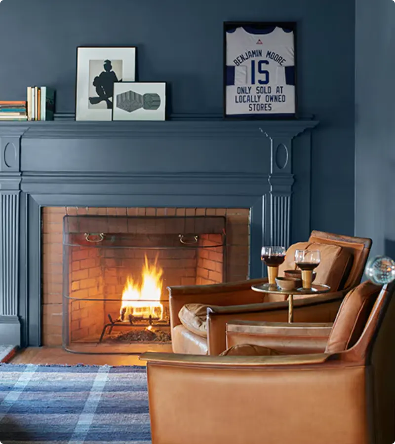
Benjamin Moore Hale Navy
This one’s a classic, and not in a boring way, more like the navy equivalent of your favorite jeans. I actually painted my living room with this once, and let me tell you… it was like the room went from “meh” to “woah, look at me” overnight.
Hale Navy is rich but not scary. It has this perfect balance of blue with just enough gray undertone to make it feel grown-up.
Pro tip: pair it with crisp white trim or even soft blush accents, it’s like the navy equivalent of peanut butter and jelly. Seriously, you’ll feel like royalty sipping your coffee there.
Get a Peel & Stick paint sample of Hale Navy
Benjamin Moore Gentleman’s Gray
Okay, don’t let the name fool you. Gentleman’s Gray sounds like it might be… gray. But nope! It’s got this subtle navy depth that just whispers “I have taste.” I tried it in my guest bedroom, and guests legit stayed longer just to bask in the cozy vibes (or maybe they didn’t want to leave my snacks, hard to tell).
It’s moody, but soft enough that it doesn’t make your room feel like a cave. And honestly, it works with literally anything, wood tones, brass, funky art, you name it.
Sherwin Williams Naval

This one’s deep. Like, late-night, secret-library, mystery-deep. I once painted my home office with this, and every time I walked in, I half-expected Sherlock Holmes to be sitting there taking notes.
Naval is dramatic, but in a very classy way. If you’ve ever wanted your room to feel like a cinematic masterpiece (or like you accidentally stumbled into a boutique hotel), this is it. Also, tip: natural light is your friend here. Without it, you might feel like you’re living inside a blueberry.
Get a Peel & Stick paint sample of Naval
Benjamin Moore Deep Royal

Deep Royal is basically the velvet jacket of paints. Bold, rich, and a little bit showy, but in the best way. I slapped this on a feature wall last year and my cat actually paused mid-nap to admire it. I swear.
This color pairs insanely well with gold accents or creamy whites. And let’s be honest, it’s just fun to say: “Deep Royal.” Try it in your bedroom, and suddenly even your messy pile of laundry looks… regal? Okay, maybe not, but your walls will.
Get a Peel & Stick paint sample of Deep Royal
Benjamin Moore Newburyport Blue
Newburyport Blue is like the calm older sibling of navy blues. It’s serene but still has personality. I used it in my kitchen nook once, and it made the little space feel like a seaside cottage, even though my closest beach is… well, 300 miles away.
It’s perfect if you want navy that’s sophisticated but not too intense. Works with light woods, whites, and even some soft greens. Pro tip: add some textured pillows or a rug to make the navy pop even more.
Benjamin Moore Old Navy
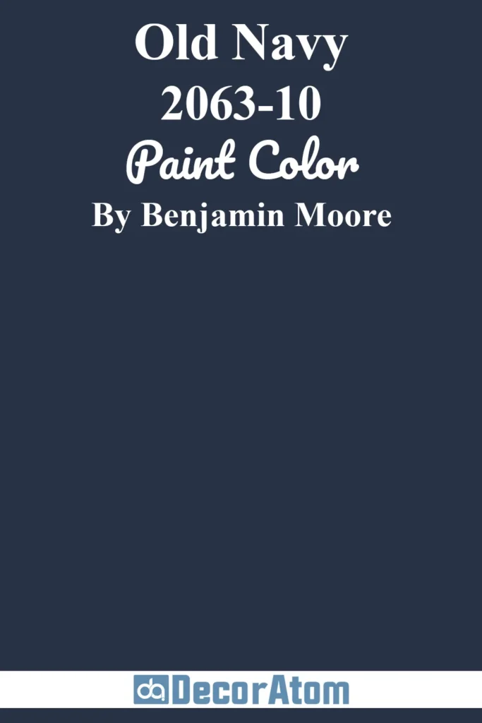
Old Navy isn’t just a store (though, guilty, I love their sales). As a paint color, it’s bold but approachable. I once did a powder room in this color, and guests were like, “Wow… this is unexpected.” Mission accomplished.
It’s slightly lighter than some of the ultra-deep navies, so it’s great for rooms that don’t get a ton of natural light. Pair it with warm wood tones or brass hardware for a cozy, stylish vibe. And honestly, it’s kind of a mood booster, it’s like a hug in color form.
Get a Peel & Stick paint sample of Old Navy
Benjamin Moore Newburg Green
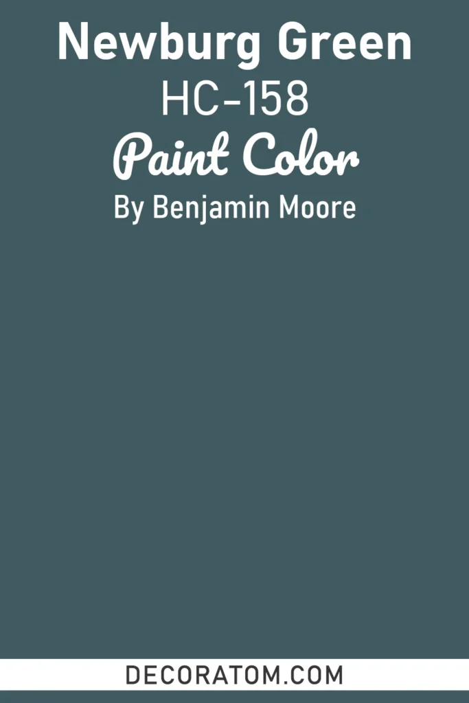
Okay, don’t panic, it has “green” in the name, but trust me, it reads as a very deep, almost navy-blue-green hybrid. I used this in my dining room, and the results? Magical. It’s moody without being oppressive, and it gives your space this subtle depth that makes people go, “Hmm… what’s that color again?”
Tip: if you love jewel tones, Newburg Green is your soulmate. Try pairing with some amber glass or leather accents, it’s a little bit mysterious, a little bit chic, and 100% mood-enhancing.
Get a Peel & Stick paint sample of Newburg Green
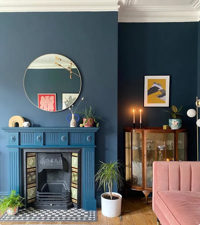
Farrow & Ball Hague Blue
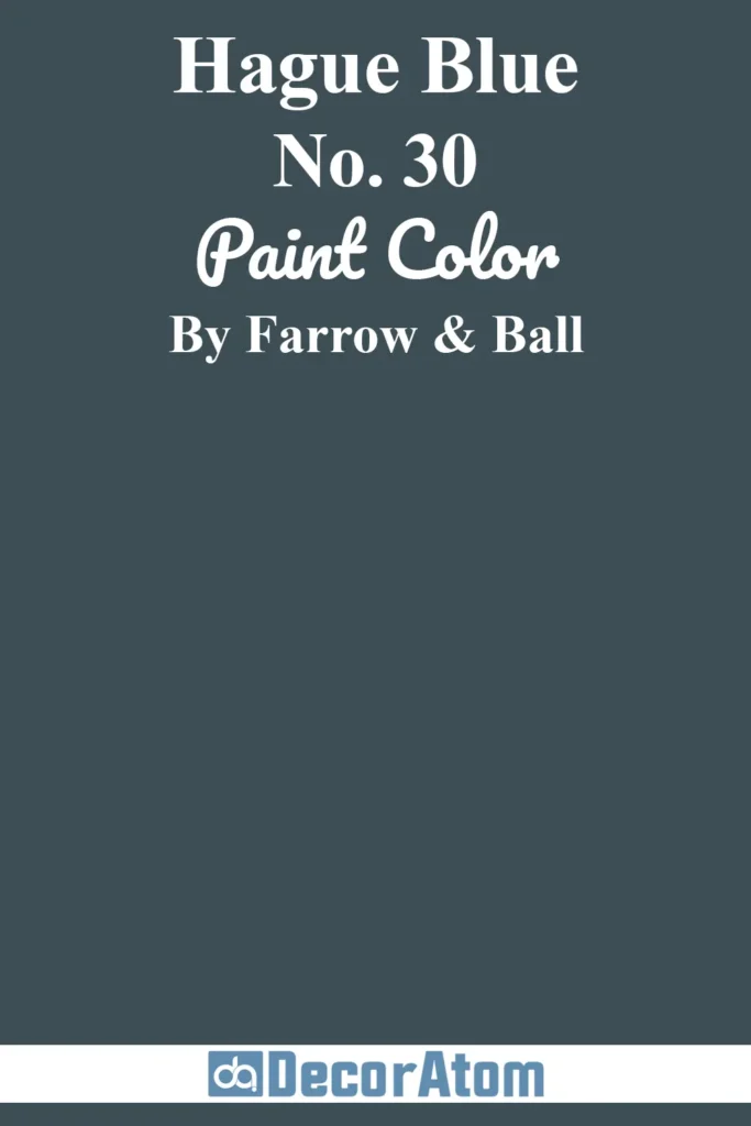
Hague Blue is one of those colors that makes people stop in their tracks. It’s dramatic, yes, but also ridiculously elegant. I did a hallway in this color once, and my niece literally gasped. True story.
It’s deep, almost black-blue in some lights, but softens beautifully with cream accents or natural oak floors. Side note: it’s one of those colors that makes you feel like you’re living in a boutique hotel, or at least like you should be.
Benjamin Moore Van Deusen Blue
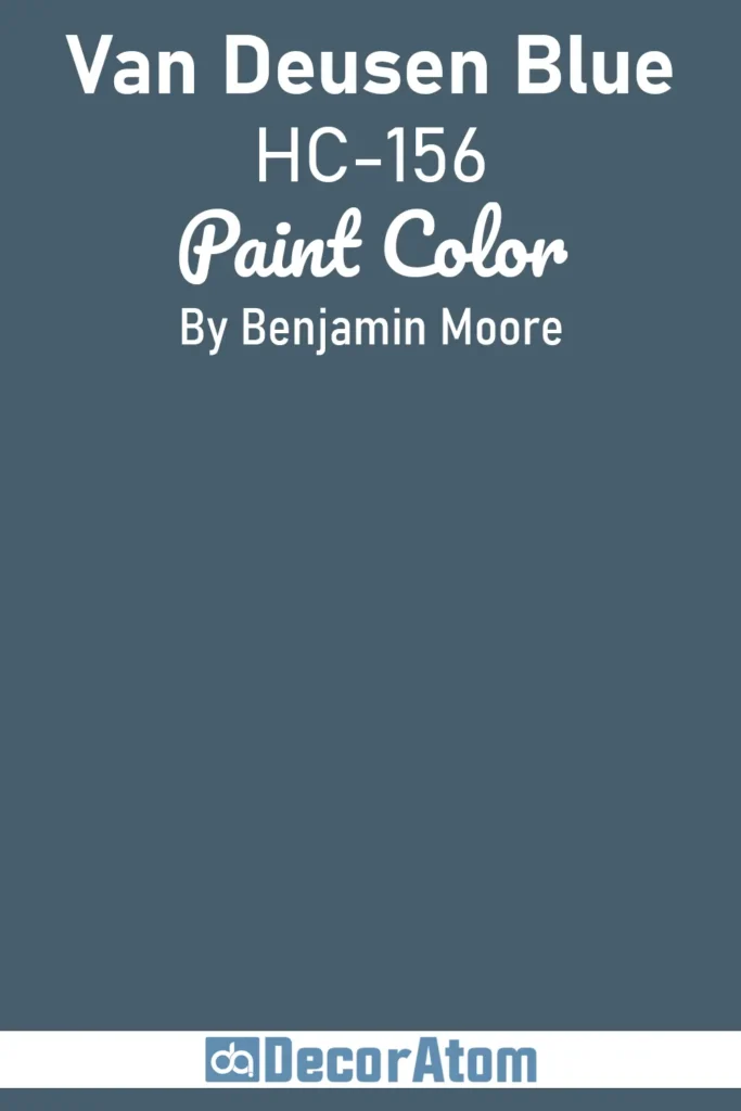
Van Deusen Blue is the kind of navy that makes your space feel like it just had a sophisticated glow-up. I painted a home office with this one, and suddenly the pile of paperwork looked… classy? Okay, maybe not, but at least the room looked amazing.
It’s slightly muted, so if you’re nervous about going too dark, this is a safe bet. Works well with warm metals and mid-century furniture. Honestly, you’ll feel like a Pinterest board came to life in your own home.
Get a Peel & Stick paint sample of Van Deusen Blue
Benjamin Moore Polo Blue

Polo Blue is fun. It’s like navy’s cooler, sportier cousin who always shows up in a crisp polo shirt and somehow makes it look effortless. I used this in a small bedroom, and the space felt punchy but still cozy.
It’s got this subtle brightness compared to the others, so it’s perfect if you want navy that doesn’t feel like it’s swallowing the room. Pair it with whites, blushes, or even mustard accents for a little playful pop.
Get a Peel & Stick paint sample of Polo Blue
Farrow & Ball Wine Dark
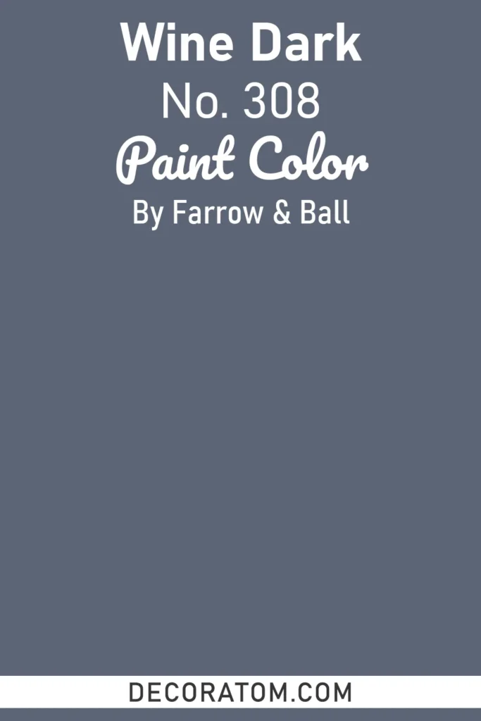
Wine Dark is basically navy’s mysterious, flirty cousin who always shows up with a glass of… well, wine. I tried this on a feature wall in my dining room, and let me tell you, the first dinner party? People were whispering, “Is that color real?” Yep. Real, moody, and absolutely stunning.
This color has a slight reddish undertone, which makes it feel warm and enveloping, like the room’s giving you a hug every time you walk in. Side note: pair it with lots of natural textures, think wooden chairs, linen tablecloths, maybe even a furry throw. Instant cozy vibes.
Benjamin Moore Midnight Hour
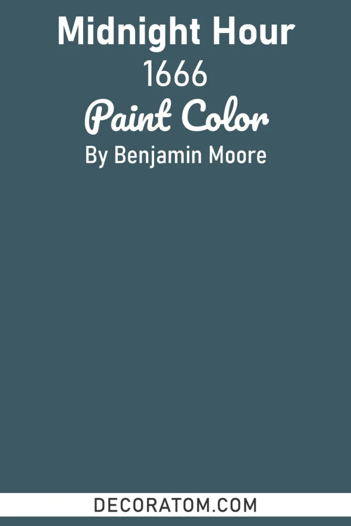
Midnight Hour is basically… midnight, in paint form. Dark, dramatic, and a little bit intimidating, but in the best way. I slapped this on my bedroom walls once, and it was like stepping into a luxury boutique hotel every night. Totally transformed the space.
Pro tip: if you go this dark, contrast it with bright whites or metallic accents. Otherwise, you risk living in a literal cave. Also, it pairs surprisingly well with pops of jewel tones, emerald, ruby, sapphire, you know, all the colors that make you feel fancy without trying too hard.
Get a Peel & Stick paint sample of Midnight Hour
Benjamin Moore Evening Sky
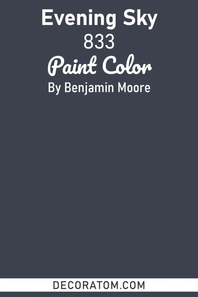
Evening Sky is softer than Midnight Hour but still has that deep, enveloping navy vibe. I used this in a tiny home office, and it made the space feel like a little creative sanctuary. Like… you close the door, sip your coffee, and suddenly ideas just appear. Or at least that’s what I tell myself.
It’s moody without being oppressive, and it really shines with warm wood tones and creamy accents. Side note: don’t be surprised if your cat decides this is now their favorite napping corner. Cats are dramatic, like this color.
Get a Peel & Stick paint sample of Evening Sky
Sherwin Williams In the Navy
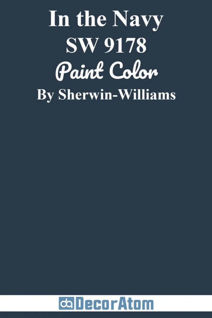
Classic, iconic, and yes, a little bit theatrical. I used this on a hallway wall once, and every single guest commented on it. “Wow, that’s bold!” Yep, that’s the point.
This color has the kind of richness that works with both modern and traditional styles. Brass hardware? Perfect. White trim? Check. Bold artwork? Absolutely. Honestly, it’s one of those colors that says, “Yeah, I have style… deal with it.”
Get a Peel & Stick paint sample of In the Navy
Benjamin Moore Blue Note
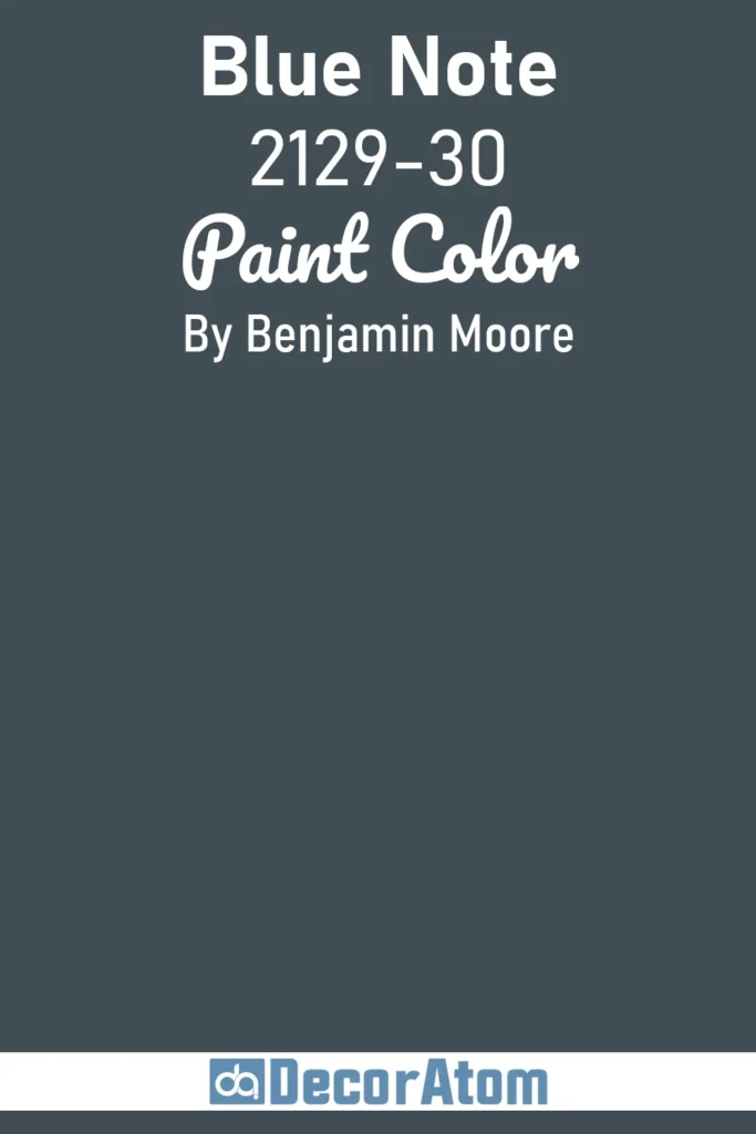
Blue Note is smooth, sophisticated, and somehow musical, like it should come with a jazz soundtrack. I put this in my living room, and let’s just say movie nights suddenly felt… cinematic. Popcorn never looked better against that deep, velvety backdrop.
It pairs beautifully with whites, golds, and even soft pinks (don’t knock it till you try it). I like to call it the “undercover dramatic navy”, rich enough to impress, subtle enough to live with.
Get a Peel & Stick paint sample of Blue Note
Benjamin Moore Washington Blue
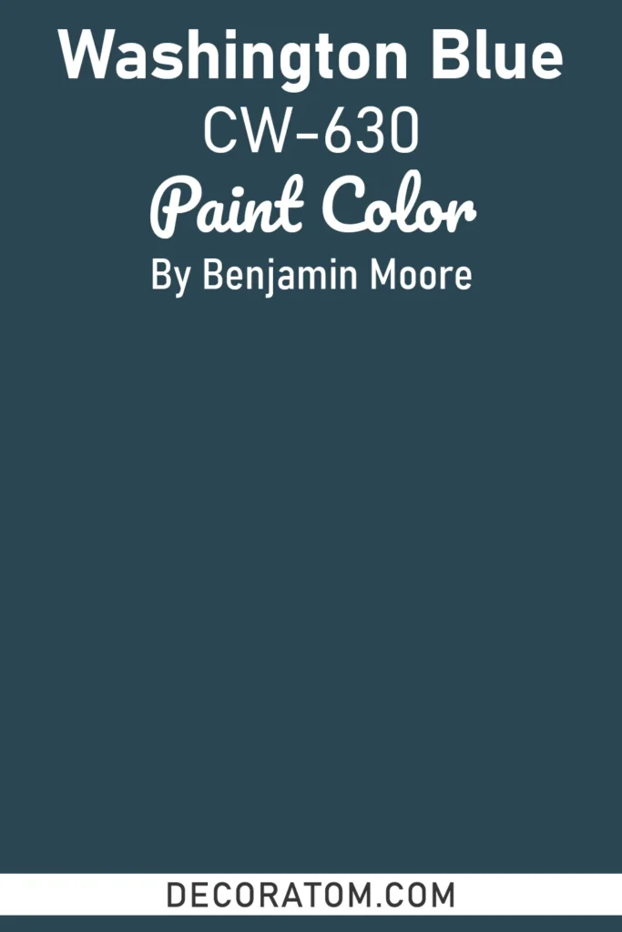
Washington Blue is like a deep, traditional navy with a little extra oomph. I tried this on a dining room wall last winter, and honestly, it felt like the room had suddenly leveled up. My table setting looked better, the candles looked warmer, and my friends were like, “Wow… who did your walls?” Me. I did.
It’s versatile, works with lots of trim colors, and honestly makes you feel a little fancy just walking into the room. Add a couple of plants and a cozy rug, and suddenly your space is both regal and welcoming.
Get a Peel & Stick paint sample of Washington Blue
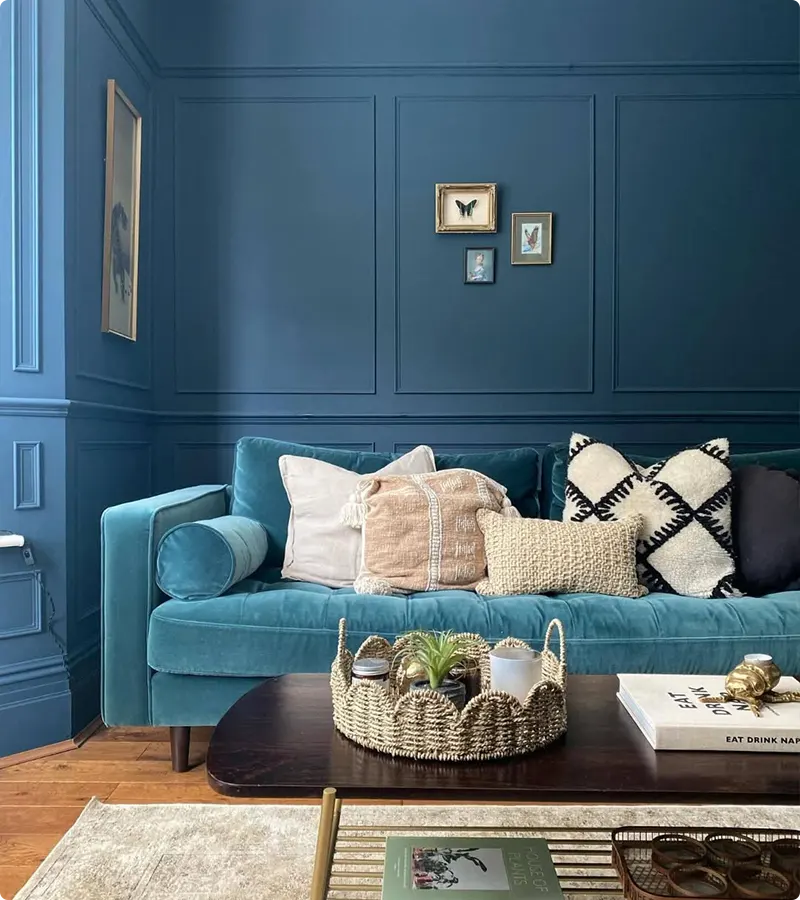
Sherwin Williams Salty Dog
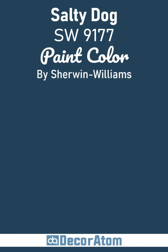
Not gonna lie, this one’s a personal favorite. I used it in a bathroom once (yes, a bathroom, because why not?), and it completely changed the vibe. It’s bold, deep, slightly in-your-face, but in a fun, nautical way.
Pair it with white or soft gray accents, maybe a touch of brass or chrome, and you’ve got instant coastal sophistication. Side note: my nephew once tried to “help” paint over it with a sponge… lesson learned, keep the tiny humans busy elsewhere.
Get a Peel & Stick paint sample of Salty Dog
And there you have it, all 17 Best Navy Blue Paint Colors. Honestly, navy is one of those colors that just works everywhere. It’s dramatic, cozy, playful, and yes, sometimes a little moody, but isn’t that what makes it so irresistible?
Trust me, pick one (or three, who’s judging?), and your walls will thank you. And hey, if you end up painting at 11 p.m., I won’t tell anyone.