I’ve always been drawn to colors that feel calm without being boring, shades that have a bit of personality but don’t take over the room. That’s exactly what led me to Sherwin-Williams Rainwashed SW 6211.
It’s one of those paint colors that’s easy to fall in love with, especially if you’re a fan of soft, airy hues that give your space a relaxed, refreshing feel.
When I first saw Rainwashed on a paint swatch, it looked like a muted seafoam, not quite green, not exactly blue, and definitely not gray. But once it went up on the walls, I realized it was even more beautiful than I expected.
In this review, I’ll walk you through everything I’ve learned about this color, how it behaves in different lighting, what undertones to expect, and how to pair it with trim and other paint colors.
So if you’re thinking of using Rainwashed in your home, keep reading. I’ve got all the details you’ll want to know before grabbing a paintbrush.
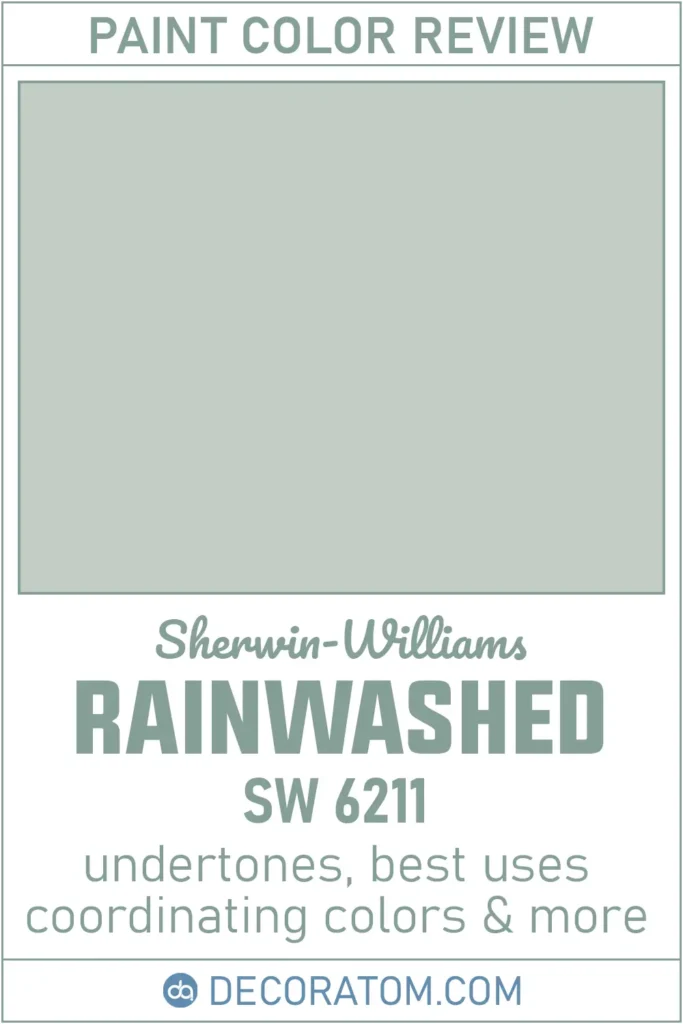
What Color is Sherwin Williams Rainwashed?
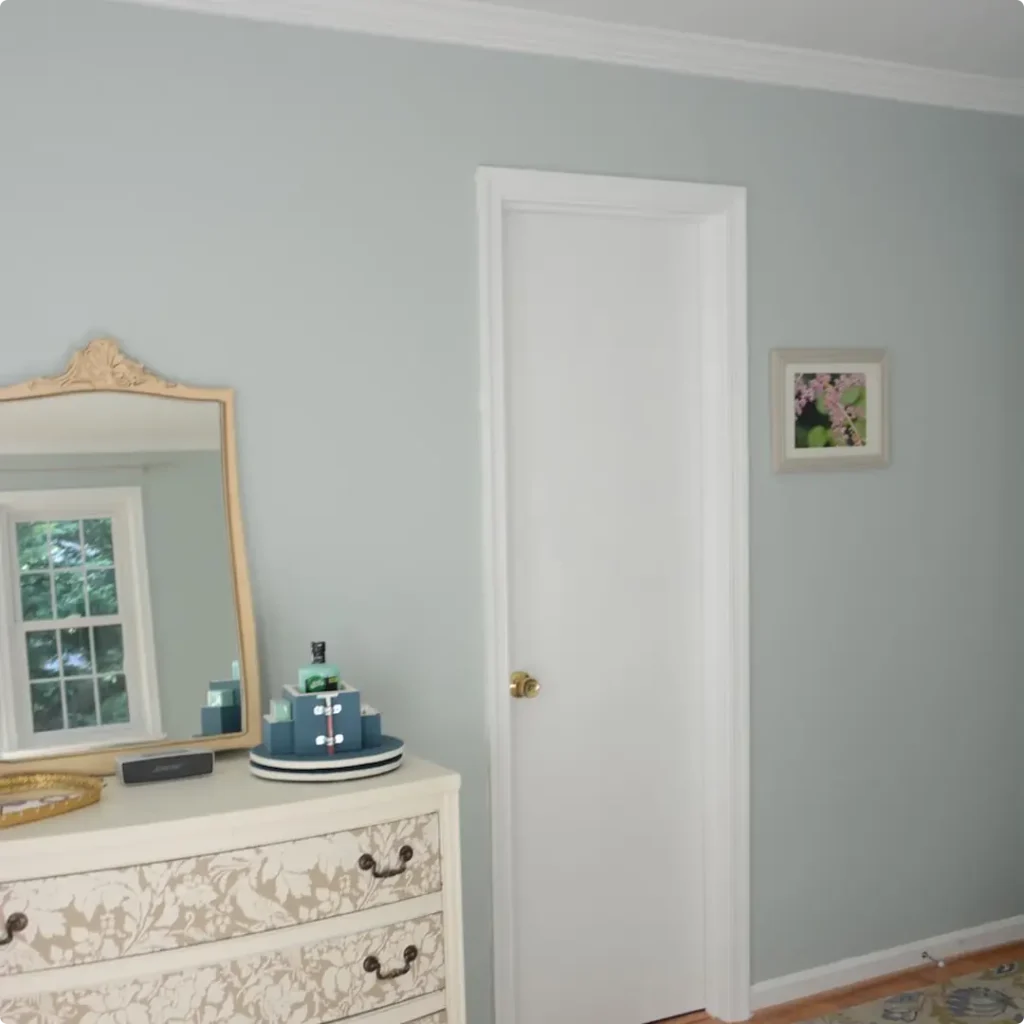
Sherwin-Williams Rainwashed is best described as a soft green with a touch of blue and gray mixed in. It reminds me of a misty coastal morning, fresh, light, and clean.
It’s not a bright green, and it’s definitely not a bold blue. Instead, it’s that peaceful in-between zone that makes a room feel calm and easy on the eyes.
On the wall, Rainwashed doesn’t scream “color” at you. It has a subtle personality, the kind that works well in almost any room where you want to create a restful and inviting atmosphere.
It’s the kind of green that doesn’t overwhelm, just a gentle, breezy presence in the background. Some people see more green in it, others see a bluish cast depending on the light, but overall, it stays soft and muted.
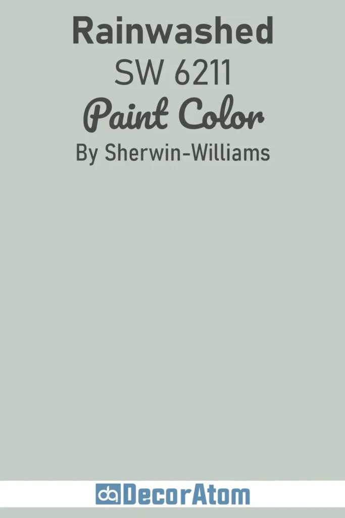
Is It a Warm Or Cool Color?
Rainwashed is definitely a cool-toned paint color. You’ll notice that the blue and gray influences give it a cooler, more relaxed feeling, especially in spaces that don’t get a lot of warm sunlight.
It’s not icy or cold by any means, but it leans cool enough that it brings a sense of calm to a space rather than warmth.
In my experience, cool colors like Rainwashed are great for creating soothing environments, think bedrooms, bathrooms, or anywhere you want to unwind.
Just keep in mind, if you pair it with other warm colors in your space, the coolness of Rainwashed may feel more noticeable. I personally love that contrast, but it’s something to be aware of depending on the mood you’re going for.
LRV of Sherwin Williams Rainwashed
💥🎁 Christmas & Year-End Deals On Amazon !
Don't miss out on the best discounts and top-rated products available right now!
*As an Amazon Associate, I earn from qualifying purchases.
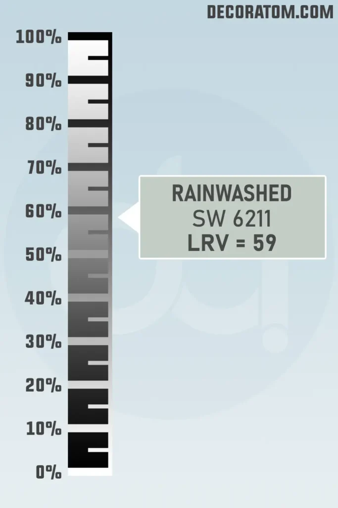
Let’s quickly talk about LRV, it stands for Light Reflectance Value. It’s a scale from 0 to 100 that tells you how much light a color reflects. The higher the number, the lighter and brighter the color will look in a room.
Sherwin-Williams Rainwashed has an LRV of 59. That puts it right in the mid-light range. It’s not too dark, and it’s not overly pale either.
In my home, it reflects a decent amount of light, which helps keep rooms feeling open and breezy. If you have a space that doesn’t get tons of natural light, Rainwashed can still work, but it may read a bit more subdued and grayish in those areas.
Color Family
Rainwashed belongs to the green color family. That’s its root, even though it carries those soft hints of blue and gray. It’s not a punchy or deep green, it’s more of a pale green with some extra softness mixed in.
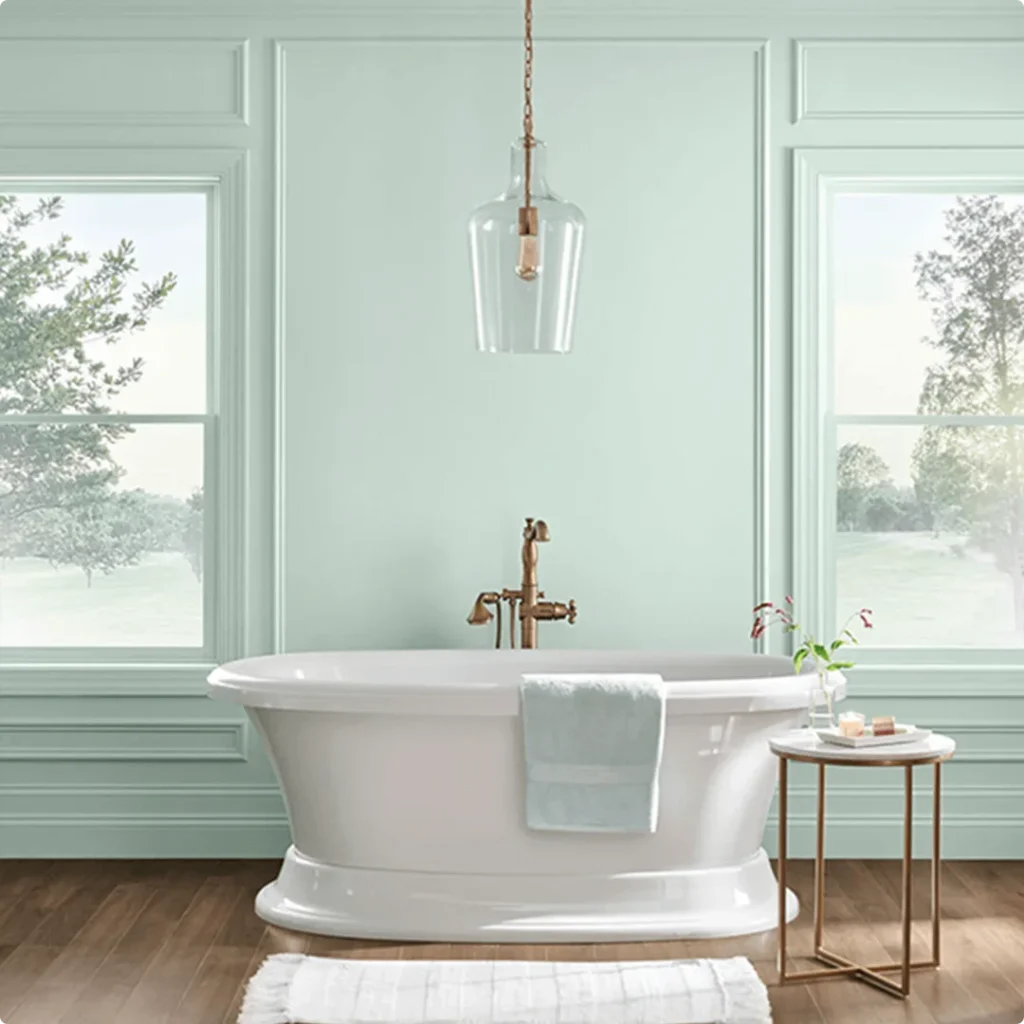
RGB Colors
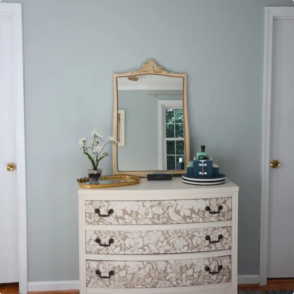
If you’re into the technical side of paint colors (which I’ve come to appreciate over time), the RGB values of Sherwin-Williams Rainwashed are 194 / 205 / 197. Now, what does that actually mean?
RGB stands for Red, Green, and Blue, it’s the formula that shows how much of each of those colors is used to create a particular shade on a digital screen.
Hex Value
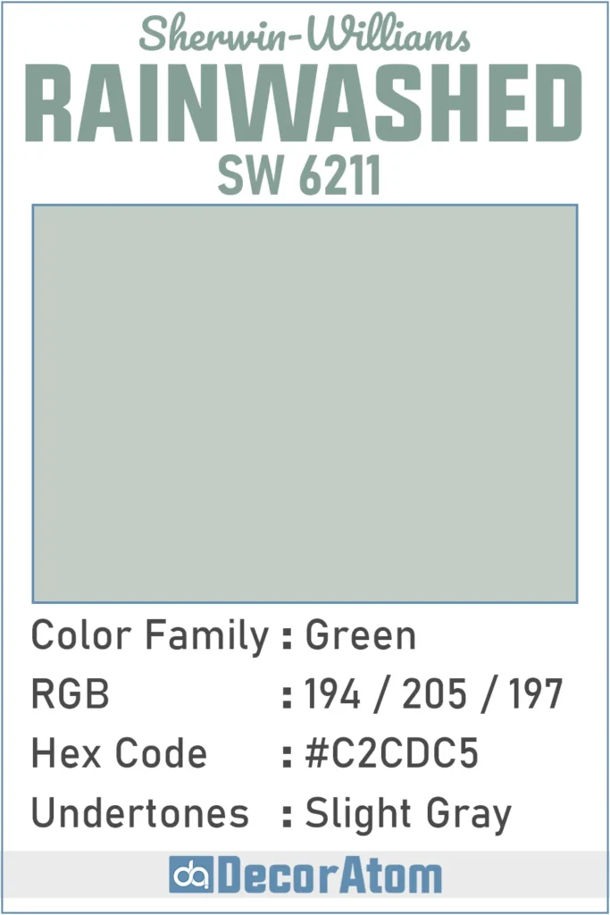
If you’re working on a digital mood board or just like to get nerdy about color codes (guilty!), the hex value of Sherwin-Williams Rainwashed is #C2CDC5.
💥🎁 Christmas & Year-End Deals On Amazon !
Don't miss out on the best discounts and top-rated products available right now!
*As an Amazon Associate, I earn from qualifying purchases.
Undertones of Sherwin Williams Rainwashed
Here’s where things get a little more subtle. Sherwin-Williams Rainwashed has slight gray undertones, and that gray is what really keeps it from feeling like a typical minty or spring green.
Without those gray notes, it might come off too juvenile or pastel. But that soft hint of gray grounds it and gives it a more sophisticated, muted look.
In certain lighting, especially lower or cooler lighting, the gray undertone can become more noticeable. You might even see the green lean slightly dusty or silvery.
But in brighter light, the gray settles into the background and lets the green-blue side of Rainwashed shine through. That shift is part of what makes this color so versatile, it adapts to its surroundings without ever feeling flat or boring.
How Different Types of Lighting Affect Sherwin Williams Rainwashed?
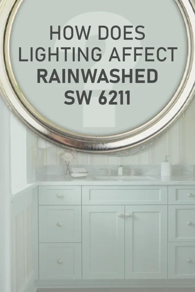
Lighting can really change how Rainwashed looks, and I’ve seen it shift throughout the day in my own home. In fact, this is one of those colors that behaves differently depending on your light exposure, so it’s worth thinking about where you’re using it.
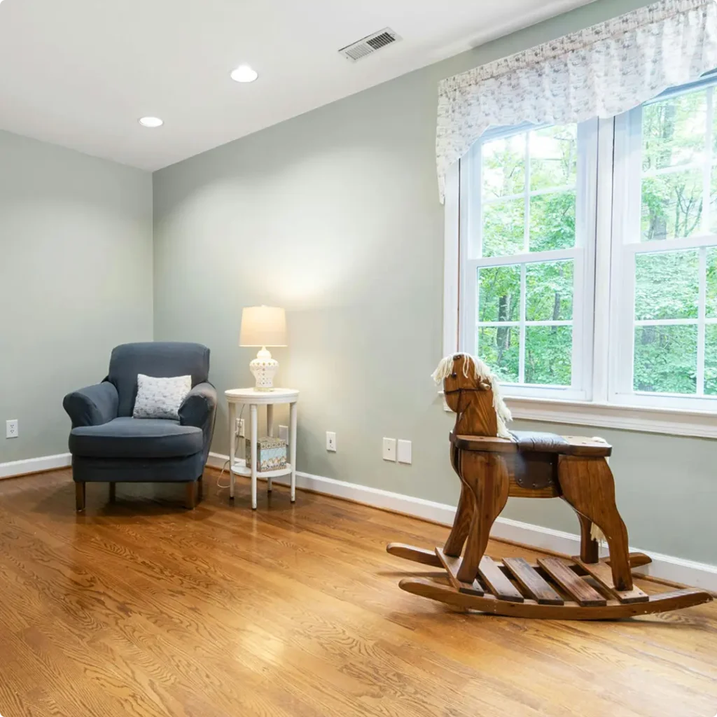
In north-facing rooms, which usually get cooler, bluish light, Rainwashed tends to look a little more gray and subdued. The green is still there, but it feels more muted and soft, almost like sea glass on a cloudy day. I actually love that effect, especially for bedrooms or offices where I want a calming vibe.
In south-facing rooms, where warm light pours in most of the day, Rainwashed comes alive. It looks much greener and even picks up a bit more warmth, although it still stays on the cool side overall. If your room gets a ton of natural light, expect this color to feel fresh and breezy.
East-facing rooms (morning light) can make Rainwashed look a little more blue early in the day, then more neutral in the afternoon. Meanwhile, in west-facing rooms, the afternoon light can give it a bit more depth, but sometimes the warmth in that late sun can make the gray undertone feel slightly more dominant.
At night, under artificial lighting, it really depends on the bulb. Soft white bulbs make Rainwashed feel warmer and cozier. Cooler LED lights can make the gray more noticeable and downplay the green. Always test a sample in your space first, lighting truly makes all the difference with this one.
Trim Colors to Pair With Sherwin Williams Rainwashed?
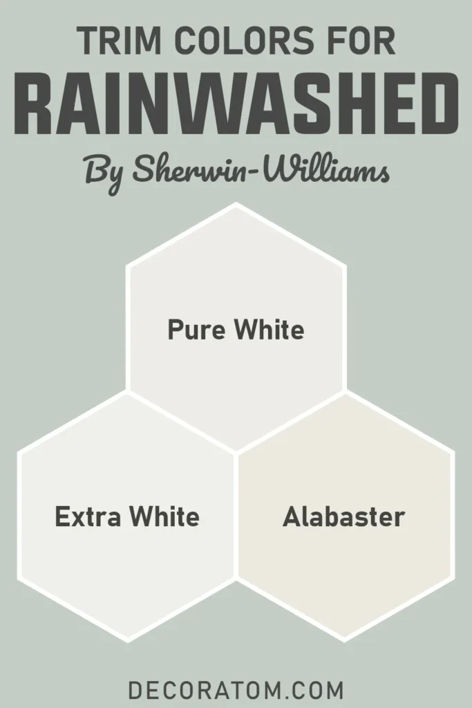
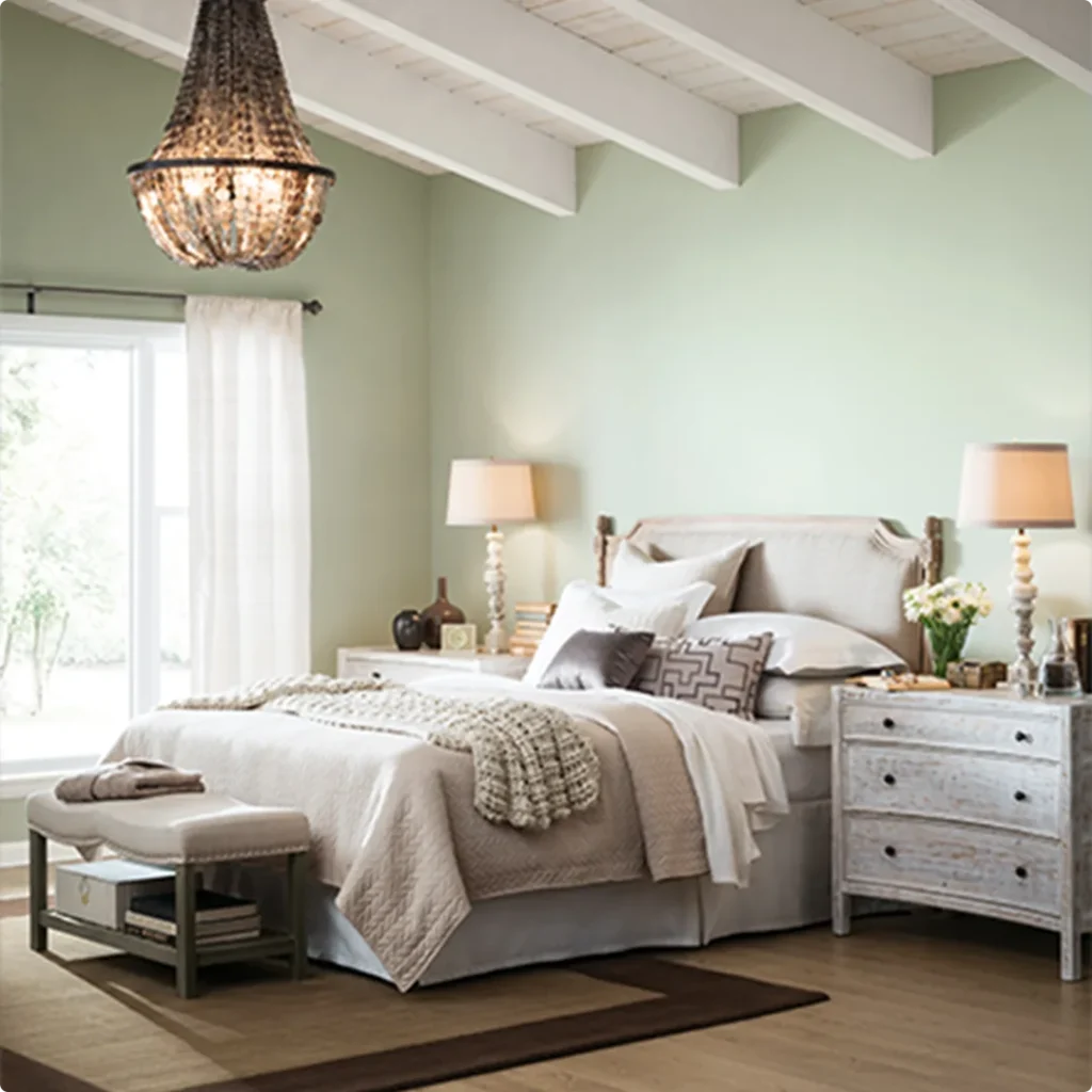
When it comes to trim colors, I always like to keep things clean and classic, especially with a color like Rainwashed that already has such a gentle personality. My go-to trim color with it is a crisp white, and Sherwin-Williams has a few great options for that.
Pure White (SW 7005) is one of my favorites. It’s soft and clean without being too stark, and it pairs beautifully with Rainwashed without making the room feel cold.
Another great choice is Extra White (SW 7006) if you want a brighter, more modern contrast. It gives your space a fresh, airy look and really helps Rainwashed pop in a subtle way.
If you’re into softer, more muted whites, Alabaster (SW 7008) can work too, especially if you want your space to feel a little warmer or more traditional. It adds just a hint of creaminess without clashing with the cool tones in Rainwashed.
I’d avoid any trim colors with strong yellow or beige undertones, those tend to fight with the blue-green-gray balance in Rainwashed. Keeping the trim clean and light really lets the color shine.
💥🎁 Christmas & Year-End Deals On Amazon !
Don't miss out on the best discounts and top-rated products available right now!
*As an Amazon Associate, I earn from qualifying purchases.
Colors Similar to Sherwin Williams Rainwashed
If you’re drawn to Sherwin-Williams Rainwashed but you’re not quite sure it’s the one, you’re in luck, there are several similar colors out there that might hit the exact note you’re looking for.
I’ve personally sampled quite a few of them over the years, especially when I was deciding on a palette for a coastal-inspired guest room.
Rainwashed falls in that soft green-blue category, with just a hint of gray that keeps it from looking too candy-colored or bright.
So when you’re searching for similar shades, you’ll want to look at colors that share this same gentle blend, especially those with calming, cool undertones and mid-range LRVs (not too dark, not too bright).
Some colors lean a bit more blue, some a touch more green, and others dial up the gray. Depending on your lighting and the other elements in your space, one of these alternatives might actually suit you even better than Rainwashed.
I always recommend testing swatches on your wall and checking them at different times of the day, it’s amazing how much that can change your opinion.
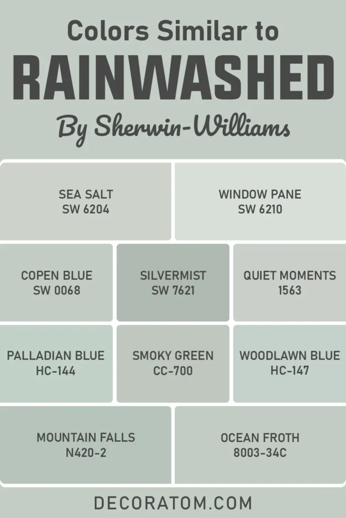
Here are 10 paint colors that are similar in tone and feel to Sherwin-Williams Rainwashed:
- Sherwin-Williams Sea Salt SW 6204
- Sherwin-Williams Window Pane SW 6210
- Sherwin-Williams Copen Blue 0068
- Sherwin-Williams Silvermist SW 7621
- Benjamin Moore Quiet Moments 1563
- Benjamin Moore Palladian Blue HC-144
- Benjamin Moore Smoky Green CC-700
- Benjamin Moore Woodlawn Blue HC-147
- Behr Mountain Falls N420-2
- Valspar Ocean Froth 8003-34C
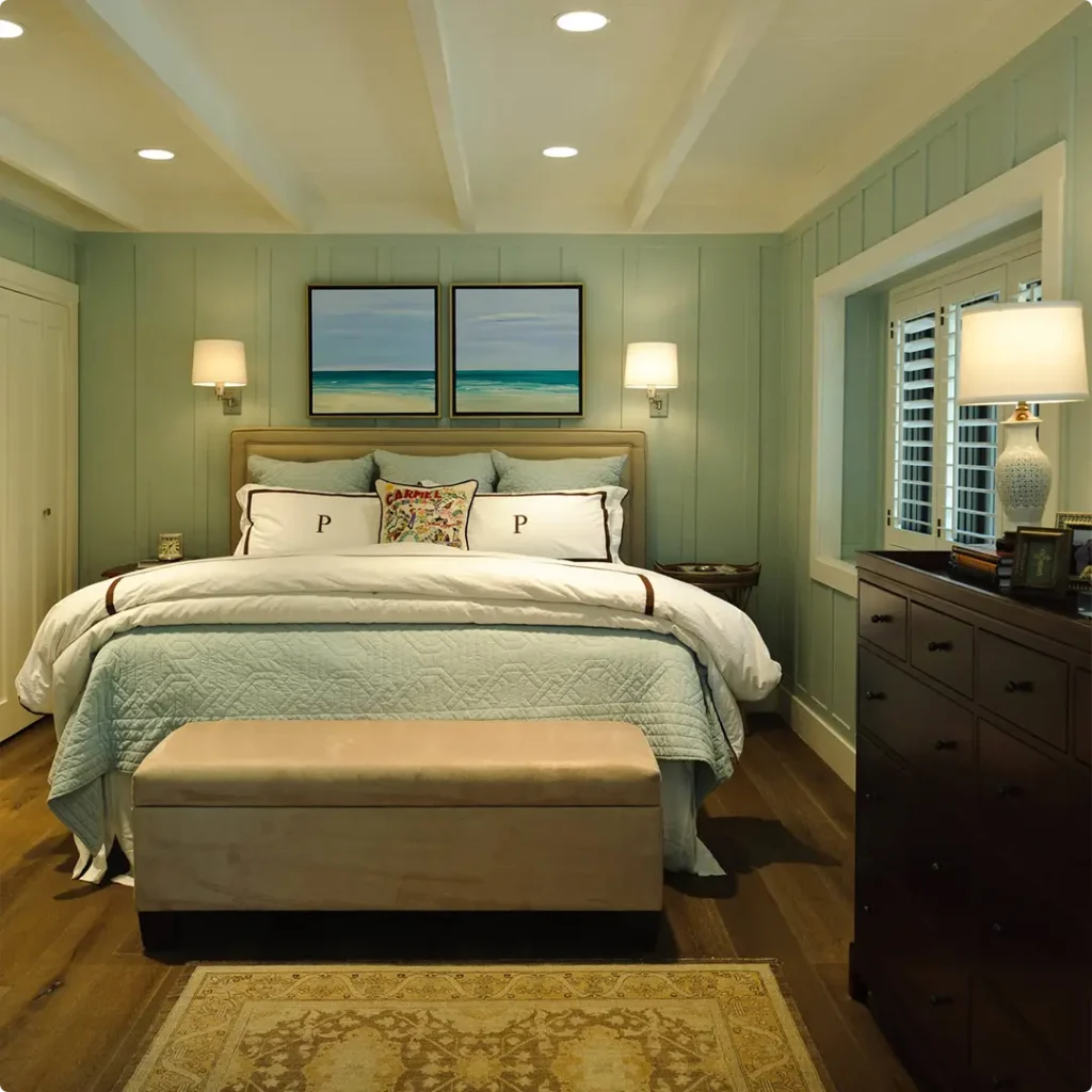
Colors that Go With Sherwin Williams Rainwashed
Finding the right colors to pair with Rainwashed is one of my favorite parts of working with it. Because it’s such a balanced, peaceful hue, it opens the door to lots of beautiful combinations, from soft neutrals to bolder contrasts.
What I’ve found is that Rainwashed works best with colors that don’t compete for attention but instead help highlight its quiet charm.
I usually reach for crisp whites, soft grays, or even muted blues and deeper greens when building a palette around Rainwashed. These combinations create a sense of flow and harmony, especially in open floor plans.
Lighter shades help maintain that fresh, breezy look, while darker accent colors (like charcoal or pewter) add some depth and anchor the space.
In one of my projects, I used Rainwashed on the walls, paired it with First Star on the trim, and added touches of Pewter Cast in accent furniture, and it turned out incredibly balanced.
Another favorite combo of mine is Rainwashed with Window Pane, which feels like a soft echo of the main wall color and keeps the whole space feeling unified.
💥🎁 Christmas & Year-End Deals On Amazon !
Don't miss out on the best discounts and top-rated products available right now!
*As an Amazon Associate, I earn from qualifying purchases.
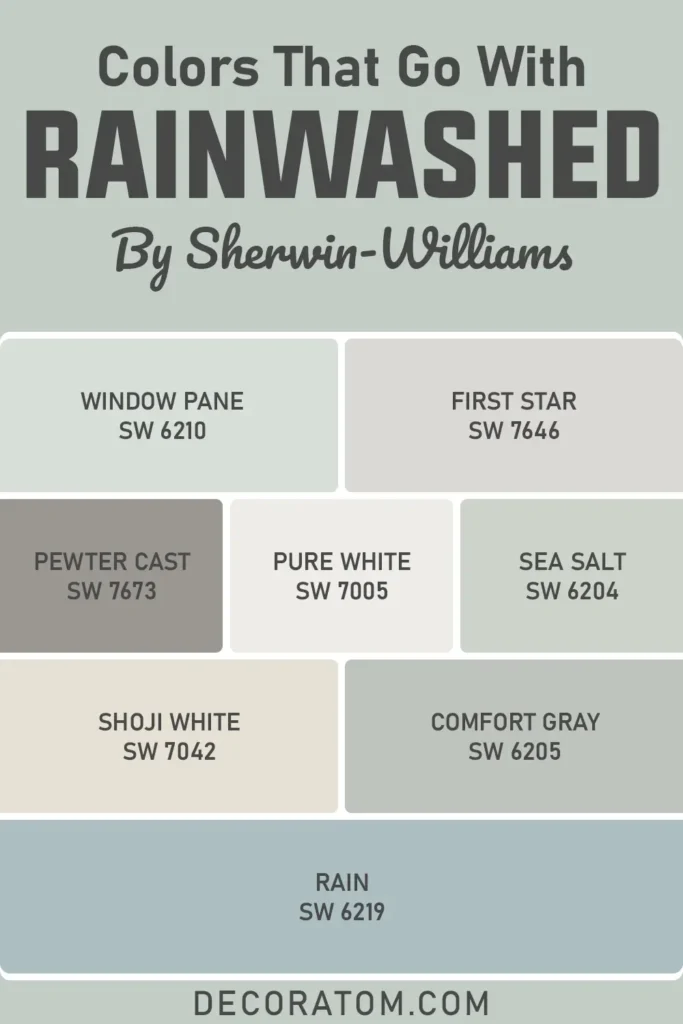
Here are 8 Sherwin-Williams colors that coordinate beautifully with Rainwashed:
- Window Pane SW 6210
- First Star SW 7646
- Pewter Cast SW 7673
- Pure White SW 7005
- Sea Salt SW 6204
- Shoji White SW 7042
- Comfort Gray SW 6205
- Rain SW 6219
Comparing Sherwin Williams Rainwashed With Other Colors
Comparing paint colors can be tricky, especially when they all look similar at first glance. But trust me, once they’re up on the wall, the differences are much more obvious.
That’s why I always suggest putting them side by side in the space where you’ll actually be using them. Rainwashed has a unique charm, that gentle mix of green, blue, and gray, but there are a few other Sherwin-Williams shades that often come up when people are trying to decide.
Below, I’ve broken down how Rainwashed compares to six other popular colors. Some are cooler, some warmer, and some are simply deeper or lighter versions of a similar tone. If you’re on the fence, this side-by-side guide might help you find your perfect match.
Sherwin Williams Rainwashed vs Sea Salt
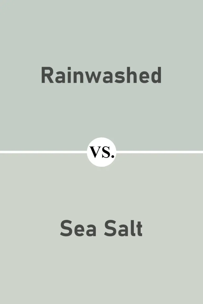
Rainwashed and Sea Salt are often mentioned together, and I can see why. They’re both cool-toned and incredibly soothing. But Sea Salt leans more green than Rainwashed, especially in warm lighting.
While Rainwashed has a clearer blue-green balance, Sea Salt can look more like a muted sage depending on the space. Personally, I find Rainwashed a bit more refreshing, while Sea Salt feels just slightly earthier.
If you want something that feels a little more natural and grounded, go with Sea Salt. For a cooler, spa-like feel, Rainwashed wins for me.
Sherwin Williams Rainwashed vs Window Pane
💥🎁 Christmas & Year-End Deals On Amazon !
Don't miss out on the best discounts and top-rated products available right now!
*As an Amazon Associate, I earn from qualifying purchases.
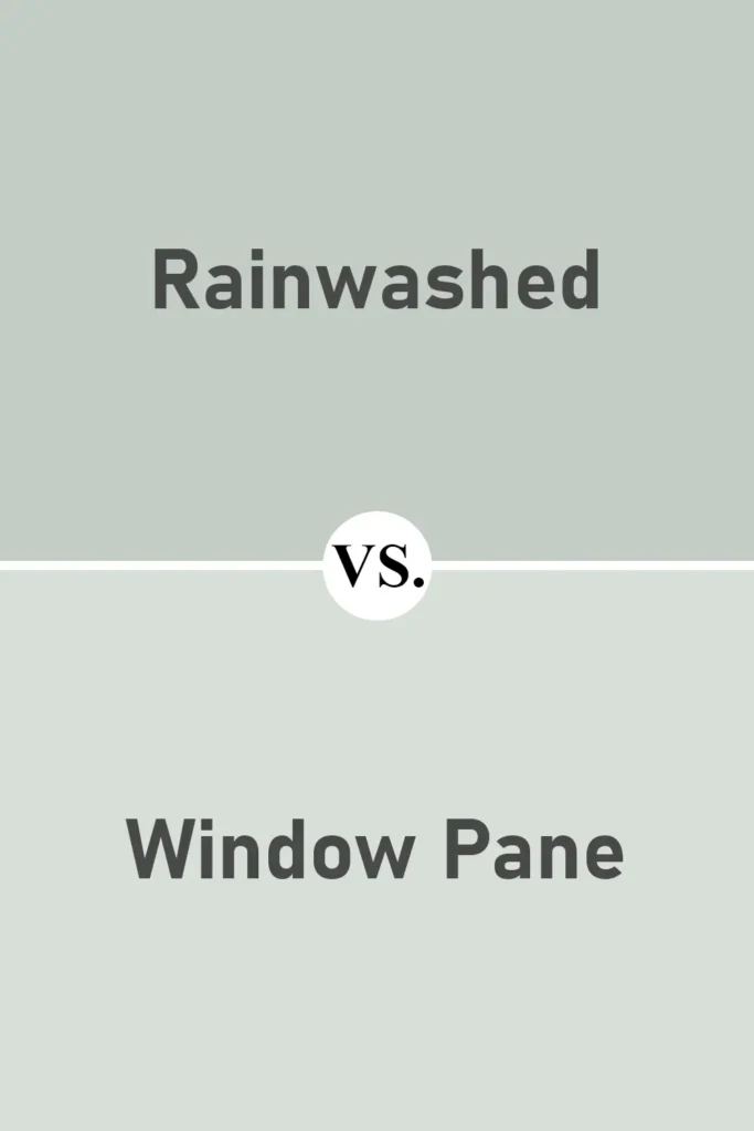
Window Pane is actually one of Rainwashed’s closest neighbors on the color strip, and it shows. The difference is mostly in depth, Window Pane is a bit lighter and slightly less saturated.
If Rainwashed feels a bit too colorful for your taste, Window Pane might be a great alternative. It still has that lovely blue-green feel, but in a quieter, more subtle way.
I’ve used Window Pane in smaller rooms or areas where I wanted just a whisper of color without going completely white or gray.
Sherwin Williams Rainwashed vs Silvermist
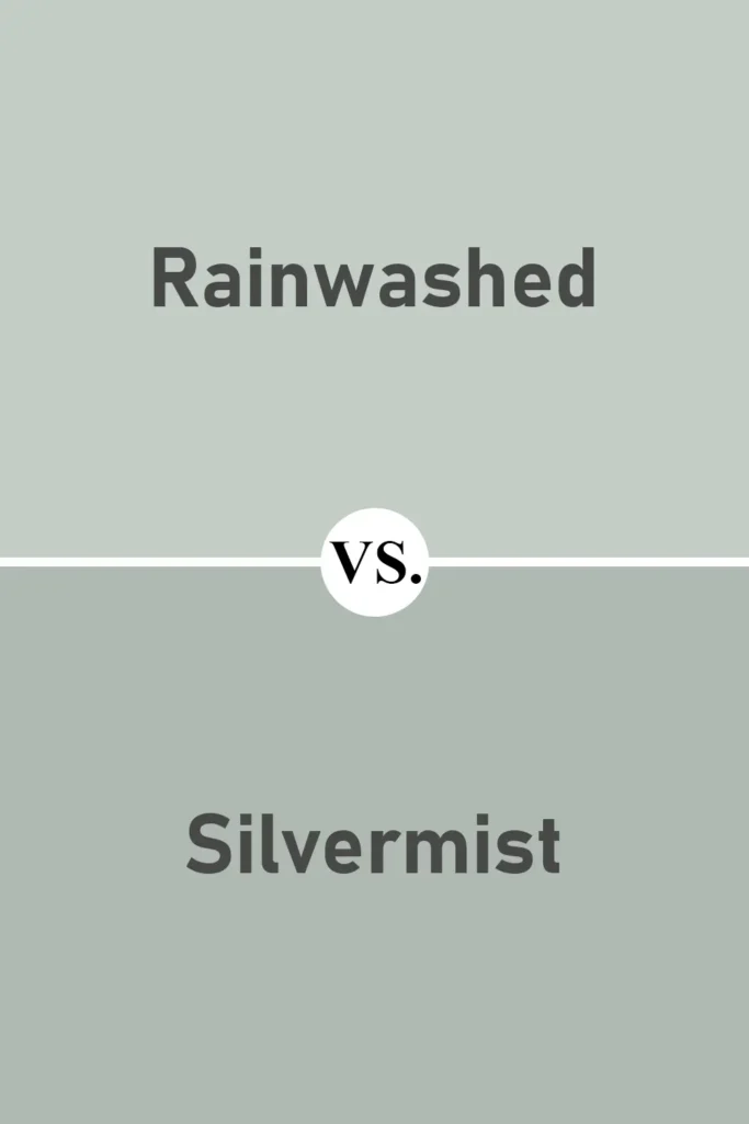
Silvermist is deeper and more blue-gray compared to Rainwashed. It still lives in that cool, muted family, but it has a stronger gray presence and can read much darker, especially in spaces with limited natural light.
I find Silvermist to be moodier, great for cozy living rooms or dramatic dining rooms. Rainwashed, on the other hand, keeps things light and uplifting.
If you want more of a “washed in soft daylight” look, Rainwashed is the better option. For something with a richer, stormy tone, Silvermist delivers.
Sherwin Williams Rainwashed vs Comfort Gray
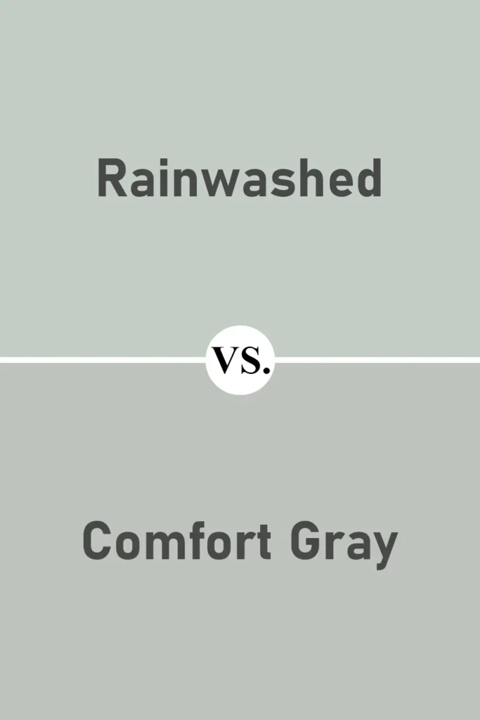
Comfort Gray has more depth and a slightly stronger green presence compared to Rainwashed. It sits a few notches down the same color strip, which means it’s like Rainwashed’s moodier cousin.
I’ve used Comfort Gray in places where I wanted the color to stand out more, like an accent wall or cabinetry. But when I want a space to feel airy and open, Rainwashed still takes the lead.
If you’re choosing between the two, ask yourself: do you want your wall color to whisper or speak up a little more?
Sherwin Williams Rainwashed vs Misty
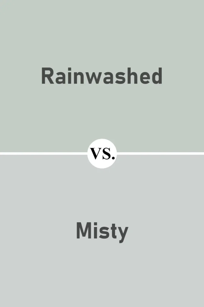
Now here’s a fun comparison, Misty leans more toward the blue-gray side of things, while Rainwashed brings in that green-blue balance.
Misty is cooler and feels more like a true gray with a blue undertone, while Rainwashed is clearly more green. I’ve used Misty in bathrooms for a crisp, spa-like feel, and it pairs beautifully with white tiles.
Rainwashed is softer, slightly warmer (though still cool-toned), and tends to feel more relaxed than clinical.
Sherwin Williams Rainwashed vs Rain
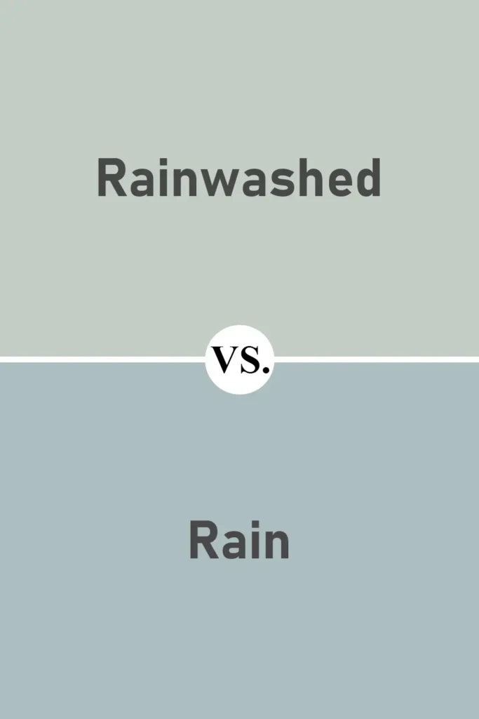
Rain is quite a bit darker than Rainwashed, like a stormier version of the same idea. It has strong gray-blue undertones and really stands out on the wall.
If Rainwashed feels too light for your space or you want more contrast with white trim, Rain might be a better fit. I love using Rain as an accent wall behind Rainwashed for some added depth without stepping too far out of the color family.
Both are beautiful, but the choice depends on how dramatic or subtle you want the result to be.
Where to Use Sherwin Williams Rainwashed?
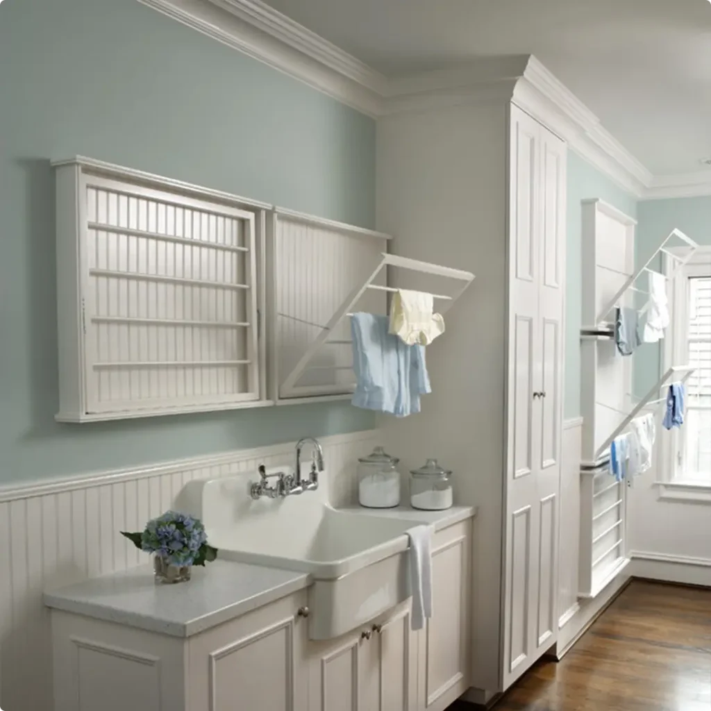
Rainwashed is the kind of color that quietly adapts to the vibe of any space. It’s light enough to keep things feeling fresh and open, but it also has enough personality to make a statement in the right setting.
What I love about this color is how versatile it is, it fits into so many different rooms and styles.
Whether you’re aiming for coastal, cottage, farmhouse, or even modern minimalism, Rainwashed can work its magic.
Below, I’ll share where I think it shines the most and how it behaves in each of those spaces based on what I’ve personally seen or tested.
Sherwin Williams Rainwashed in the Bedroom
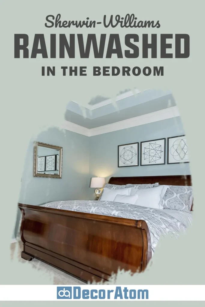
In the bedroom, Rainwashed is like a gentle exhale. I honestly can’t think of a better color if you’re trying to create a calming retreat.
The cool blue-green tones with that soft gray base make it feel like you’re waking up in a quiet beach cottage, even if you’re in the middle of the city.
I’ve used it in a small guest bedroom, and the space instantly felt more peaceful and welcoming. Pair it with white bedding, natural wood furniture, and soft lighting, and you’ve got the perfect place to unwind.
It doesn’t overwhelm the room, but it still gives the walls enough interest so they don’t feel flat.
Sherwin Williams Rainwashed in the Living Room
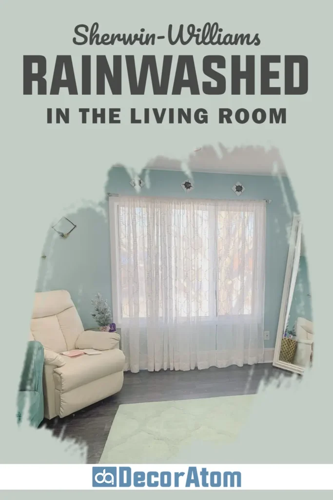
Using Rainwashed in the living room creates a soft, easygoing backdrop that’s really versatile.
It plays well with both light and dark furniture, and I’ve found that it looks amazing with layered textures like linen, jute rugs, or rustic wood accents.
One thing I noticed is that it helps reflect light beautifully, so even if your living room doesn’t get tons of sun, Rainwashed helps brighten things up.
I love using it alongside neutral grays or whites for a crisp, airy vibe, but it also looks incredible paired with deeper greens or navy for a more layered look.
Sherwin Williams Rainwashed in the Kitchen

At first, I was hesitant to try Rainwashed in a kitchen, but I’m so glad I gave it a shot.
It adds just the right amount of color without competing with other elements like cabinetry, counters, or appliances. I’ve seen it used on walls with white or cream cabinets, and the result is always soft and fresh.
It works especially well in kitchens that don’t get a ton of natural light, since its LRV of 59 helps keep things from feeling too closed in.
For a bolder move, I’ve seen people use Rainwashed on lower cabinets with white uppers, and the contrast is subtle but gorgeous.
Sherwin Williams Rainwashed in the Bathroom

This is honestly one of my favorite places to use Rainwashed. Bathrooms are usually smaller and often don’t have a ton of natural light, so finding the right paint color is tricky.
Rainwashed brings in that spa-like calm without making the space feel cold or sterile. I used it in a half bath once with brushed nickel hardware and white beadboard, and it gave the space a boutique-hotel vibe.
In a master bathroom, it pairs beautifully with marble or white tile. It feels clean, but not too clinical, just the right amount of personality for a space that’s supposed to help you relax.
Sherwin Williams Rainwashed for the Exterior
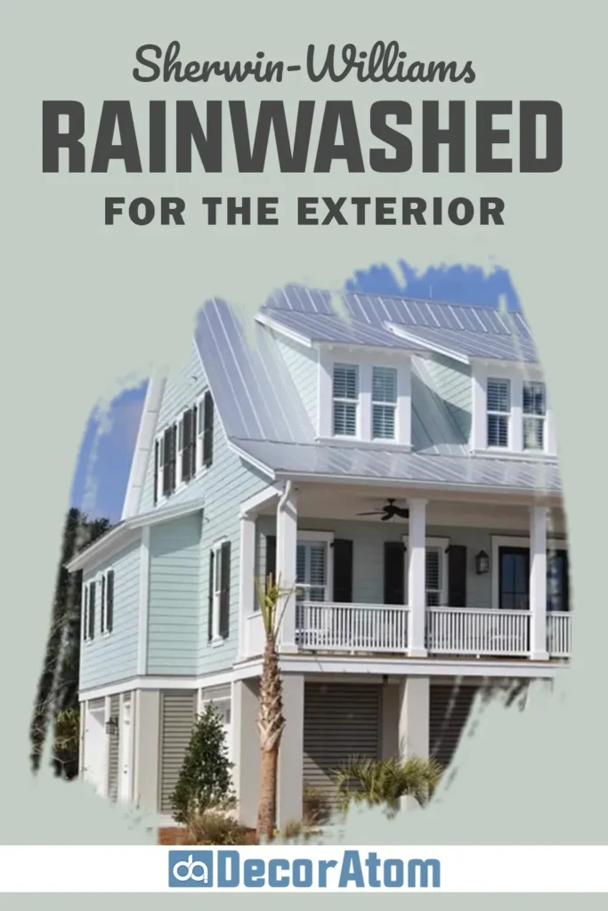
I’ve seen Rainwashed used on exteriors, and it can be stunning when done right, especially if you’re going for a light, coastal look. On an exterior wall, it looks slightly more blue than it does indoors, especially in full sun.
It pairs beautifully with crisp white trim and even natural wood or black accents for contrast. I wouldn’t use it on a very traditional or formal house style, but for beach cottages, bungalows, or relaxed farmhouse-style homes, it’s a total win.
It gives off a welcoming, breezy vibe that feels both modern and timeless. Just be sure to test it in natural light first, because exterior lighting can shift its tone more than you’d expect.
Why I Love Sherwin Williams Rainwashed SW 6211
There are plenty of paint colors that look pretty in a swatch book but fall flat on the wall. Rainwashed is not one of them. What I love most about it is how quietly beautiful it is.
It’s not trying too hard to make a statement, but it still adds so much atmosphere to a space. It has this soft energy that makes you want to breathe a little slower, move a little more gently, and just be in your home.
It’s also incredibly flexible. I’ve used it in bedrooms, bathrooms, and even considered it for cabinetry, and it’s worked in every space I’ve tried.
The blend of green, blue, and a hint of gray gives it a depth that feels intentional without being overwhelming.
And because of its LRV, it always keeps a space feeling light, which I value more than ever in a world where rooms can so easily feel heavy and cluttered.
So yes, Rainwashed is one of those colors that I keep coming back to. It’s not trendy. It’s just quietly perfect.

Final Thoughts
If you’re looking for a paint color that makes your space feel lighter, calmer, and just plain easier to live in, Sherwin-Williams Rainwashed SW 6211 is worth a serious look.
It brings a subtle freshness to any room, the kind of color that doesn’t need to shout to be noticed.
It plays well with other colors, adapts to different lighting, and gives off a feeling that’s clean, soft, and a little bit coastal.
To me, Rainwashed is one of those rare shades that checks all the boxes, it’s pretty without being precious, modern without being cold, and flexible enough to use in almost any room of the house.
Whether you’re updating a small nook or painting your entire main floor, it’s a color that can do it all without feeling overdone. And that’s exactly why it’s earned a permanent spot in my shortlist of go-to paint colors.

