
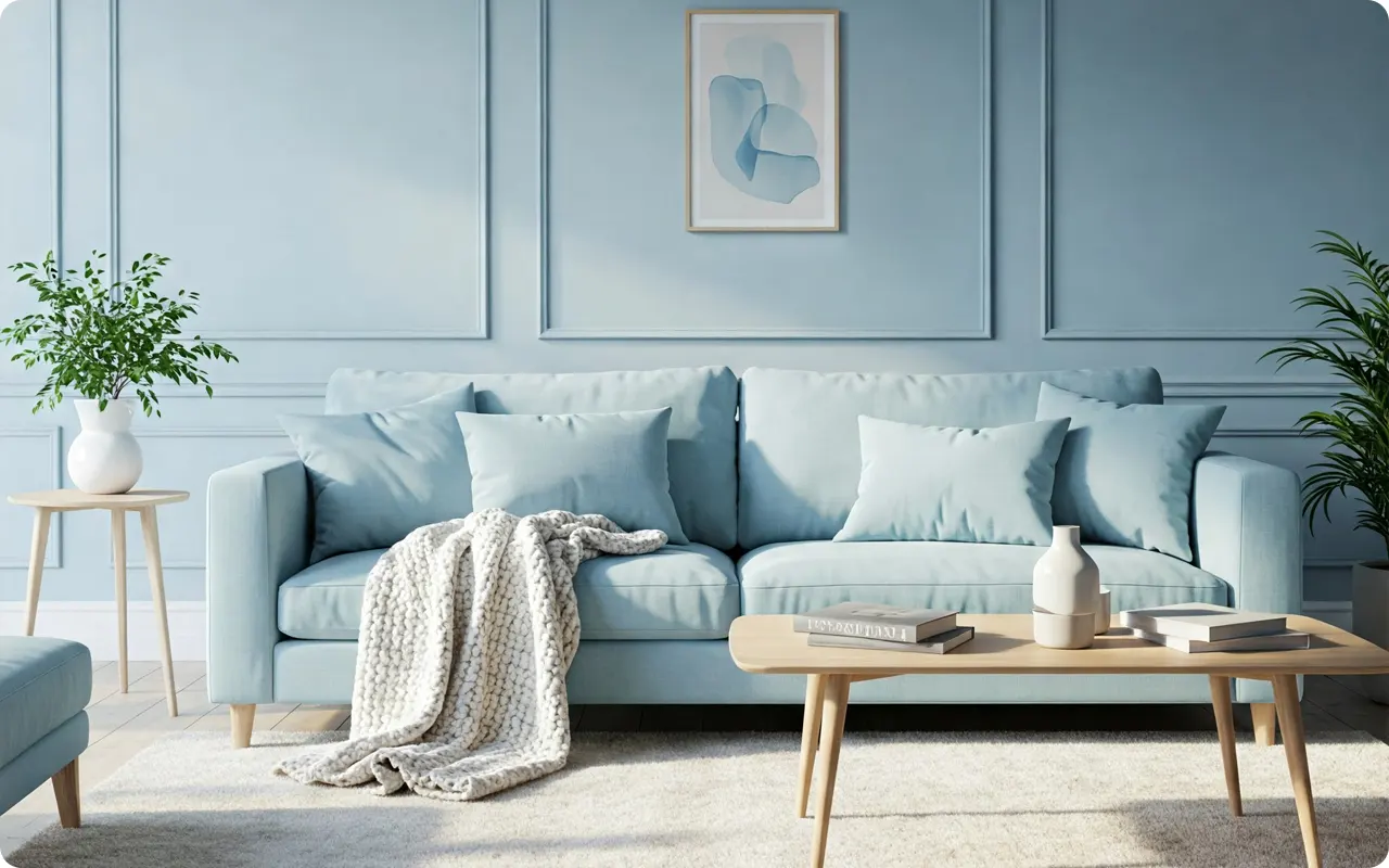
The living room is more than just a space to sit—it’s where we unwind after a long day, gather with family, and enjoy quiet moments of relaxation.
The right paint color can completely transform how this space feels, setting the tone for peace, comfort, and serenity.
If your goal is to create a living room that feels calm, cozy, and effortlessly inviting, choosing the right shade is key.
Soft, muted hues—like gentle blues, airy greens, warm neutrals, and soft grays—have a way of making a space feel more relaxed and balanced.
They work beautifully with natural light, soft textures, and warm wood tones, giving your living room an effortlessly soothing atmosphere.
But not all “calm” colors are the same! Some shades bring a touch of warmth, while others create a cool, spa-like ambiance.
The secret is finding a color that not only looks beautiful but also enhances the comfort and energy of your space.
To help you find the perfect shade, I’ve rounded up 19 of the best calming paint colors for a living room.
From timeless neutrals to soft blues and nature-inspired greens, these colors will help you craft a space that feels welcoming, peaceful, and effortlessly stylish.
Color Pairing & Styling Tips to Create a Calming Living Room
Choosing the right calming paint color is just the first step—how you pair it with furniture, trim, and decor can make all the difference in creating a truly serene space. Here are some expert tips to help you style your living room for a soft, inviting look:
1. Choose the Right Trim & Ceiling Color
The trim and ceiling color play a crucial role in enhancing your wall color. A well-chosen trim color can brighten the space and create a crisp contrast or a seamless flow.
- For soft blues & greens (like Healing Aloe or Sea Salt), pair them with warm whites like Sherwin Williams Alabaster or Benjamin Moore White Dove to keep the room feeling cozy and inviting.
- For warmer neutrals & greiges (like Edgecomb Gray or Agreeable Gray), go for cooler whites like Sherwin Williams Pure White or Benjamin Moore Chantilly Lace to balance the warmth.
- If you want a monochromatic, cocooning feel, try using the same paint color on the walls, trim, and ceiling, but in different finishes—matte for walls and satin or semi-gloss for trim.
2. Layer in Soft, Natural Textures
Calming colors shine when paired with natural materials and soft textures. This helps the space feel more relaxed and grounded:
- Linen curtains in off-white or light gray add an airy elegance.
- Chunky knit or woven throw blankets in soft neutrals create warmth.
- Jute or wool rugs soften the space and add an organic feel.
- Wood furniture (light oak, walnut, or whitewashed tones) balances the coolness of blues and grays.
3. Be Intentional with Accent Colors
While calming colors work beautifully on their own, layering in a few accent shades can bring depth and personality to your living room:
- With soft blues & greens → Add warm accents like terracotta, blush, or gold to prevent the space from feeling too cool.
- With warm neutrals & greiges → Layer in muted blues, soft greens, or charcoal for a balanced, sophisticated look.
- With deeper earthy greens → Use warm beiges, deep browns, or soft peachy tones to enhance the cozy vibe.
4. Choose the Right Metal Finishes
Your choice of hardware, light fixtures, and decor pieces can enhance the calming effect of your space.
- Warm brass & gold finishes → Work beautifully with warm whites, greiges, and soft blues.
- Matte black accents → Add a modern touch and contrast well against lighter neutral tones.
- Brushed nickel or pewter → Complement cool-toned blues and grays without being too harsh.
5. Lighting Matters!
Soft lighting enhances the calm, cozy ambiance of your space:
- Opt for warm white bulbs (2700K-3000K) instead of cool or daylight bulbs.
- Use table lamps and floor lamps for layered lighting rather than relying solely on overhead lights.
- If your wall color is cool-toned, avoid bright white LED lighting, which can make it feel too stark.
Common Mistakes to Avoid (What NOT to Do When Choosing a Calming Paint Color)
Even the most beautiful paint colors can feel off if they’re not chosen or paired correctly. Here are some common mistakes to avoid when creating a calming living room:
1. Ignoring Natural Light
Lighting dramatically affects how a paint color appears. A color that looks soft and neutral in one home might appear too dark, too cool, or too washed out in another.
✔ Do this instead: Test paint swatches on different walls and observe them at various times of the day. North-facing rooms can make colors look cooler, while south-facing rooms can enhance warmth.
2. Choosing a Color That’s Too Cool or Too Dark
While soft blues and grays are calming, overly cool or deep shades can sometimes make a space feel cold and uninviting—especially in north-facing rooms or homes with little natural light.
✔ Do this instead: Choose warmer-toned blues, greens, or grays with slight beige, greige, or taupe undertones for balance.
3. Using Clashing Undertones
Undertones can make or break a space. If your paint color has cool undertones, but your flooring and furniture lean warm (or vice versa), the room may feel off-balance.
✔ Do this instead: Identify your existing undertones (warm or cool) and select a color that complements them.
Example: If you have warm beige furniture, choosing a cool gray paint color may create a mismatch. Instead, opt for a greige like Edgecomb Gray or Repose Gray for harmony.
4. Going Too Monochrome Without Depth
While a neutral palette is calming, a completely monochromatic room with no contrast can feel flat and uninspired.
✔ Do this instead: Add depth with subtle contrast—use different shades of white and beige, or introduce soft green or muted blue-gray accents through pillows, rugs, or decor.
5. Not Considering Finish & Sheen
Paint finish affects both the look and durability of the color. The wrong sheen can either make a room too shiny or too flat and dull.
✔ Do this instead:
- Matte or eggshell finishes for walls (soft, subtle, and easy to maintain).
- Satin or semi-gloss for trim and doors (adds just enough contrast without being too glossy).
6. Forgetting About the Flow Between Rooms
A calming living room should feel harmonious with the rest of the home. If you choose a color that’s completely different from nearby rooms, it can feel disjointed.
✔ Do this instead: Stick to a cohesive color palette throughout your home. Use variations of the same color family, or choose a neutral that complements the other spaces.
7. Relying on a Single Light Source
A beautiful paint color can lose its magic if the lighting is too harsh or too dim.
✔ Do this instead: Layer your lighting with soft overhead lights, warm white bulbs, and accent lighting like table lamps or sconces to enhance the room’s calm feel.
19 Best Calming Paint Colors for a Relaxing Living Room
Soft & Airy Blues
Blue is known to be calming and stress-reducing, making it a fantastic choice for a serene and inviting living room. These soft blues have gray and green undertones that prevent them from feeling too bold, giving your space a tranquil, effortless vibe.
1. Sherwin Williams Sea Salt (SW 6204)

Sea Salt is a soft blue-green with gray undertones that reacts heavily to lighting. In bright natural light, it leans more green, bringing in a spa-like, fresh ambiance. In dim lighting, the gray undertones come forward, making it feel more neutral and subdued. This color has a misty, coastal feel, ideal for a relaxed, nature-inspired living room. Pair it with creamy whites, soft wood tones, and light linen textures to enhance its organic, soothing quality.
Get a Peel & Stick paint sample of Sea Salt
2. Benjamin Moore Palladian Blue (HC-144)

💥🎁 Christmas & Year-End Deals On Amazon !
Don't miss out on the best discounts and top-rated products available right now!
*As an Amazon Associate, I earn from qualifying purchases.
Palladian Blue is a light blue-green with subtle gray undertones, offering a fresh and airy look without being too bright. It’s often described as the perfect blend of sky and sea, making it a great choice for those who love the idea of blue but don’t want a strong, overpowering shade. North-facing rooms bring out its cooler, grayish side, while south-facing rooms make it feel slightly warmer and more vibrant. This color works beautifully with soft beiges, crisp whites, and muted grays.
Get a Peel & Stick paint sample of Palladian Blue
Paint Color Samples
Would you like to sample these paint colors? I recommend using Samplize. They offer 12″x12″ peel-and-stick paint swatches that make testing colors super simple. Just stick it on your wall, move it around if needed, and when you’re done—peel it off and toss it. No mess, no cleanup. It’s quick, easy, and way more convenient!

Advantages of using peel and stick paint samples:
- EASY TO USE: Simply move your SAMPLIZE paint sample around the room to test under a variety of lighting conditions.
- AFFORDABLE: Budget-friendly solution and no more buying inaccurate swatches, rollers, wasted paint.
- SUPER FAST DELIVERY: Depending on your location, 1 day delivery is possible.
- ORDER FROM HOME: Save a trip to the store looking for samples.
- NO MESS: SAMPLIZE uses real paint samples with zero-mess
- NO WASTE: No leftover cans or wasted paint.
3. Sherwin Williams Misty (SW 6232)

Misty is a delicate gray-blue that feels airy and refreshing. It’s slightly cooler than Sea Salt but still has a subtle warmth that keeps it from feeling too stark. This color thrives in bright, naturally lit spaces, where it maintains a soft and dreamy feel. In artificial lighting, the gray undertones become more pronounced, giving it a sophisticated, almost foggy appearance. Pair it with off-whites, greiges, and natural wood furniture for a cozy, balanced look.
Get a Peel & Stick paint sample of Misty
4. Benjamin Moore Quiet Moments (1563)

💥🎁 Christmas & Year-End Deals On Amazon !
Don't miss out on the best discounts and top-rated products available right now!
*As an Amazon Associate, I earn from qualifying purchases.
A muted blue-green with a whisper of gray, Quiet Moments truly lives up to its name. This shade creates an effortlessly elegant, calming atmosphere, working especially well in living rooms that get a mix of natural and artificial light. The gray keeps it toned down, making it a fantastic backdrop for minimalist, Scandinavian, or coastal-inspired decor.
Get a Peel & Stick paint sample of Quiet Moments
5. Sherwin Williams Krypton (SW 6247)

Krypton is a medium-light blue with a strong gray undertone, giving it a serene and refined presence. Unlike other blues on this list, Krypton leans cooler and more sophisticated, making it perfect for modern or transitional living rooms. It pairs exceptionally well with warm neutrals like beige, taupe, or off-white, creating a peaceful yet grounded space.
Get a Peel & Stick paint sample of Krypton
Warm & Cozy Neutrals
Neutral tones create a timeless and relaxed foundation, making them ideal for a cozy, welcoming living room. These colors range from off-whites to warm greiges that soften harsh lighting and bring a sense of warmth to the space.
6. Sherwin Williams Alabaster (SW 7008)

Alabaster is a creamy off-white with subtle beige undertones, making it feel inviting without being too warm. This color is perfect for creating an airy, soft environment that doesn’t feel stark like a crisp white would. In bright natural light, Alabaster retains its creamy warmth, while in dim or artificial lighting, it leans more neutral and soft. Pair it with light woods, soft blues, and warm taupes for a balanced and harmonious look.
Get a Peel & Stick paint sample of Alabaster
7. Benjamin Moore Swiss Coffee (OC-45)

💥🎁 Christmas & Year-End Deals On Amazon !
Don't miss out on the best discounts and top-rated products available right now!
*As an Amazon Associate, I earn from qualifying purchases.
Swiss Coffee is a warm, inviting off-white with a creamy glow. Unlike Alabaster, which has a slightly muted warmth, Swiss Coffee has a richer, more enveloping feel that makes living rooms feel cozy and elegant. This color pairs beautifully with earthy tones like taupe, muted greens, and warm grays, enhancing the calm and sophisticated aesthetic.
Get a Peel & Stick paint sample of Swiss Coffee
8. Sherwin Williams Accessible Beige (SW 7036)

Accessible Beige is a light greige with warm beige undertones. It has enough gray to keep it feeling modern and sophisticated, while the beige adds warmth and comfort. This shade adapts beautifully to different lighting conditions—in bright daylight, it appears soft and neutral, while in dimmer settings, its cozy warmth becomes more pronounced. It’s perfect for transitional, farmhouse, and classic living rooms.
Get a Peel & Stick paint sample of Accessible Beige
9. Benjamin Moore Classic Gray (OC-23)

Classic Gray is a soft, airy warm gray with subtle warmth that makes a space feel open yet comfortable. Unlike cooler grays, which can feel sterile, Classic Gray maintains a gentle warmth that makes it ideal for a peaceful, neutral backdrop. It’s great for small living rooms that need a touch of brightness without starkness.
Get a Peel & Stick paint sample of Classic Gray
10. Sherwin Williams Shoji White (SW 7042)

💥🎁 Christmas & Year-End Deals On Amazon !
Don't miss out on the best discounts and top-rated products available right now!
*As an Amazon Associate, I earn from qualifying purchases.
Shoji White is a warm white with beige undertones, leaning slightly taupe in certain lighting. It’s an excellent alternative to crisp white for those who want a softer, more inviting look. This color pairs beautifully with earthy greens, muted blues, and natural wood accents, creating a subtle, calming palette.
Get a Peel & Stick paint sample of Shoji White
Earthy & Relaxing Greens
Green is known for its grounding and balancing effect, making it a fantastic choice for a calm and nature-inspired living room. These muted greens work beautifully with warm woods, soft whites, and neutral textiles, creating a tranquil and restorative space.
11. Sherwin Williams Evergreen Fog (SW 9130)

Evergreen Fog is a muted green-gray with subtle hints of warmth, giving it a sophisticated yet organic feel. It’s a slightly deeper shade than sage, making it a great choice for those who want a bold but soothing backdrop. This color thrives in north-facing rooms, where its warmth helps balance out cooler lighting. In south-facing spaces, it can appear slightly lighter and more open, giving the room an effortlessly elegant and cozy atmosphere. Pair it with warm off-whites, rich wood furniture, and soft taupe accents for a timeless, inviting look.
Get a Peel & Stick paint sample of Evergreen Fog
12. Benjamin Moore October Mist (1495)

A soft sage green with a touch of warmth, October Mist brings an earthy, botanical vibe to a space. Unlike deeper greens, this shade feels airy and muted, making it an ideal backdrop for bohemian, farmhouse, and nature-inspired interiors. It pairs beautifully with creamy whites, warm beiges, and natural wood accents, enhancing its organic and relaxed charm.
Get a Peel & Stick paint sample of October Mist
13. Sherwin Williams Comfort Gray (SW 6205)

💥🎁 Christmas & Year-End Deals On Amazon !
Don't miss out on the best discounts and top-rated products available right now!
*As an Amazon Associate, I earn from qualifying purchases.
Despite its name, Comfort Gray leans more green-blue than true gray, making it a refreshing and spa-like color. In brighter rooms, the blue undertones become more noticeable, creating a soft, coastal feel. In dimmer spaces, the gray undertones step forward, giving it a soothing, muted presence. This color works exceptionally well with light woods, warm whites, and soft textiles, making the room feel effortless and serene.
Get a Peel & Stick paint sample of Comfort Gray
14. Benjamin Moore Healing Aloe (1562)

Healing Aloe is an ultra-light green with hints of blue and gray, making it feel airy and almost ethereal. It’s a perfect choice for those who want a whisper of color without overpowering the space. This shade pairs beautifully with off-whites, taupes, and soft grays, enhancing its delicate and peaceful aura. In rooms with a lot of natural light, Healing Aloe appears fresh and breezy, while in darker spaces, its gray undertones help it feel cozy and refined.
Get a Peel & Stick paint sample of Healing Aloe
Serene Grays & Greiges
Gray and greige (a mix of gray and beige) are timeless neutrals that create a calm, sophisticated atmosphere. These shades adapt beautifully to different lighting conditions and pair effortlessly with a variety of decor styles.
15. Sherwin Williams Repose Gray (SW 7015)

Repose Gray is a warm gray with soft taupe undertones, making it feel balanced and inviting. Unlike cooler grays, which can feel stark, this shade has a gentle warmth that makes the space feel cozy yet airy. In north-facing rooms, it leans more gray, while in south-facing rooms, it can pull slightly warm, almost greige. This makes it a fantastic choice for a versatile, timeless living room.
Get a Peel & Stick paint sample of Repose Gray
16. Benjamin Moore Edgecomb Gray (HC-173)

Edgecomb Gray is a light greige with a warm undertone, making it feel soft and approachable. This color is perfect for those who want a neutral that’s warmer than gray but cooler than beige. It works beautifully in both modern and classic living rooms, offering a fresh yet cozy ambiance. Pair it with soft blues, warm wood tones, and crisp whites for a harmonious, calming look.
Get a Peel & Stick paint sample of Edgecomb Gray
17. Sherwin Williams Agreeable Gray (SW 7029)

Agreeable Gray is one of the most popular greige paint colors because of its ability to adapt to different decor styles and lighting conditions. It has a perfect balance of gray and beige, making it a go-to choice for a soft, warm neutral. In bright rooms, it leans slightly cooler, while in low-light spaces, it pulls warmer. This flexibility makes it a fantastic backdrop for both contemporary and traditional living rooms.
Get a Peel & Stick paint sample of Agreeable Gray
18. Benjamin Moore Balboa Mist (OC-27)

Balboa Mist is a soft, warm gray with a subtle violet undertone, giving it an elegant and calming presence. Unlike true grays, which can feel cold, Balboa Mist has just enough warmth to feel inviting without being too beige. It’s ideal for open-concept living rooms that need a cohesive and airy color. This shade pairs beautifully with off-whites, muted blues, and natural textures.
Get a Peel & Stick paint sample of Balboa Mist
19. Sherwin Williams Mindful Gray (SW 7016)

Mindful Gray is a deeper greige that leans slightly cooler, making it a fantastic choice for a sophisticated and grounded living room. It has subtle green undertones that keep it from feeling too warm, ensuring a modern, calming effect. This color works exceptionally well with deep wood tones, black accents, and soft white trim, creating a layered, serene aesthetic.
Get a Peel & Stick paint sample of Mindful Gray
What Makes These Calming Paint Colors Ideal for Your Living Room?
The calming paint colors listed above are perfect for a living room because they share a few key characteristics that help create a peaceful and welcoming atmosphere.
First, many of them are soft, muted tones that don’t overwhelm the senses.
They have low saturation, which means they don’t demand attention but instead create a serene backdrop that fosters relaxation.
Whether it’s the soft green-blue of Sea Salt or the warm greige of Accessible Beige, these colors have a natural ability to make a space feel open and airy.
Their neutral and earthy undertones help balance the room and provide a sense of stability. Additionally, their versatility makes them adaptable to different furniture and décor styles, creating a cohesive and calming environment no matter the look you’re going for.
Tips for Pairing Calming Paint Colors with Furniture and Décor
When pairing calming paint colors with furniture and décor, the goal is to maintain the soothing vibe that these colors provide. Here are a few tips to keep in mind:
- Keep it light and neutral: Pair soft paint colors like Palladian Blue or Classic Gray with light, neutral-colored furniture and décor, such as white, beige, or natural wood tones. This creates a serene and uncluttered aesthetic.
- Add texture: Instead of bold colors or patterns, introduce texture through fabrics like linen, cotton, and wool. A cozy textured throw or a soft wool rug can enhance the calming nature of your space.
- Use natural materials: For a grounding, earthy feel, pair calming colors with furniture made from wood, stone, or wicker. These materials help bring the outdoors in, which adds to the tranquility of the room.
- Soft accent colors: To keep the space from feeling too neutral, you can add accents in pastel shades or subtle metallics, like soft blues, sage greens, or gold. These colors complement the calming tones without overpowering them.
- Consider your layout: Keep the room open and uncluttered, with clean lines in your furniture choices. Overcrowding a space can diminish the calm energy the paint colors create.
How Lighting Affects Your Calming Paint Choices
Lighting plays a huge role in how calming paint colors are perceived.
Natural light brings out the softer, airier aspects of colors like Sea Salt or Palladian Blue, enhancing their tranquility.
On the other hand, artificial lighting can create shadows and intensify the color’s undertones.
Warm light may bring out the warmth in colors like Revere Pewter or Alabaster, while cool lighting can make grays and blues feel even cooler.
If your living room doesn’t get much natural light, choose lighter shades such as Balboa Mist or Classic Gray to help reflect the light and keep the space from feeling too dark.
On the flip side, in a sun-drenched room, you can opt for deeper calming hues like Evergreen Fog to create a more grounded, cozy atmosphere.
Also, consider the type of artificial lighting you use. Incandescent lights tend to enhance warm tones, while fluorescent lights can make cooler colors look more neutral or even slightly green.
To ensure the paint color maintains its calming effect, test it under different lighting conditions before committing.
Choosing Between Warm vs. Cool Calming Paint Colors for Your Living Room
When deciding between warm and cool calming paint colors, it’s essential to consider both the atmosphere you want to create and the existing elements in your space.
- Warm calming colors like Accessible Beige or Alabaster provide a cozy, inviting feel. They are perfect for making a room feel comfortable and intimate. Warm tones can also help balance spaces with lots of natural light, as they introduce a sense of warmth and grounding. They are ideal for living rooms that you want to feel welcoming, relaxed, and comforting.
- Cool calming colors like Palladian Blue, Misty, and Silver Strand have a refreshing, crisp feel. These colors evoke a sense of tranquility, and they’re excellent for creating a more open, airy space. Cool tones are ideal if you want to bring a sense of calm without overwhelming the room, particularly in rooms that are naturally darker or have warmer undertones in the furniture and décor. They also work beautifully in coastal or minimalist-inspired spaces.
Ultimately, your choice between warm and cool will depend on the vibe you want for your living room. If you prefer a cozy, inviting atmosphere, warm tones are the way to go. But if you want to evoke a sense of freshness and tranquility, cool colors may be your best bet.
Final Thoughts
If you’re looking to create a calm, inviting living room, these 19 paint colors offer the perfect blend of soft, muted blues, warm neutrals, earthy greens, and timeless grays.
Whether you prefer a light and airy feel or a cozy and grounded atmosphere, there’s a shade here to fit your vision.