

If you’ve been on the hunt for a soft, elegant off-white paint color that doesn’t feel too stark or too yellow, Eider White SW 7014 by Sherwin Williams might just be what you’re looking for.
I’ve spent quite a bit of time researching this color and testing it in different spaces, and let me tell you, it’s one of those shades that surprises you in the best way.
At first glance, it looks like a simple white, but the more you look, the more dimension you notice. It has just enough warmth to keep things cozy, and just enough gray to keep things modern and grounded.
Whether you’re thinking about using it in a bedroom, kitchen, or even on your exterior, Eider White is one of those colors that works beautifully across the board, as long as you understand how it behaves in different lighting.
In this post, I’ll walk you through everything you need to know about Eider White SW 7014, including its undertones, where it works best, and how it compares to other popular shades.
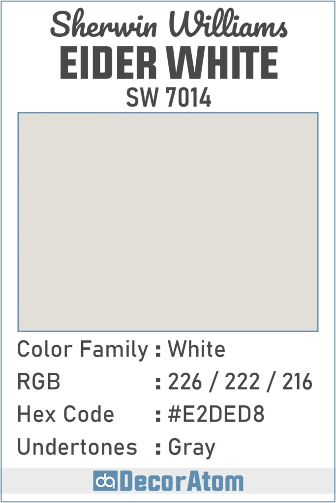
What Color is Sherwin Williams Eider White SW 7014?
Sherwin Williams Eider White is what many people might call a “soft white” or “off-white.” But there’s more to it than just being light and airy.
It’s a white paint with a hint of gray in it, which gives it a subtle and calming presence on the wall.
Think of it as a white that’s been gently toned down, it doesn’t scream “bright white,” and that’s exactly what makes it feel so inviting.
When you paint a wall with Eider White, you’re not going to get a true, crisp white. Instead, you’ll see a light, muted shade that feels neutral with just a whisper of coolness.
It’s clean but not cold, and soft without feeling overly creamy. It’s one of those colors that straddles the line between white and light gray in a really sophisticated way.
Is It a Warm Or Cool Color?
This is where things get a little interesting. Eider White sits right on that tricky line between warm and cool. Technically, it leans a little cool, mostly because of its gray undertones. But it’s not icy or sterile like some cool whites can be.
In fact, depending on the room and the lighting, Eider White can shift. In north-facing rooms, which get cooler natural light, it might look more gray or even a bit shadowy.
In rooms with warm or southern light, you’ll likely see more of the softness come through, and it may look slightly warmer, but never yellow or beige. So if you’re trying to decide whether it’s warm or cool, I’d say it’s a cool-leaning neutral white that still feels soft and approachable.
LRV of Sherwin Williams Eider White SW 7014
💥🎁 Christmas & Year-End Deals On Amazon !
Don't miss out on the best discounts and top-rated products available right now!
*As an Amazon Associate, I earn from qualifying purchases.
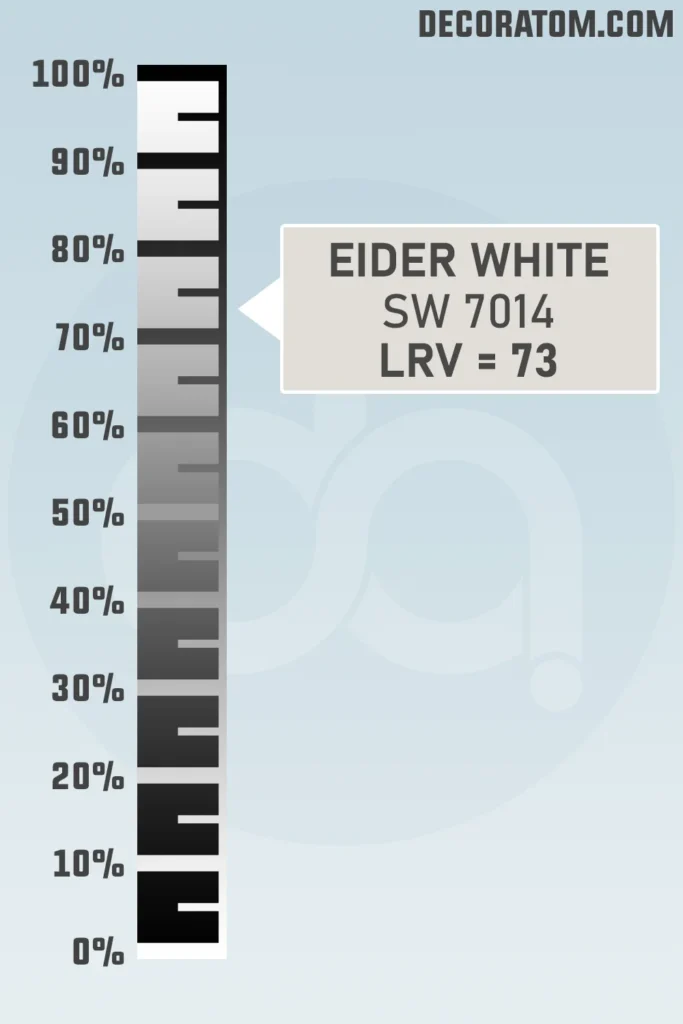
Let’s quickly talk about LRV, which stands for Light Reflectance Value. It’s basically a number from 0 to 100 that tells you how much light a paint color reflects. The higher the number, the lighter and brighter the color will appear.
Sherwin Williams Eider White has an LRV of 73, which means it’s definitely on the lighter end of the scale. It reflects a good amount of light and will help make a space feel open and airy.
However, it’s not as bright or stark as a pure white (which usually has an LRV in the 80s or 90s). That slightly lower LRV gives it a bit more softness and moodiness, especially in dim or shaded rooms.
Color Family
Eider White belongs to the white color family, but it doesn’t behave like a plain, traditional white. It has subtle gray undertones, which makes it feel more muted and versatile than a bright white.
That’s one of the reasons people love it so much, it brings all the freshness of a white, but with added depth and character.
RGB Colors
The RGB value of a paint color gives us a simple breakdown of how much red, green, and blue is mixed to create the final shade. For Sherwin Williams Eider White SW 7014, the RGB makeup is 226 / 222 / 216.
Hex Value
The hex value is what we use in digital design or on the web to represent a color. Think of it as the digital fingerprint of the paint. For Sherwin Williams Eider White, the hex value is #E2DED8.
Undertones of Sherwin Williams Eider White SW 7014
💥🎁 Christmas & Year-End Deals On Amazon !
Don't miss out on the best discounts and top-rated products available right now!
*As an Amazon Associate, I earn from qualifying purchases.
Let’s talk undertones, because this is where things really make or break a paint color in your space. Eider White has a clear gray undertone, and it’s pretty noticeable compared to some other whites.
This gray undertone gives the color its soft, slightly moody character. But that’s not all.
Depending on your lighting and surroundings, some people even see a hint of violet or purple peek through, especially in darker rooms or spaces with cooler lighting.
It’s not dramatic, but it’s definitely there if you’re sensitive to undertones.
So, if you’re expecting a creamy white, this isn’t it. Eider White’s undertone gives it a more modern, cooler vibe. But that’s also what makes it so versatile.
It pairs beautifully with both warm and cool palettes, and that little touch of gray helps it feel grounded instead of washed out.
How Different Types of Lighting Affect Sherwin Williams Eider White SW 7014
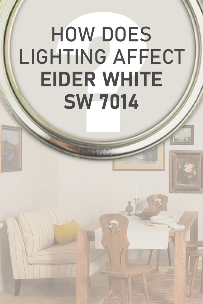
This is where Eider White really shows off its personality, it reacts to lighting in a big way. If you’re considering this color, it’s so important to test it in your actual space first, because it can shift quite a bit.
In north-facing rooms, which naturally get cooler, bluish light, Eider White can lean more gray and even pull a slight purple undertone. These cooler shadows bring out the depth in the paint and might make it feel more muted or moody than you expect.
In south-facing rooms, which have warm, golden sunlight, the gray undertone softens, and Eider White looks lighter and warmer, more like a soft, cozy white.
In artificial lighting, it depends on the bulb. Cool white or daylight bulbs can emphasize the gray and purple notes, while warm bulbs will make the color feel softer and a bit more inviting.
In low-light spaces, like hallways or rooms with small windows, it can look a lot more gray than white. If you want it to look brighter in those spaces, you might need to bring in some additional lighting.
All of this means one thing: Eider White isn’t boring. It’s dynamic. But you have to know how it will play with your light sources.
Trim Colors to Pair With Sherwin Williams Eider White SW 7014
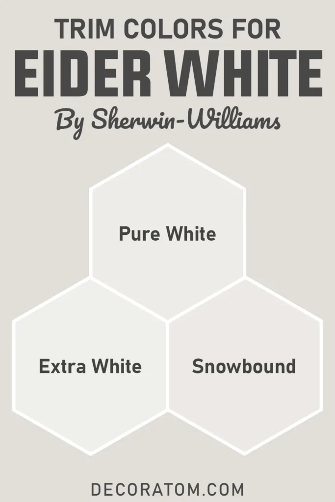
If you’re wondering what trim color works best with Eider White, the good news is, you’ve got options! Because it’s a soft, muted white with gray undertones, you can pair it with both true whites and deeper contrast shades, depending on the look you’re going for.
Here are some tried-and-true trim color options:
Sherwin Williams Pure White (SW 7005): This is one of the safest and most beautiful pairings. Pure White has just a touch of warmth but still reads like a clean, fresh white. It complements Eider White’s soft gray undertones without clashing.
Sherwin Williams Extra White (SW 7006): If you want a crisper contrast for a modern or more high-contrast look, Extra White works beautifully. It’s cooler and brighter, so it makes Eider White stand out a little more.
Sherwin Williams Snowbound (SW 7004): This one’s a bit softer and has a warm, subtle tone that pairs nicely if you want a more cohesive, gentle transition between wall and trim.
No matter which one you choose, just make sure to test them together in the same lighting. Trim can make or break how Eider White looks overall, especially if you’re trying to avoid it leaning too cool or too purple.
Colors Similar to Sherwin Williams Eider White SW 7014
💥🎁 Christmas & Year-End Deals On Amazon !
Don't miss out on the best discounts and top-rated products available right now!
*As an Amazon Associate, I earn from qualifying purchases.
When you’re looking for a paint color like Eider White, it usually means you’re after something soft, subtle, and not too bright.
But maybe Eider White is just slightly off from what you’re envisioning, or maybe you’re just curious about close alternatives that behave similarly. That’s where similar colors come in.
Eider White is an off-white with gray undertones, and sometimes even a touch of purple peeking through, depending on lighting. So if you want a color with a comparable look and feel, maybe just a little warmer, cooler, lighter, or cleaner, there are plenty of great options to explore.
Many homeowners find that Eider White can be a bit unpredictable in some lighting, so it’s common to compare it with similar shades to find the right fit for their space.
Whether you’re trying to avoid that violet undertone, want a cleaner white, or just need something that plays more nicely with your lighting, the following colors from Sherwin Williams and Benjamin Moore can give you that same modern, muted look without veering too far off track.
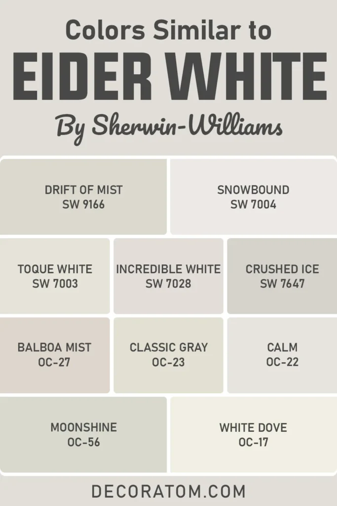
Here’s a list of 10 similar colors:
- Sherwin Williams Drift of Mist SW 9166
- Sherwin Williams Snowbound SW 7004
- Sherwin Williams Toque White SW 7003
- Sherwin Williams Incredible White SW 7028
- Sherwin Williams Crushed Ice SW 7647
- Benjamin Moore Balboa Mist OC-27
- Benjamin Moore Classic Gray OC-23
- Benjamin Moore Calm OC-22
- Benjamin Moore Moonshine OC-56
- Benjamin Moore White Dove OC-17
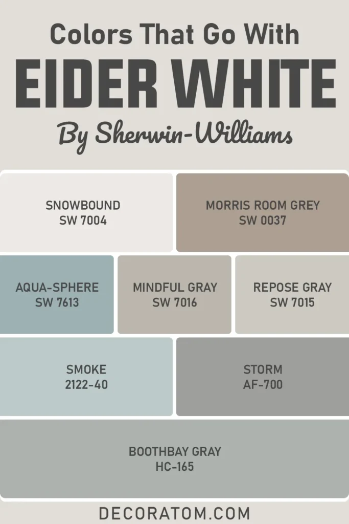
Colors that Go With Sherwin Williams Eider White SW 7014
Choosing the right coordinating colors for Eider White can really elevate the whole room. Since it’s a soft, muted white with gray undertones (and sometimes a tiny touch of violet), it pairs beautifully with other calm, moody, or nature-inspired shades.
Whether you’re designing a whole-house color palette or just looking for accent walls, trim, or cabinetry colors to match, knowing what works well with Eider White makes all the difference.
This color tends to thrive when paired with muted tones rather than bold brights. Think soft sage greens, mid-tone grays, dusty blues, and even greige or mushroom colors.
It’s also incredibly pretty next to wood finishes, especially light oak or weathered tones, because it adds contrast without feeling too stark.
It’s also important to think about balance. If you want to warm up a room where Eider White feels too cool, bring in colors with warmth, like a creamy beige, warm gray, or blush. If you want to emphasize the crisp and clean look, stick with more neutral or cool partners.
Below is a list of 8 colors that coordinate well with Eider White. These include a mix of colors that bring contrast, harmony, and depth to a space. (And yes, I’ve included the 3 specific ones you asked for.)
💥🎁 Christmas & Year-End Deals On Amazon !
Don't miss out on the best discounts and top-rated products available right now!
*As an Amazon Associate, I earn from qualifying purchases.
- Sherwin Williams Snowbound SW 7004
- Sherwin Williams Morris Room Grey SW 0037
- Sherwin Williams Aqua-Sphere SW 7613
- Sherwin Williams Mindful Gray SW 7016
- Sherwin Williams Repose Gray SW 7015
- Benjamin Moore Smoke 2122-40
- Benjamin Moore Storm AF-700
- Benjamin Moore Boothbay Gray HC-165
Comparing Sherwin Williams Eider White SW 7014 With Other Colors
Comparing paint colors is one of the most helpful ways to really get a feel for what works best in your space.
You might think you’ve found the perfect white until you put it next to another one, and suddenly you realize one is too bright, too warm, too cool, or just not quite right.
Eider White is often compared to other popular whites and off-whites, especially because of its gray undertones and slightly cool feel.
When I’m deciding between similar paint colors, I like to look at how they differ in undertones, warmth, and light reflectance. Even small changes can have a big impact on how a room feels.
Below, I’ll walk you through a few detailed comparisons between Eider White and other widely used colors so you can really understand the differences and pick the best fit for your home.
Sherwin Williams Eider White vs Sherwin Williams Alabaster
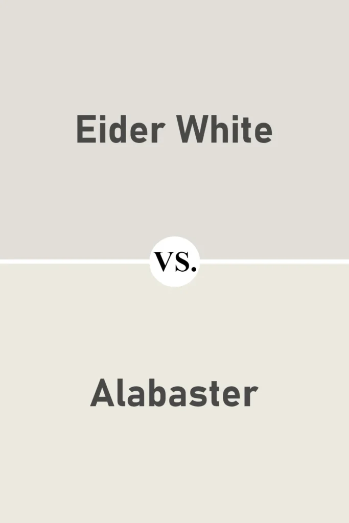
Alabaster SW 7008 is much warmer than Eider White. It leans into creamy, almost buttery undertones without ever feeling yellow.
When placed next to Eider White, you’ll instantly notice that Alabaster feels more traditional and cozy, while Eider White looks cooler and more modern.
If you’re looking for a soft white with more warmth, Alabaster might be the better pick. But if you want something a bit crisper and more neutral, Eider White wins.
Also Read: Alabaster SW 7008 Paint Color Review
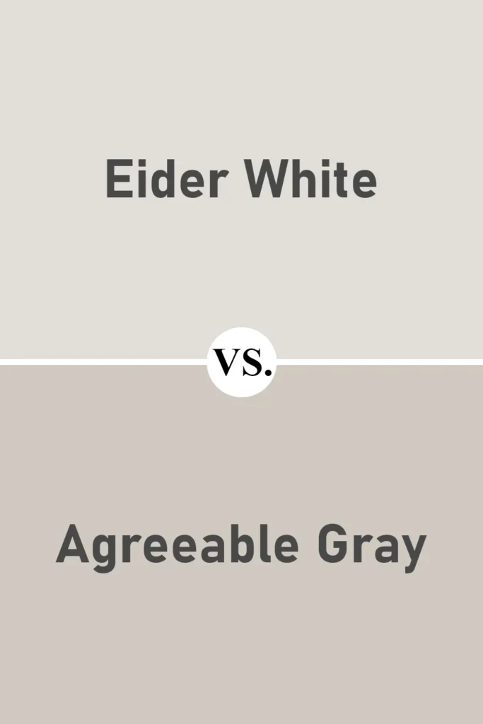
Sherwin Williams Eider White vs Sherwin Williams Agreeable Gray
💥🎁 Christmas & Year-End Deals On Amazon !
Don't miss out on the best discounts and top-rated products available right now!
*As an Amazon Associate, I earn from qualifying purchases.
Agreeable Gray SW 7029 is a greige, meaning it’s a perfect balance of gray and beige, while Eider White is more of a gray-white.
Agreeable Gray is significantly darker and richer in tone, making it better suited as a wall color in contrast with lighter trims like Eider White.
If you’re thinking of pairing the two, they actually work beautifully together. But for a main wall color, if you want something lighter and more subtle, Eider White is the way to go.
Also Read: Agreeable Gray SW 7029 Paint Color Review
Sherwin Williams Eider White vs Sherwin Williams Snowbound
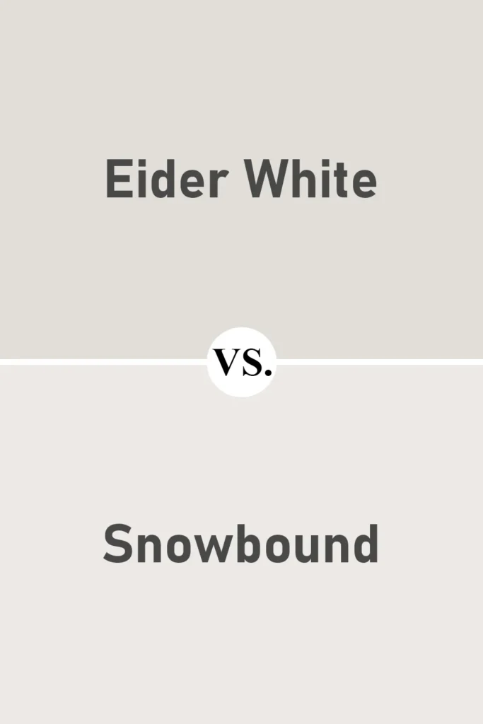
Snowbound SW 7004 and Eider White are both in the off-white family, but Snowbound leans a little warmer and cleaner.
It doesn’t have the same gray-violet undertone that Eider White can show in certain light. Snowbound often feels more neutral and consistent, whereas Eider White can shift with lighting.
If you’re looking for a color that plays well with both warm and cool tones and doesn’t surprise you, Snowbound might feel safer.
Sherwin Williams Eider White vs Sherwin Williams Repose Gray
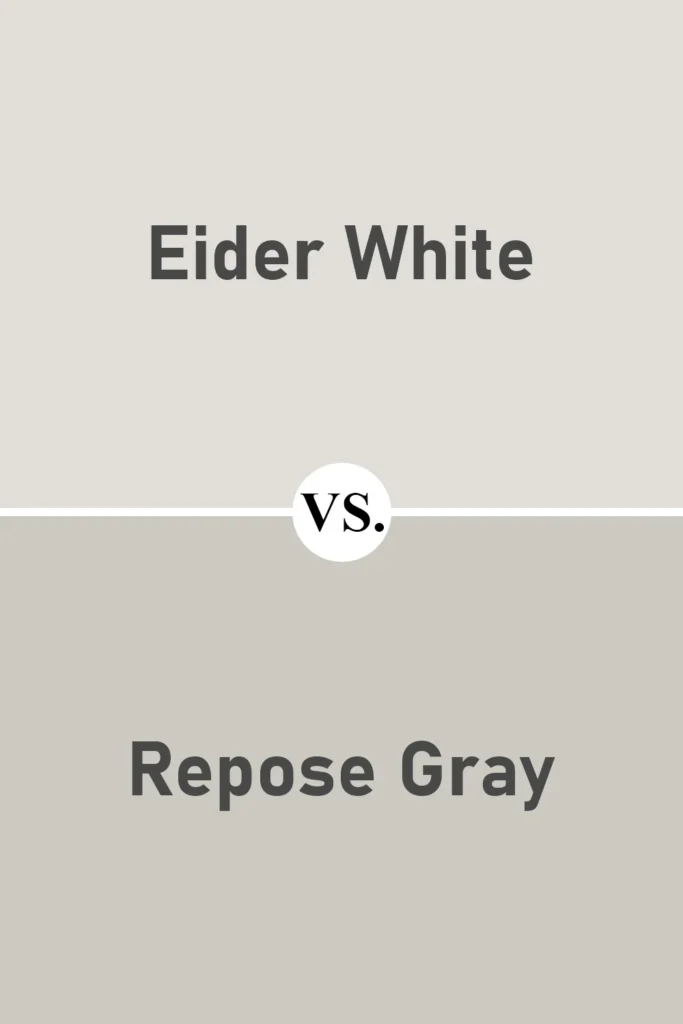
Repose Gray SW 7015 is noticeably darker than Eider White and is considered a mid-tone gray.
It has similar undertones, including that ever-so-slight hint of purple, but because of its depth, it reads more definitively gray.
These two colors can be used beautifully together, Repose Gray on cabinets or accent walls, and Eider White on the surrounding walls or trim.
But if you’re after a light and airy backdrop, Eider White is the brighter choice.
Sherwin Williams Eider White vs Sherwin Williams Toque White
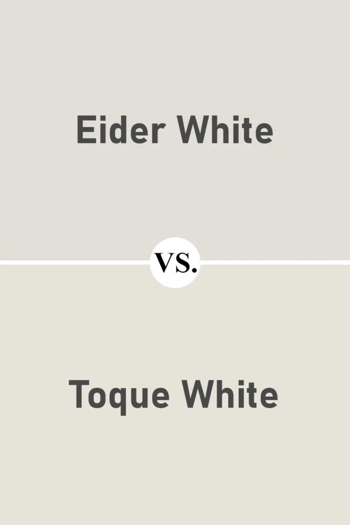
Toque White SW 7003 is actually quite close to Eider White in tone and depth but leans a bit warmer and has a softer feel.
It doesn’t show the cool undertones that Eider White sometimes reveals, especially in low light.
If you love Eider White but worry about that hint of violet, Toque White might be a great alternative. It’s also a bit more forgiving in tricky lighting.
Sherwin Williams Eider White vs Benjamin Moore Classic Gray
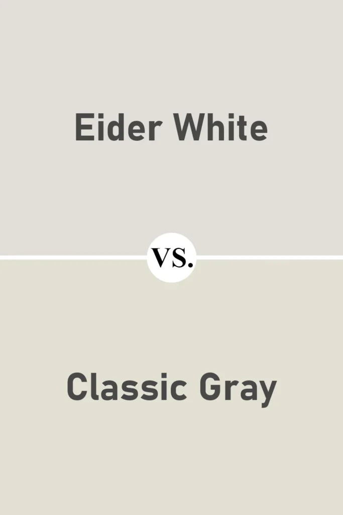
Classic Gray OC-23 is often seen as a neutral, crowd-pleasing warm gray. When compared to Eider White, Classic Gray comes across as warmer and creamier, while Eider White feels more crisp and slightly cooler.
The two are similar in depth, but their undertones are what really set them apart.
If you’re torn between the two, your decision may come down to whether you want a soft warm gray (Classic Gray) or a light cool white with gray undertones (Eider White).
Also Read: 17 Best Benjamin Moore Blue Gray Paint Colors
Where to Use Sherwin Williams Eider White SW 7014?
Eider White is one of those colors that can work in almost any room, if you understand how it behaves.
Because it’s a soft off-white with gray undertones, it doesn’t scream for attention, but instead creates a calm, balanced atmosphere.
It’s subtle, a little moody in the right light, and it plays well with both traditional and modern design styles.
But here’s the thing: Eider White doesn’t look exactly the same in every room. Lighting, surrounding colors, and even your furniture can influence how it shows up. So, let’s talk about where this color truly shines.
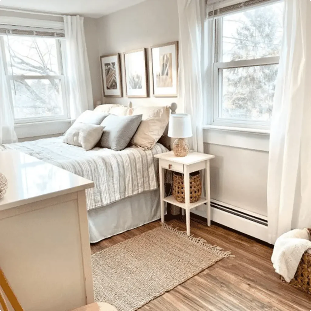
Sherwin Williams Eider White In the Bedroom
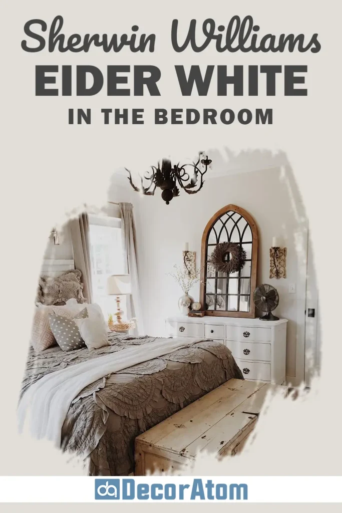
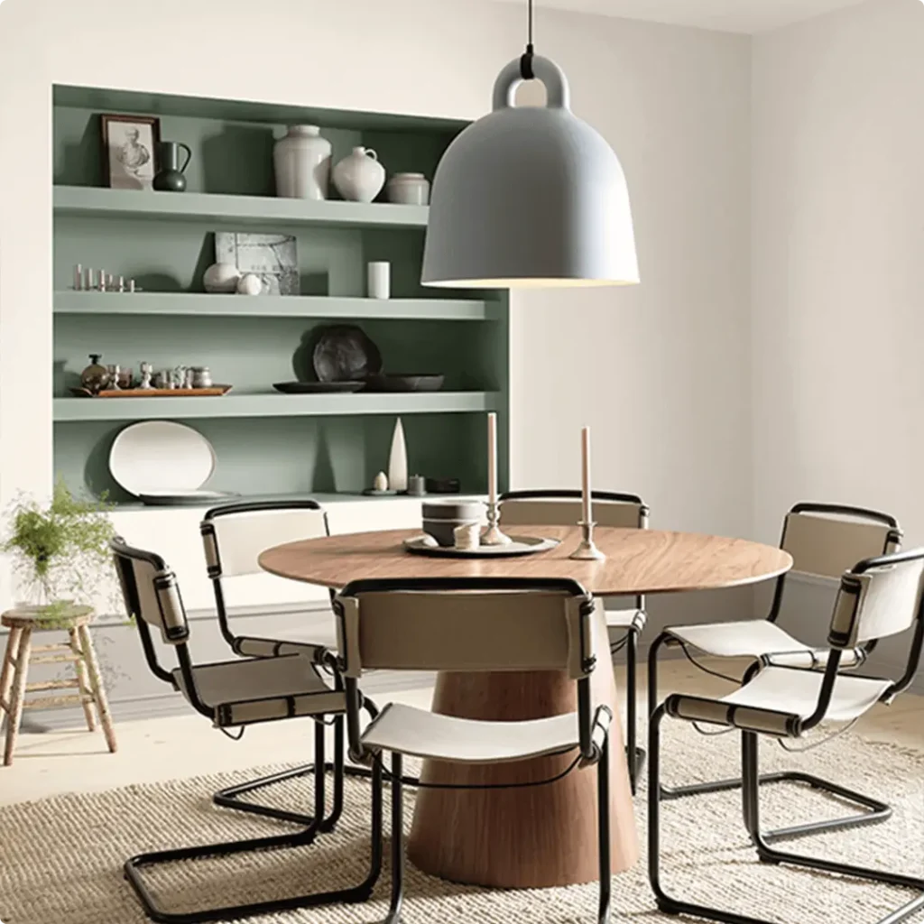
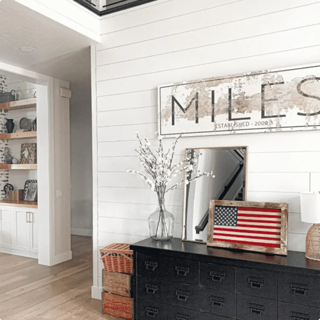
Bedrooms are one of the best places to use Eider White. If you’re aiming for a soft, tranquil space that feels calm without being too cold or too beige, this color checks all the boxes.
On bedroom walls, Eider White acts as a cozy, neutral backdrop, one that works beautifully with soft grays, blush tones, dusty greens, or even dark charcoal accents.
It’s a great choice if you want a minimalist or Scandinavian-style bedroom, or even a more romantic and layered space with plush bedding and warm wood furniture.
Just keep in mind: in north-facing bedrooms or ones that don’t get a ton of natural light, Eider White can look a bit more gray and even slightly cool. But in south-facing rooms, it takes on a soft, elegant glow that’s incredibly soothing.
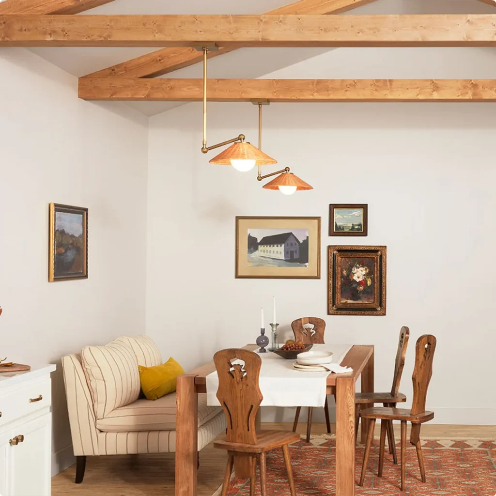
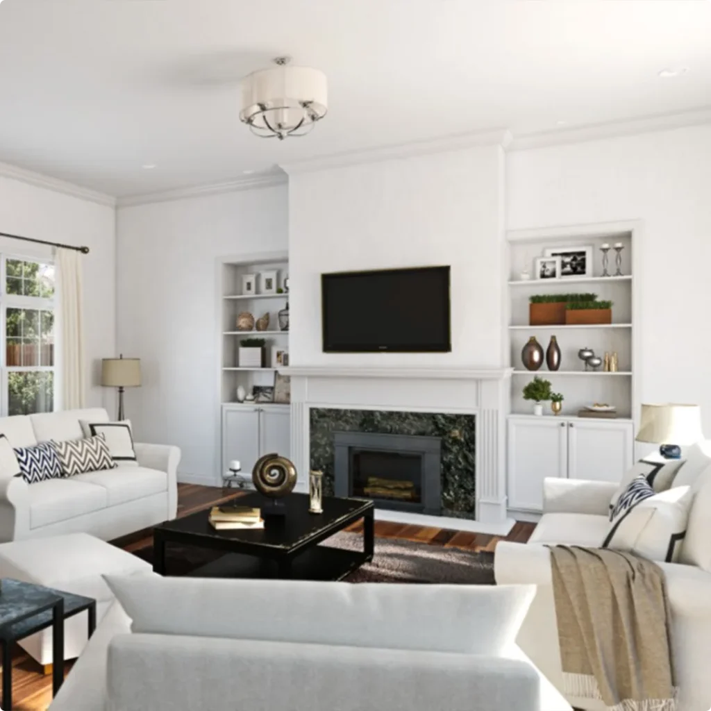
Sherwin Williams Eider White In the Living Room

If your living room needs a fresh update but you’re not a fan of stark white walls, Eider White is a wonderful alternative.
It adds just enough warmth and softness to feel inviting without dominating the room. It’s also incredibly versatile with furniture, whether you’re working with a gray sectional, a leather couch, or even bold accent pieces.
One of the things I love about using Eider White in living rooms is how well it adapts to different lighting throughout the day. In the morning, it feels light and airy; in the evening, it takes on a more grounded tone that feels cozy without being dark.
It also works well with both white trim and darker accent colors. If you want to highlight crown molding or a fireplace mantel, pairing Eider White with a crisper white trim like Pure White or Snowbound can create beautiful contrast.
Sherwin Williams Eider White in Kitchen

Eider White is a fantastic choice for kitchens, especially if you’re not a fan of overly bright or sterile whites.
Whether you’re painting the walls, the cabinets, or even just the ceiling, this color brings in a quiet sophistication. On kitchen cabinets, it offers a muted, modern look that works well with both black hardware and brushed gold finishes.
Because kitchens often have a mix of warm and cool elements, stainless steel appliances, wood floors, stone countertops, Eider White’s balance of gray and warmth makes it a great “bridge” color.
It harmonizes with a lot of materials without clashing. One thing to be cautious of: under cooler LED lighting or shadowy corners, that subtle violet undertone might become noticeable.
So it’s always a good idea to test a large swatch in your kitchen before committing.
Sherwin Williams Eider White In the Bathroom

Bathrooms are another great spot to use Eider White, especially if you’re after a spa-like, calming vibe.
It creates a soft, clean backdrop that complements marble, white tiles, natural wood, or even dramatic black accents. Because it’s not as stark as a pure white, it gives bathrooms a softer, more luxurious feel.
However, bathrooms usually have limited natural light, which can sometimes make Eider White lean a bit cooler or show its gray undertone more prominently.
If your bathroom has no windows or only gets cool northern light, pair Eider White with warm metal finishes (like brass or gold) and cozy lighting to balance things out. It can be especially beautiful with soft sage or dusty blue accents.
Sherwin Williams Eider White For the Exterior
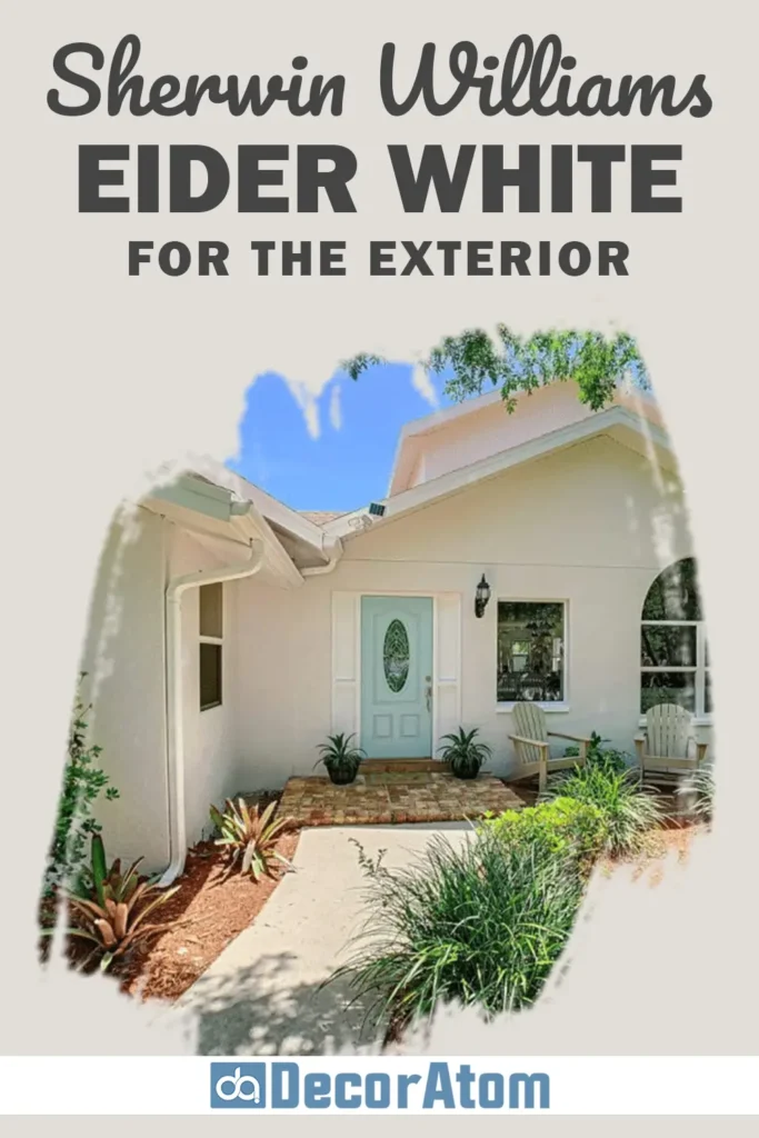
Using Eider White on the exterior of a home can be stunning, but it does behave a little differently than it does indoors. Because of its LRV of 73, it will look much brighter in full sunlight.
Outdoors, it reads like a soft, warm white, but it can still hold onto that subtle gray edge, which gives it a sophisticated look, especially if you’re going for a modern farmhouse or transitional style.
It looks gorgeous with black shutters, bronze fixtures, or deep gray trim. If your home has stonework or warm brick, Eider White offers just enough contrast without clashing.
Just keep in mind, strong sunlight will wash it out a bit, so if you’re looking for deeper contrast, you may want to go a shade darker on trim or accents to make everything pop.
Also Read: 25 Most Popular Sherwin Williams Exterior Paint Colors

Why I Love Sherwin Williams Eider White
Honestly, there’s something incredibly appealing about Eider White’s quiet charm. It’s not one of those trendy whites that everyone uses, but once you see it in the right space, it’s unforgettable.
I love how it brings softness to a room without feeling flat. That subtle gray undertone gives it just enough edge to feel modern, yet it still manages to feel warm and welcoming.
What I really appreciate is its versatility, it can lean modern or traditional, warm or cool, depending on the light and your design choices.
You can pair it with bold colors or keep the palette soft and neutral. And it always seems to ground a space in a calm, effortless way.
Sure, it has its quirks (like that occasional purple tint), but if you’re aware of how it behaves and plan accordingly, it can be an absolutely beautiful foundation for your home.
Final Thoughts
Sherwin Williams Eider White SW 7014 isn’t your average off-white paint. It has depth, personality, and just enough complexity to make it special. If you’re tired of whites that are too bright, too yellow, or too plain, Eider White might be exactly what your space needs.
Yes, it’s important to be mindful of lighting, this color can shift depending on whether your space gets warm or cool light, but that’s part of its charm.
It adapts, it changes, and it never feels one-note. Whether you’re painting a cozy bedroom, a fresh and airy kitchen, or even your entire home’s exterior, Eider White brings elegance and softness in a way that’s hard to match.
If you’re considering it, I definitely recommend testing it in your own space first. But if you’re like me, once you see it on the wall, you just might fall in love.