

If you’ve ever stood in the paint aisle completely overwhelmed by all the shades of white, trust me—you’re not alone.
I’ve been there too, holding up tiny swatches, trying to picture what they’d look like on a full wall.
One white that stood out to me in the middle of all that guesswork was Sherwin-Williams Dover White SW 6385. It’s not your typical cold, stark white. It’s soft, welcoming, and surprisingly versatile.
In this review, I’ll walk you through everything I’ve learned about this color—what it really looks like, how it behaves in different lighting, what it pairs well with, and where it truly shines in the home.
If you’re considering a warm, creamy white that doesn’t feel sterile, keep reading—Dover White might just be the one.
*This post contains affiliate links. For more details see my full disclosure.
What Color is Sherwin Williams Dover White?
Dover White is what I like to call a “gentle white.” It’s definitely a white paint, but not the kind that feels icy or cold.
It has a soft creaminess to it that gives it more warmth and depth than a pure white.
When I see Dover White on the wall, I think of a cozy, sunlit room—there’s a subtle richness to it that makes the space feel relaxed and inviting.
It’s not yellow. But it leans in that direction just enough to keep it from feeling flat.
That’s what makes it work so beautifully in spaces where you want white walls but not a clinical vibe.
Get a Peel & Stick paint sample of Dover White
Is It a Warm or Cool Color?
Dover White is absolutely a warm white. And I don’t just mean “slightly warm.” It has a real creamy, soft undertone that gives it that warm feel—especially when you compare it next to a true white or cooler shade.
So, if you’re someone who likes your home to feel cozy and lived-in rather than sleek and modern, this warmth is a big win.
It pairs beautifully with wood tones, earthy decor, and traditional or farmhouse styles. But I’ll be honest: if you’re going for that high-contrast, modern black-and-white aesthetic, Dover White might feel too soft for that look.
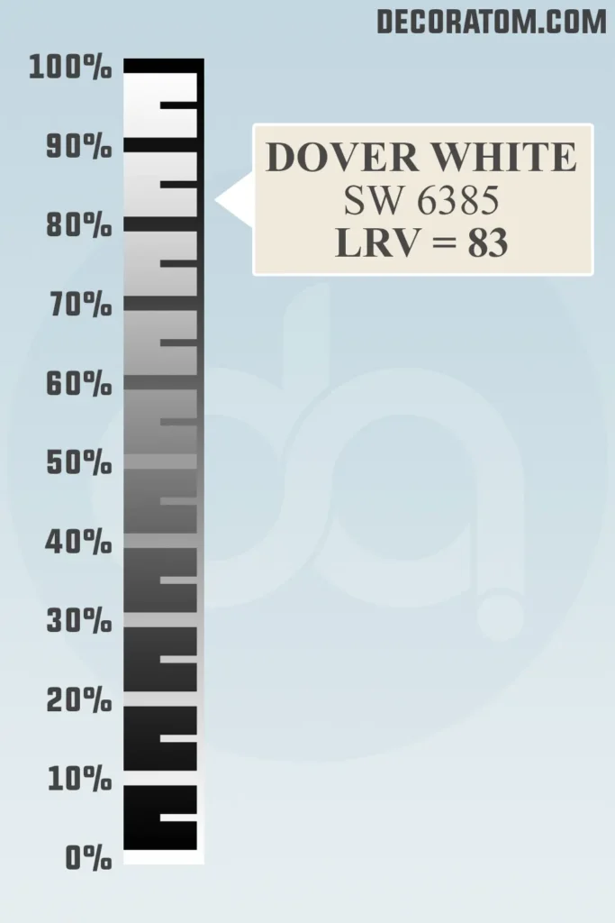
LRV of Sherwin Williams Dover White
💥🎁 Christmas & Year-End Deals On Amazon !
Don't miss out on the best discounts and top-rated products available right now!
*As an Amazon Associate, I earn from qualifying purchases.
Let’s talk about LRV—but don’t worry, I’ll keep it simple. LRV stands for Light Reflectance Value, which just tells you how much light a paint color reflects.
The scale goes from 0 to 100, with 0 being pure black (reflects no light) and 100 being pure white (reflects the most light).
Dover White has an LRV of 83, which means it reflects a lot of light. It’s bright and can make a space feel airy and open. But because it’s a warm white, it doesn’t feel stark or glaring.
That’s what makes it such a popular choice for people who want a light color that still feels soft and welcoming.
Color Family
Dover White is part of the white color family, but it’s definitely on the warmer, creamier end of that spectrum.
It’s not what I’d call a “true white,” but it still reads as white on the wall—especially in well-lit spaces.
I think of it as a bridge between white and very pale cream. It gives you that classic white look, but with more character and softness.
RGB Colors
If you’re someone who loves to understand color a little deeper (without getting too technical), the RGB breakdown can help.
RGB stands for Red, Green, and Blue, which are the three colors that mix together digitally to make any color you see on a screen.
For Dover White, the RGB values are 240 / 234 / 220.
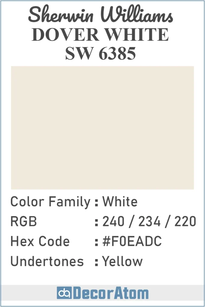
Hex Value
If you’ve ever worked with digital design or picked paint colors online, you’ve probably come across something called a hex value.
It’s basically the digital “name tag” for a color. Every color gets its own hex code based on its RGB mix.
For Sherwin-Williams Dover White, the hex value is #F0EADC.
Undertones of Sherwin Williams Dover White
Let’s talk undertones, because they make all the difference in how a paint color feels. Dover White has a yellow undertone, and this is what gives it that cozy, creamy feel instead of a sharp or sterile white look.
Now, don’t worry—it doesn’t look straight-up yellow on your walls. But if you compare it to a cooler white (like one with blue or gray undertones), that yellow warmth will definitely stand out.
In bright daylight, the undertone can peek through more clearly, especially if your room has a lot of natural sun. In the evening, under warm artificial lighting, it just feels soft and glowy.
If you’re looking for a white that won’t turn icy or make your room feel cold, the subtle yellow in Dover White is a big plus.
How Does Lighting Affect Sherwin Williams Dover White?
Lighting has a huge influence on how Dover White looks—and trust me, this is one of those colors that really shifts depending on your light source.
In natural daylight, especially in rooms with southern exposure, Dover White will lean into its yellow undertones more. It’ll feel bright, soft, and creamy.
That’s when it truly shines—literally. The warmth comes forward, making the space feel welcoming.
In cool, north-facing light, the color can look a bit more subdued. The creamy undertone is still there, but it might not feel as warm and sunny. If you want to tone it down, this lighting will help balance that yellow.
Under warm artificial lighting (like soft white bulbs), the yellow undertone becomes more pronounced. In some cases, it might even look a little golden—especially in rooms with beige or brown accents.
So here’s my tip: always sample it on your wall and check it morning, afternoon, and evening. It’s not that it looks bad in any light—it’s just that its personality shifts, and you want to know what version you’re getting in your own space.
Trim Colors to Pair With Sherwin Williams Dover White?
💥🎁 Christmas & Year-End Deals On Amazon !
Don't miss out on the best discounts and top-rated products available right now!
*As an Amazon Associate, I earn from qualifying purchases.
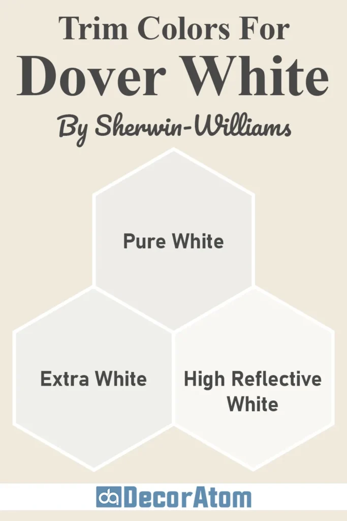
Choosing the right trim color with Dover White can make or break the look. Because this is a warm white, I’ve found it pairs best with a clean, crisp white on the trim. You want a color that creates just enough contrast without clashing.
Here are a few trim colors I love with Dover White:
- Sherwin-Williams Extra White (SW 7006): This is my go-to. It’s a bright, clean white with cool undertones. Next to Dover White, it helps the warmth of the walls stand out without looking yellow.
- Sherwin-Williams Pure White (SW 7005): Another solid choice. It’s a little softer than Extra White, but still bright enough to give contrast. This combo feels elegant without going too stark.
- Sherwin-Williams High Reflective White (SW 7757): If you want maximum contrast and brightness, this one will do it. It’s almost pure white—great for a classic, high-end feel.
I wouldn’t recommend pairing Dover White with off-whites or creams on the trim—those can blend too much and the space can start to feel a bit washed out. Let the walls bring the warmth, and use a clean white trim to keep things fresh and balanced.
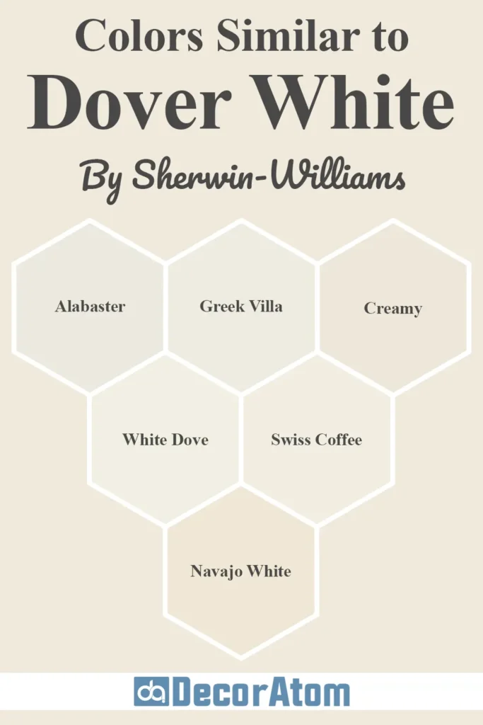
Colors Similar to Sherwin Williams Dover White
If you’ve fallen in love with the look of Dover White SW 6385, but you’re still exploring options, you’re not alone.
I’ve done that too—staring at a dozen whites that all look almost the same on the swatches but completely different on the walls. That’s the magic (and madness) of paint shopping.
So I pulled together six similar colors from Sherwin-Williams and Benjamin Moore that you might want to compare side-by-side with Dover White.
Let’s look at them closely and see how they stack up:
1. Sherwin-Williams Alabaster (SW 7008)
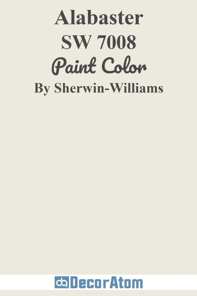
Alabaster is another creamy white, but it’s noticeably more neutral than Dover White.
While both are warm, Alabaster has more of a subtle beige undertone and less yellow.
If Dover White feels too creamy or golden in your space, Alabaster might strike the perfect balance.
I find it a little more versatile, especially if you’re looking for something that reads clean without leaning cold.
Get a Peel & Stick paint sample of Alabaster
2. Sherwin-Williams Greek Villa (SW 7551)

💥🎁 Christmas & Year-End Deals On Amazon !
Don't miss out on the best discounts and top-rated products available right now!
*As an Amazon Associate, I earn from qualifying purchases.
Greek Villa is soft and warm like Dover White, but it’s a touch lighter and has slightly less yellow in it.
I think of Greek Villa as Dover White’s more muted cousin. It’s a great option if you want something creamy but understated.
It pairs beautifully with warm wood tones and doesn’t shift too much in different lighting.
Get a Peel & Stick paint sample of Greek Villa
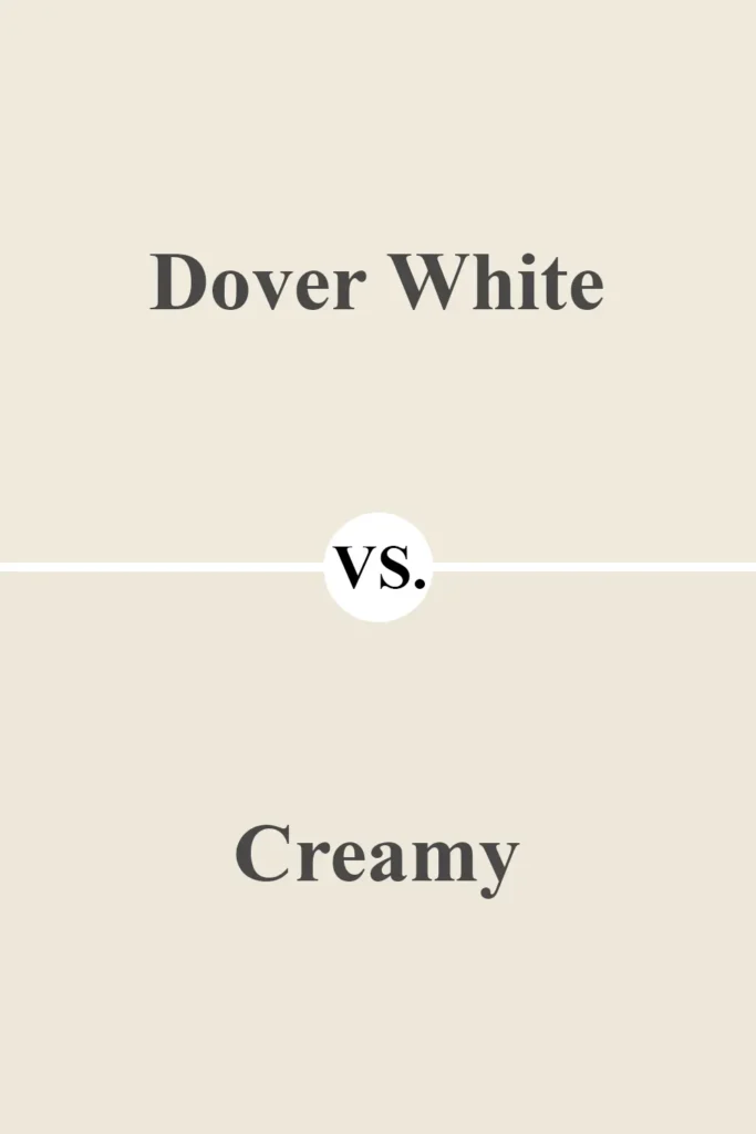
3. Sherwin-Williams Creamy (SW 7012)

Now this one lives up to its name. Creamy is very close to Dover White in warmth but has a bit more beige-buttery richness.
The two are in the same family, but Creamy has just a little more depth.
If you’re after a color with stronger warmth that still stays in the off-white zone, this is worth sampling.
Get a Peel & Stick paint sample of Creamy
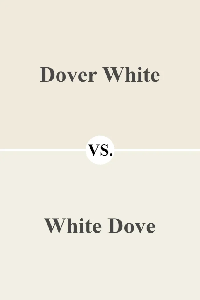
4. Benjamin Moore White Dove (OC-17)

White Dove is probably one of the most popular warm whites from Benjamin Moore. Compared to Dover White, White Dove feels more subtle and less yellow.
It leans slightly gray-beige in comparison. So if you’re working with cooler trim or modern finishes but still want warmth, White Dove is a great alternative.
Get a Peel & Stick paint sample of White Dove
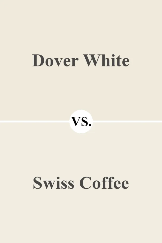
5. Benjamin Moore Swiss Coffee (OC-45)

💥🎁 Christmas & Year-End Deals On Amazon !
Don't miss out on the best discounts and top-rated products available right now!
*As an Amazon Associate, I earn from qualifying purchases.
Swiss Coffee is another cult favorite. It’s definitely in the same creamy family as Dover White but carries more beige than yellow.
Swiss Coffee looks softer and more muted in rooms with natural light, while Dover White is brighter and feels more cheerful.
It really comes down to the vibe you’re going for—Swiss Coffee is calmer, Dover White is sunnier.
Get a Peel & Stick paint sample of Swiss Coffee
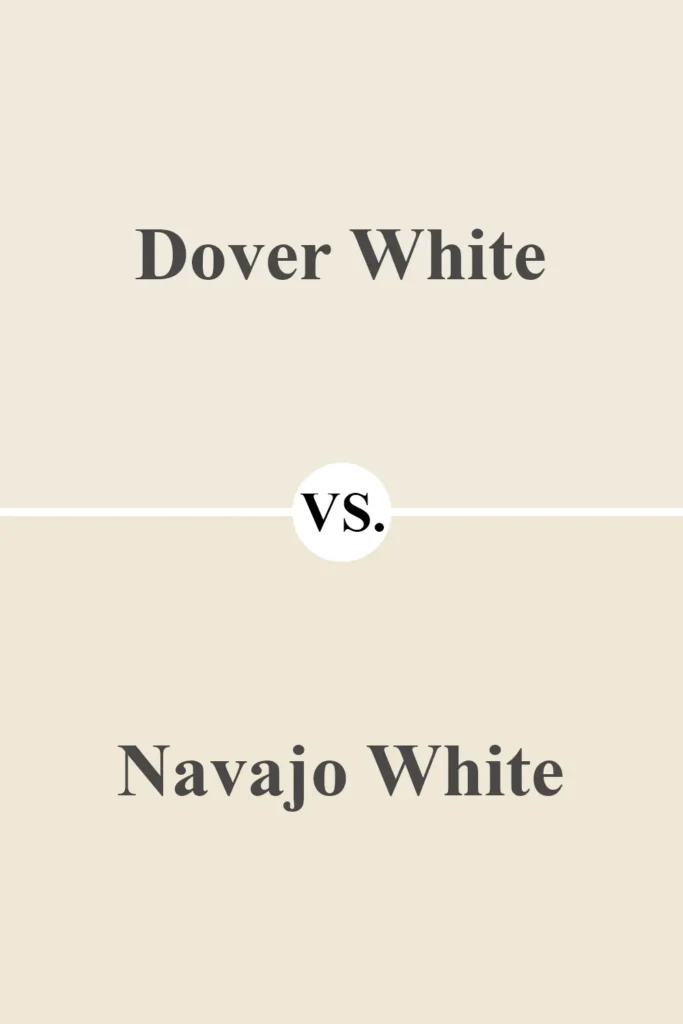
6. Benjamin Moore Navajo White (947)
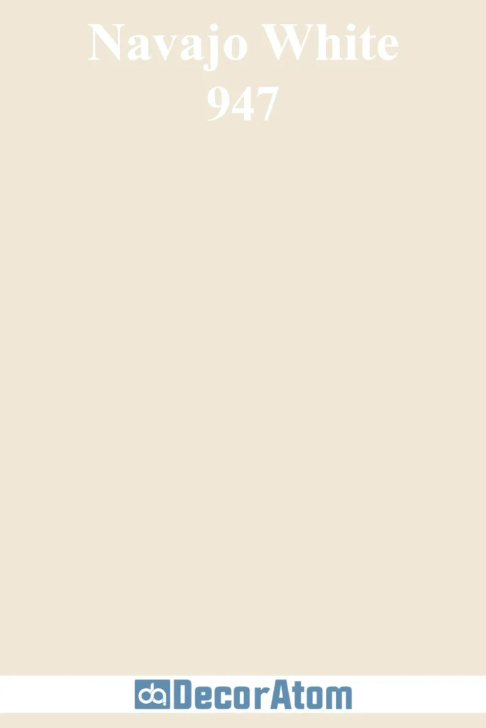
Navajo White is very close to Dover White when it comes to undertones. Both have a strong yellow warmth. But Navajo White is just a hair darker and feels a bit more traditional.
It has an almost antique, old-world feel when used in the right setting. I’d say Dover White is a fresher, slightly lighter version of Navajo White.
Get a Peel & Stick paint sample of Navajo White
Colors that Go With Sherwin Williams Dover White
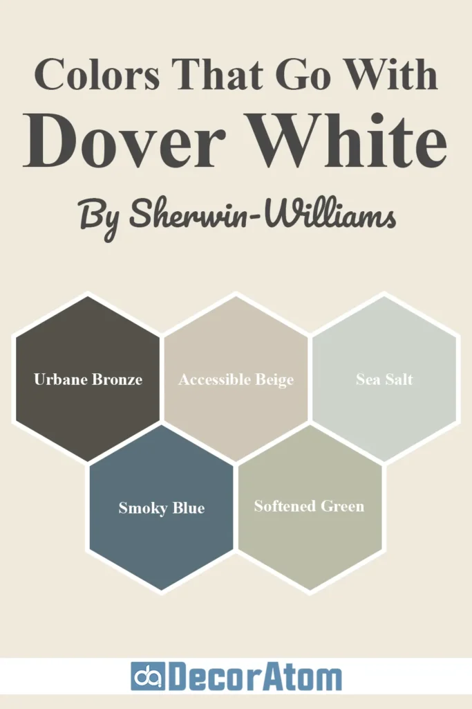
Now, let’s talk pairings. One of the reasons I love Dover White is because it plays so well with others—especially earthy, muted, or rich tones.
Because of its warm yellow undertone, Dover White looks best when it’s paired with complementary colors that either balance that warmth or echo it softly.
Here are five coordinating colors I’ve either personally used or seen work beautifully with Dover White:
1. Sherwin-Williams Urbane Bronze (SW 7048)

💥🎁 Christmas & Year-End Deals On Amazon !
Don't miss out on the best discounts and top-rated products available right now!
*As an Amazon Associate, I earn from qualifying purchases.
This deep, earthy bronze color is dramatic in the best way. It’s bold without being black, and it pairs beautifully with the soft creaminess of Dover White.
I love this combo for exteriors or spaces with contrast—think white walls and a moody accent door or fireplace.
Get a Peel & Stick paint sample of Urbane Bronze
2. Sherwin-Williams Accessible Beige (SW 7036)
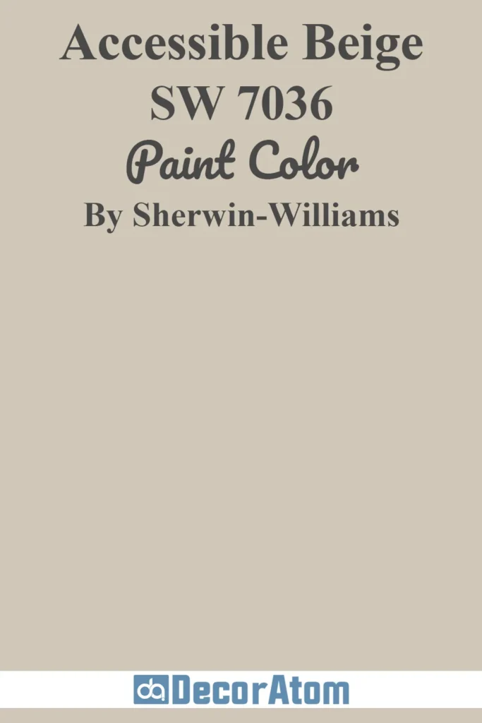
Accessible Beige is warm, calm, and easygoing. It has a touch of gray, which helps to tone down Dover White’s yellow without clashing.
If you’re aiming for a relaxed, earthy palette, this combo is a no-brainer—especially in living rooms and bedrooms.
Get a Peel & Stick paint sample of Accessible Beige
3. Sherwin-Williams Sea Salt (SW 6204)
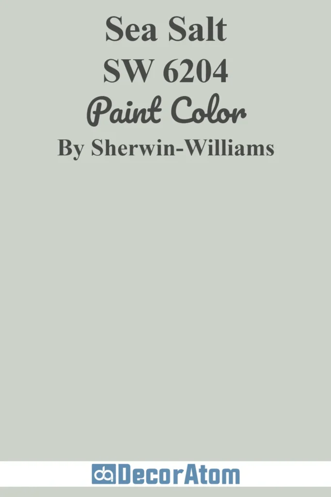
This soft greenish-blue gray is a beautiful contrast to Dover White. It cools down the space without making it feel stark or sterile.
If you’re working on a coastal, spa-inspired, or nature-focused room, Sea Salt and Dover White are a dream team.
Get a Peel & Stick paint sample of Sea Salt
4. Sherwin-Williams Smoky Blue (SW 7604)
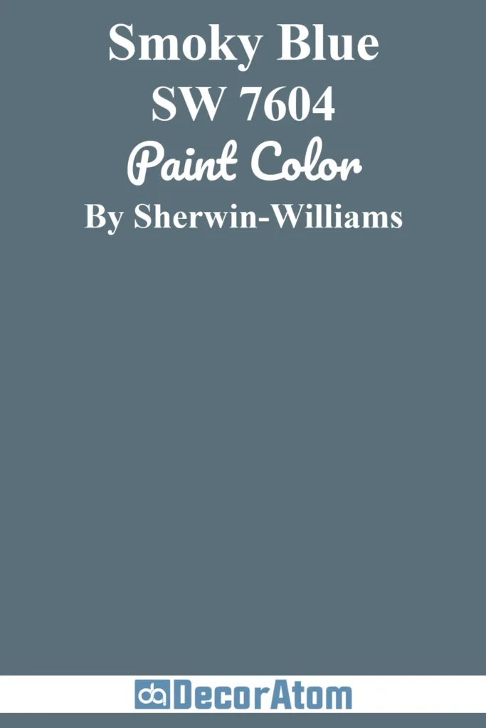
Smoky Blue is a deep, rich blue that adds elegance and structure to the creamy softness of Dover White.
I love this pairing in dining rooms or powder baths—it feels classic but not stuffy. The yellow warmth in Dover White really makes this blue stand out.
Get a Peel & Stick paint sample of Smoky Blue
5. Sherwin-Williams Softened Green (SW 6177)

Softened Green is muted and mellow, with a slight gray undertone. It brings a natural, grounded feel when paired with Dover White.
Perfect for kitchens or bedrooms where you want a calm but uplifting palette.
Get a Peel & Stick paint sample of Softened Green
Where to Use Sherwin Williams Dover White?
When people think of white paint, they often imagine something cold or clinical. But Dover White is not that kind of white.
It’s warm, soft, and welcoming, and that makes it incredibly versatile in almost every room of the house—and even outside of it.
It works well across multiple design styles, from farmhouse to traditional to transitional.
Let’s break it down room by room:
Sherwin Williams Dover White In the Bedroom

In a bedroom, Dover White creates a cozy and peaceful backdrop. Its warm undertones make the room feel like it’s gently glowing, especially in the morning light.
I love using it on walls with crisp white bedding and natural wood furniture. It doesn’t overwhelm the space but adds a subtle, comforting softness.
And if you’re someone who likes your bedroom to feel serene and relaxing without going gray or beige, this is a solid choice.
Sherwin Williams Dover White In the Living Room

Living rooms are where Dover White really gets to shine. Whether you have lots of windows or rely on artificial lighting, this color adjusts beautifully.
It keeps the space feeling open and bright during the day and cozy in the evenings. I love pairing it with taupe or charcoal accents, maybe even a hint of navy.
Dover White on the walls lets your furniture and decor be the stars, while still offering plenty of warmth.
Sherwin Williams Dover White in Kitchen

Kitchens can be tricky with whites because you don’t want it to feel too cold or too yellow.
Dover White hits that sweet spot. It looks great on walls, but also on cabinets if you’re going for that creamy, farmhouse feel.
I’ve seen it paired beautifully with brass hardware, butcher block countertops, and even dark islands.
Just make sure to use a bright white on the ceiling and trim so your kitchen still feels fresh and crisp.
Sherwin Williams Dover White In the Bathroom
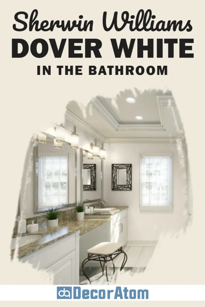
In bathrooms, lighting is everything—and Dover White plays nicely in both small and large spaces. Its warmth makes a bathroom feel inviting and spa-like, not stark.
Pair it with marble, gold or black hardware, and maybe even a soft sage green or pale blush accent for a little contrast.
Just avoid pairing it with cooler tile colors like icy grays or blues unless you’re balancing them with warm decor elsewhere.
Sherwin Williams Dover White For the Exterior
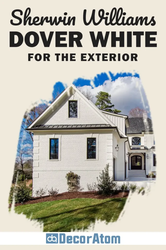
Yes, Dover White works outdoors too—and it looks especially good on traditional or farmhouse-style homes.
On exteriors, its yellow undertones are more noticeable, especially in direct sunlight. So if you want something soft and creamy instead of a crisp modern white, this could be perfect.
Pair it with black shutters, a deep bronze front door, or even warm gray trim for a classic, timeless look.
Comparing Sherwin Williams Dover White With Other Colors
When choosing paint, it’s never just about loving one shade—it’s about understanding how it compares to others you’re considering.
Especially with whites, the subtle shifts in undertone, warmth, and brightness can make a world of difference depending on the room, lighting, and decor style.
I’ve personally stared at swatches of nearly identical whites, only to discover how not identical they look on the wall.
So, if you’re deciding between Dover White and other popular paint colors, this breakdown should help. Let’s dive into six in-depth comparisons to see how Dover White stacks up against them.
Sherwin Williams Dover White vs Alabaster (SW 7008)

Alabaster is one of Sherwin-Williams’ most loved warm whites—and for good reason. It’s clean, soft, and slightly beige without being creamy.
Dover White, on the other hand, has a stronger yellow undertone, which makes it feel richer and creamier, especially in warm light.
If you’re after a more neutral white that won’t shift as much with lighting, Alabaster might be your match.
But if you want something with more character and warmth, especially in cozy spaces like bedrooms or traditional living rooms, Dover White wins. Alabaster reads crisper, while Dover White brings a touch more charm.
Sherwin Williams Dover White vs Greek Villa (SW 7551)
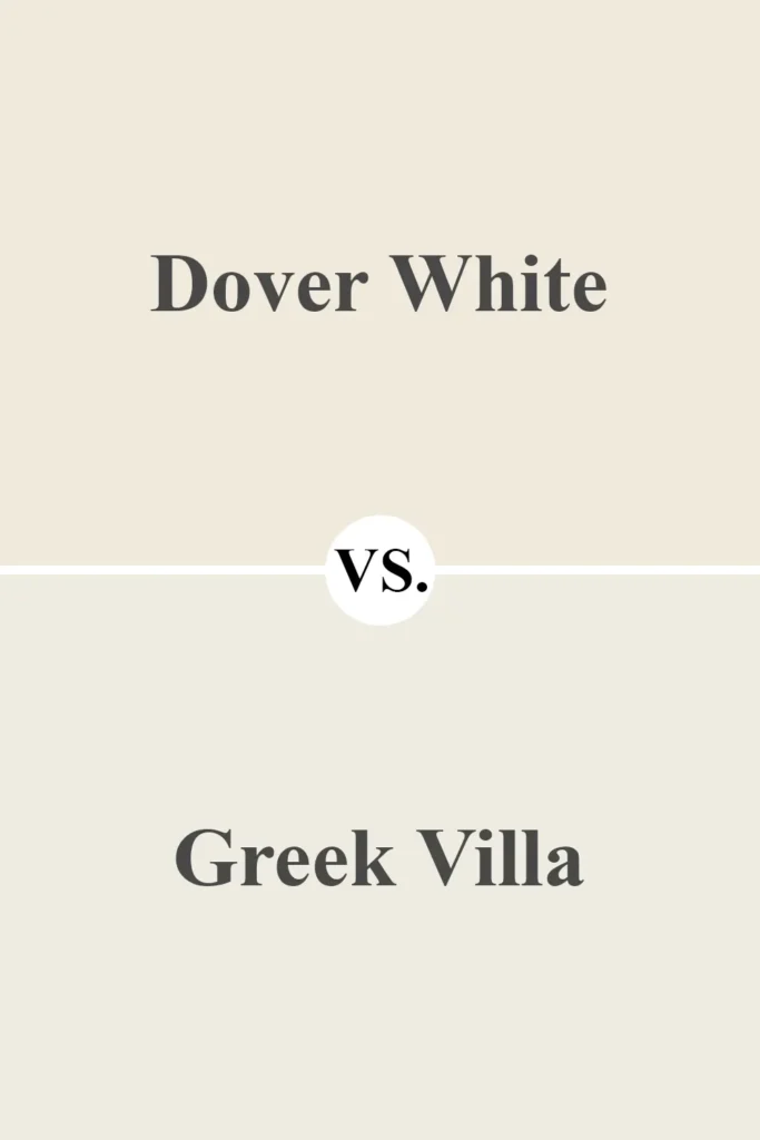
Greek Villa is often compared to Dover White because both are warm and inviting, but there’s a big difference in how they reflect light.
Greek Villa feels a bit more airy and subdued. It doesn’t lean as yellow, which makes it appear more subtle and less creamy than Dover White.
Dover White will feel cozier and more saturated. Greek Villa works beautifully in modern farmhouse or coastal styles where you want white but not too bright.
If you want your white to glow softly and feel slightly golden, Dover White adds that extra depth.
Sherwin Williams Dover White vs Creamy (SW 7012)
This comparison is close—they’re like sisters. Both are creamy off-whites with warmth, but Creamy leans a little more beige, while Dover White is clearly in the yellow family.
Creamy is slightly more muted and versatile in more lighting conditions. Dover White is brighter and more cheerful, especially in sunlit rooms.
If you’re choosing cabinetry or trim, Creamy may feel more balanced. But if you’re going for warmth on walls with rich wood or warm decor, Dover White delivers that cozy glow.
Sherwin Williams Dover White vs Benjamin Moore White Dove (OC-17)
White Dove is a fan favorite from Benjamin Moore, especially for those seeking a warm but balanced white. Compared to Dover White, White Dove feels much more neutral.
It has a subtle gray-beige undertone that makes it very flexible with both warm and cool palettes.
Dover White, with its yellow base, feels creamier and more traditional. White Dove is a better fit for modern or transitional interiors, while Dover White shines in classic, vintage-inspired, or cottage spaces.
Sherwin Williams Dover White vs Benjamin Moore Swiss Coffee (OC-45)
Swiss Coffee is creamy and warm like Dover White, but a bit more muted and beige.
It doesn’t have the same golden glow that Dover White can have in certain lighting. If you find Dover White a little too yellow, Swiss Coffee might feel more relaxed.
I love Dover White in spaces where you want a friendly, lived-in warmth.
Swiss Coffee works better when you want something soft but a little more sophisticated and less saturated.
Sherwin Williams Dover White vs Benjamin Moore Navajo White (OC-95)
This is probably the closest match in overall warmth. Both Dover White and Navajo White carry a lot of yellow in their undertones.
But Navajo White has a slightly deeper tone, which makes it feel more traditional or old-school.
Dover White reads lighter and brighter, especially in natural light. If you want a classic creamy white without it turning too deep or dated, Dover White is the more updated, fresh version of Navajo White.
Why I Love Sherwin Williams Dover White
What I personally love most about Dover White is its ability to make a space feel warm without going full-on yellow or beige.
It has just enough richness to avoid that stark, cold feeling some whites can bring, but it’s still light enough to keep a room feeling open and inviting.
I also appreciate how adaptable it is. I’ve seen Dover White look beautiful with brass, black, wood, soft blues, or earthy greens—it truly flexes based on what you pair it with.
And unlike some whites that are too clean or sterile, this one brings a comforting, lived-in vibe.
To me, Dover White is the kind of white that feels like home. Cozy but bright. Classic but never boring.

The Only Paint Color Samples You Need – Real Paint Without the Mess!
Ever wished paint sampling was as easy as sticking a sticker? Guess what? Now it is! Get Samplize’s unique peel & stick paint samples delivered overnight!
Final Thoughts
If you’re looking for a warm white that brings light, character, and timeless beauty to your space, Sherwin Williams Dover White SW 6385 should definitely be on your shortlist.
It’s not a blank-slate white—it has personality. That soft yellow undertone creates a gentle warmth that works in almost any room, from interiors to exteriors.
Just be aware: lighting plays a big role here. If your space already leans warm or gets a lot of sunlight, Dover White may pull a little more yellow.
In cooler or low-light spaces, it settles into a cozy, creamy tone that makes the room feel more inviting.
Whether you’re repainting a single room or choosing a whole-house color, Dover White is one of those shades that can do it all—as long as you’re okay with a bit of warmth.