
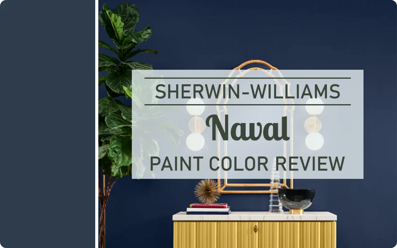
I have to admit, there’s just something magnetic about a rich navy blue. It feels bold yet timeless, dramatic but still grounded.
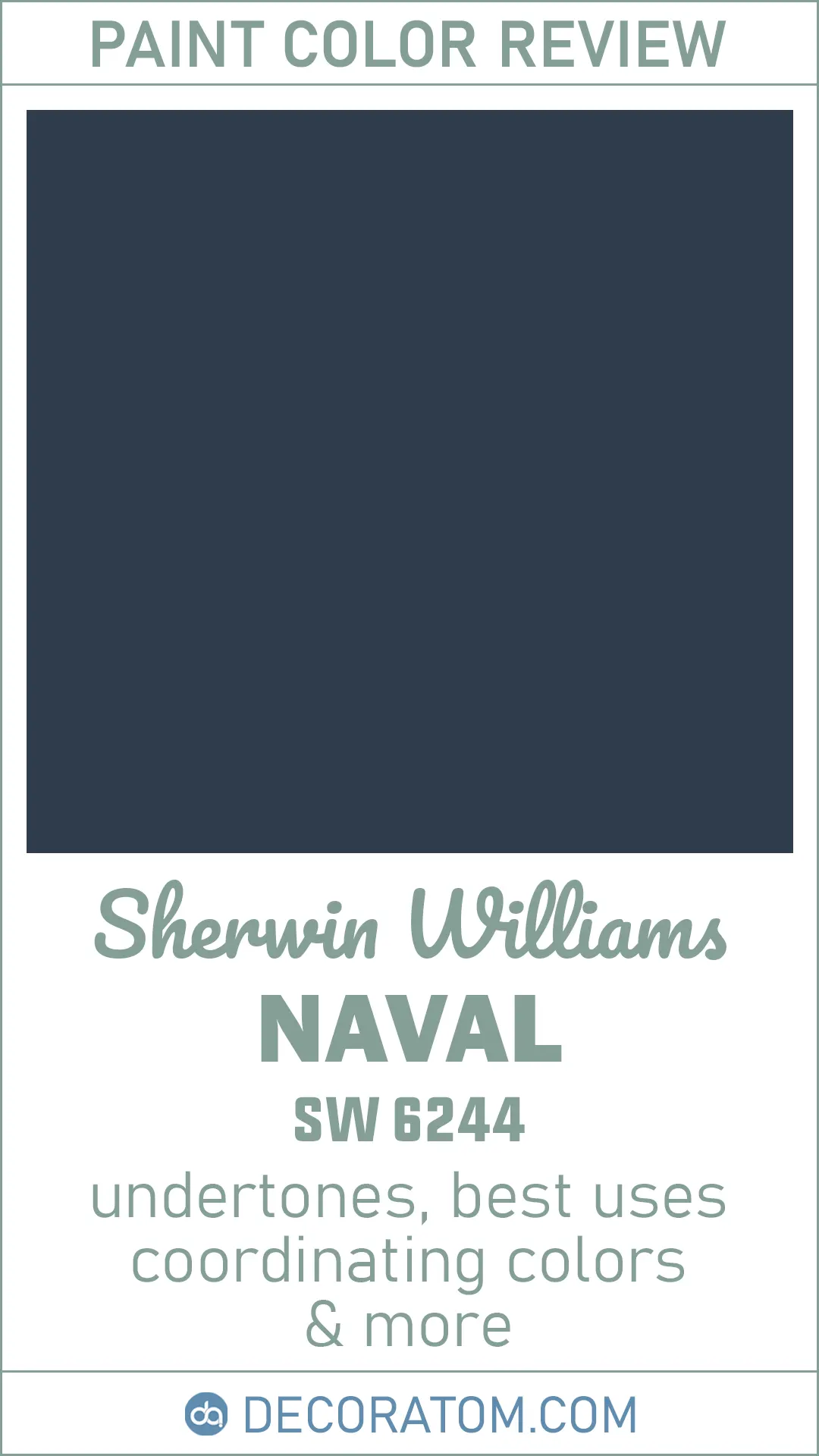
That’s exactly why Sherwin-Williams Naval SW 6244 has become one of my all-time favorite dark paint colors.
If you’ve been hunting for a deep, elegant navy that brings a sense of confidence and calm to a space, Naval might be exactly what you’re looking for.
Whether you’re dreaming of a moody home office, a statement-making dining room, or even a show-stopping front door, this shade brings a dose of sophistication without feeling cold or stark.
In this post, I’ll walk you through exactly what kind of color Naval is, how it behaves in different lighting, what undertones you should expect, and how you can use it in your home without the space feeling too dark or closed in.
Let’s dig into what makes Naval SW 6244 such a showstopper.
What Color is Sherwin-Williams Naval SW 6244?
Sherwin-Williams Naval is a deep navy blue—rich, saturated, and full of depth.
It’s one of those colors that instantly feels luxurious and classic.
Picture the kind of deep blue you’d find in a starry night sky or in a perfectly tailored navy blazer. That’s Naval. It has just the right balance of boldness and elegance.
It’s not too bright, not too muted—just a true navy that doesn’t lean obviously toward green or purple. That’s part of what makes it so versatile.
It looks crisp against white trim, stands out beautifully with brass or gold accents, and works surprisingly well with natural wood tones, too.
In other words, it’s not just pretty in a paint sample—it actually holds up beautifully once it’s on the wall.

How to Know if a Paint Color Is Right for You?
Would you like to sample Naval SW 6244 paint color? I recommend using Samplize. They offer 9”x14.75”” peel-and-stick paint swatches that make testing colors super simple. Just stick it on your wall, move it around if needed, and when you’re done, peel it off and toss it. No mess, no cleanup. It’s quick, easy, and way more convenient!

Advantages of using peel and stick paint samples:
- EASY TO USE: Simply move your SAMPLIZE paint sample around the room to test under a variety of lighting conditions.
- AFFORDABLE: Budget-friendly solution and no more buying inaccurate swatches, rollers, wasted paint.
- SUPER FAST DELIVERY: Depending on your location, 1 day delivery is possible.
- ORDER FROM HOME: Save a trip to the store looking for samples.
- NO MESS: SAMPLIZE uses real paint samples with zero-mess
- NO WASTE: No leftover cans or wasted paint.
Is It a Warm or Cool Color?
Naval is definitely a cool-toned color, but it doesn’t feel icy or uninviting like some other cool shades can. That’s what makes it so special.
Its blue base clearly puts it in the cool family, but there’s enough richness in the pigment that it still feels cozy and grounding rather than sterile.
If your room gets a lot of warm sunlight, Naval will look a little softer and more balanced.
In cooler lighting, like north-facing rooms or evening light, it leans more into its inky, dramatic side.
Either way, it holds its color beautifully without ever turning purple or teal, which can sometimes happen with navy blues.
It’s a cool color with real depth—and just enough softness to feel livable.
LRV of Sherwin-Williams Naval SW 6244
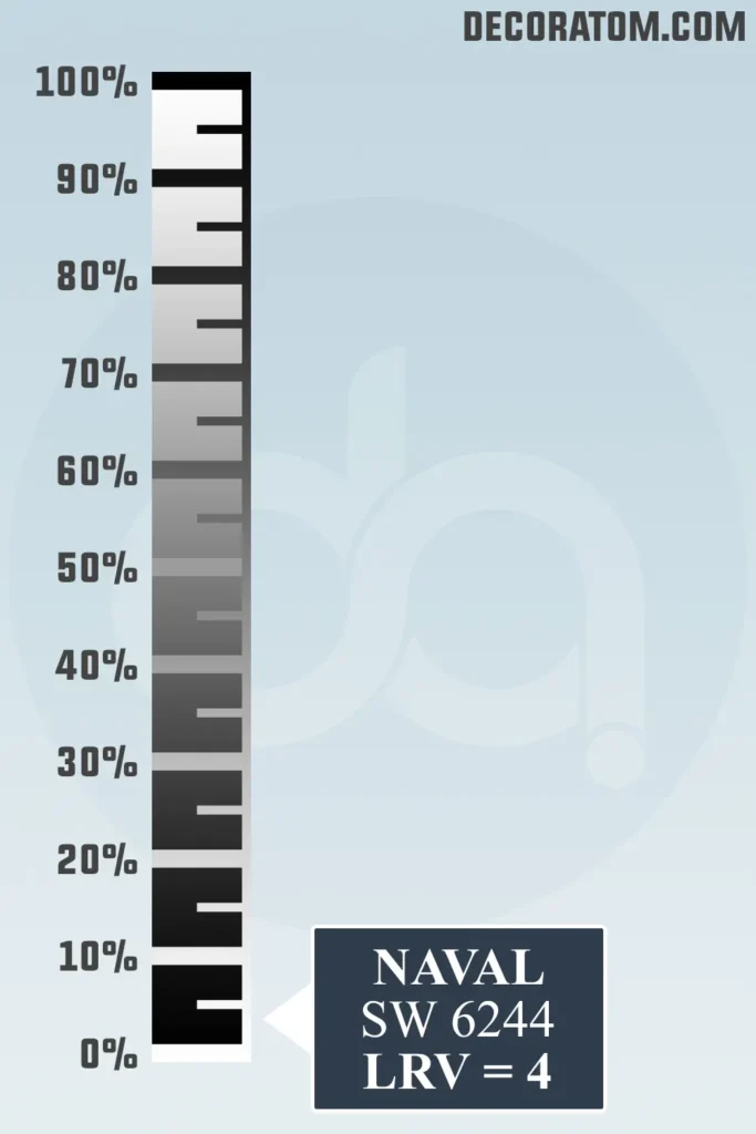
Let’s talk about LRV, or Light Reflectance Value. I promise this part’s not complicated.
LRV is basically a number between 0 and 100 that tells you how much light a color reflects. The higher the number, the lighter and more reflective the color is.
Whites usually sit in the 80s and 90s. Black is a 0. So the lower the number, the darker the color.
Sherwin-Williams Naval has an LRV of 4, which means it’s very dark—it doesn’t reflect much light at all. That’s part of what gives it that rich, moody look.
It’s a true navy that brings a lot of drama to a room. But keep in mind, because it’s so dark, it can make small rooms feel even smaller if there’s not enough natural light or good lighting layered in.
That said, in the right space, it can be absolutely stunning—cozy, elegant, and endlessly stylish.
Undertones of Sherwin-Williams Naval SW 6244
One of the things I appreciate most about Sherwin-Williams Naval SW 6244 is how grounded and dependable it feels, and a lot of that comes down to its undertones.
At first glance, Naval just looks like a deep, true navy. But if you take a closer look—especially in different lighting—you’ll notice a subtle cool gray-green undertone hiding beneath that bold blue surface.
Now, let me explain what that means in real-life terms. Naval isn’t one of those navies that shifts toward purple or feels overly bright.
Instead, its cool gray-green undertone helps it stay calm and collected. That whisper of green is what gives it a bit of earthiness—it’s barely noticeable, but it keeps the color from feeling harsh or synthetic.
These undertones also help Naval blend beautifully with other natural materials, like wood, stone, and greenery.
It’s a great choice if you want a navy that doesn’t feel too crisp or nautical.
It has a grounded richness that gives it a refined, classic look—perfect for both traditional and modern spaces.
How Does Lighting Affect Sherwin-Williams Naval SW 6244?
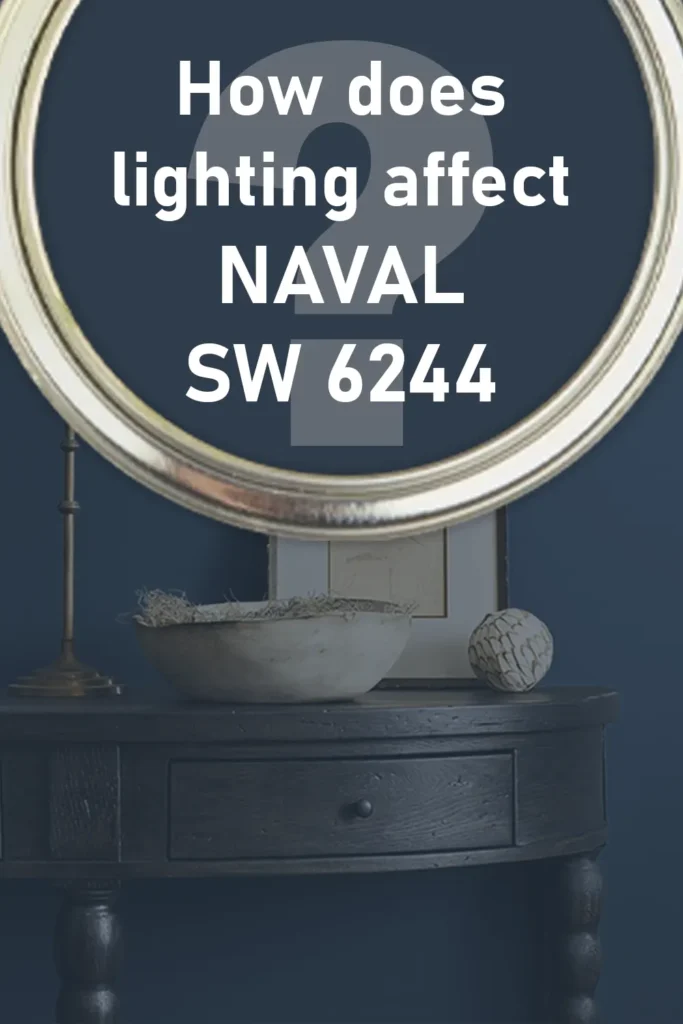
Lighting can truly make or break how a color looks in your home, and that’s especially true for deeper colors like Naval. Because this color has such a low LRV (just a 4), it’s very sensitive to the type and amount of light in a room. So, here’s what to expect.
In natural daylight, especially if the room is south-facing or flooded with sunshine, Naval comes alive. The rich navy tone softens a bit, and those cool undertones become more visible, which can give it a clean, crisp vibe without making it feel cold. It looks classic and polished—think dark blue velvet in the sunlight.
In a north-facing room or during the evening when there’s less light, Naval becomes moodier and more dramatic. The deep navy gets even darker, sometimes almost looking black in low lighting. That can be really beautiful if you’re going for a cozy, cocoon-like atmosphere, especially in a bedroom, dining room, or study.
In artificial lighting, it depends on the bulb. Warmer lights will soften it a little, drawing out the gray-green undertones, while cooler LED lighting might enhance the deep blue side and give it a crisp finish.
The key is to layer your lighting—think overhead lights, table lamps, and sconces—so Naval doesn’t feel flat or too heavy.
Trim Colors to Pair With Sherwin-Williams Naval SW 6244
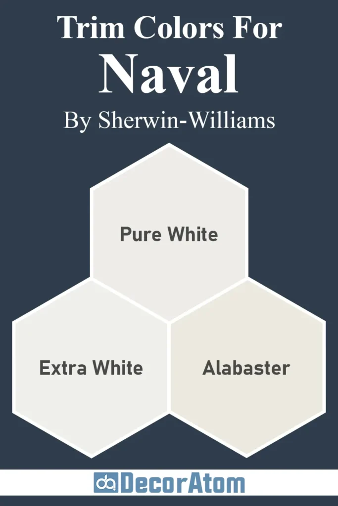
Because Naval is such a deep, bold color, choosing the right trim color really matters. The contrast is what makes this shade pop and feel finished. You want something that brightens the space and creates a crisp edge.
My go-to trim pairing for Naval is a bright, clean white—something like Sherwin-Williams Pure White (SW 7005). It’s not stark, but it’s fresh and modern and lets Naval do all the talking. Another great option is Extra White (SW 7006) if you want even more contrast and a slightly cooler finish.
If you’re after a softer, more classic look, Sherwin-Williams Alabaster (SW 7008) also works beautifully. It has a creamy warmth to it that creates a softer, more traditional feel next to the navy, without looking dingy.
And if you’re feeling a little adventurous? Consider pale wood trim or a very soft taupe. These can add an organic, earthy contrast that feels sophisticated and unexpected. But for most people, white trim is the safest and most timeless choice—it gives Naval that bold frame it deserves.
Colors Similar to Sherwin-Williams Naval SW 6244
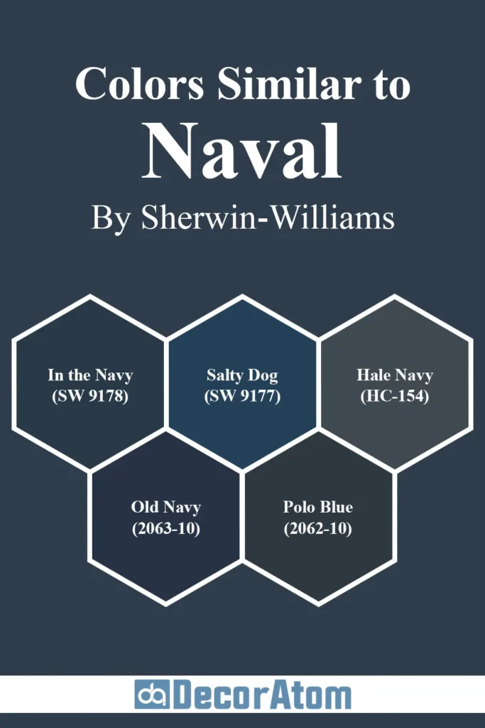
If you love Naval but you’re curious to see what else is out there, you’re not alone. Sometimes you want something just a touch lighter, darker, cooler, or warmer—something that gives you the same dramatic navy feel, but with a twist.
There are quite a few colors out there that fall into the same deep blue category, and some may work even better for your space depending on the lighting, furniture, and overall mood you’re going for.
Here are five paint colors from both Sherwin-Williams and Benjamin Moore that are similar to Naval—and how they compare:
1. Sherwin-Williams In the Navy (SW 9178)
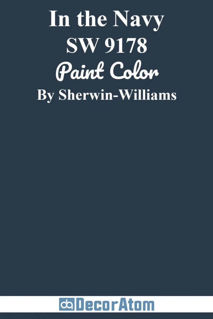
Compared to Naval, In the Navy is slightly deeper and has a touch more gray in its base. It feels just a bit more subdued and traditional.
If Naval feels too bold or blue for your taste, In the Navy might give you that same stately feel with a slightly more neutral undertone. It still reads navy, but with less vibrancy.
2. Sherwin-Williams Salty Dog (SW 9177)

Salty Dog is a brighter and more saturated version of navy, with a clearer blue tone. It leans a little more nautical and has more energy.
Compared to Naval, Salty Dog feels more youthful and playful, while Naval leans more mature and classic. This is a good pick if you want a navy that stands out more in rooms with lots of light.
3. Benjamin Moore Hale Navy (HC-154)

This is probably Naval’s biggest competitor, and they get compared all the time. Hale Navy is slightly more gray and subdued, which makes it feel a bit more traditional and balanced.
While Naval reads as a rich navy blue, Hale Navy leans more charcoal-blue. It’s a little easier to use in low-light spaces because it won’t go quite as dark, but both are stunning.
4. Benjamin Moore Old Navy (2063-10)
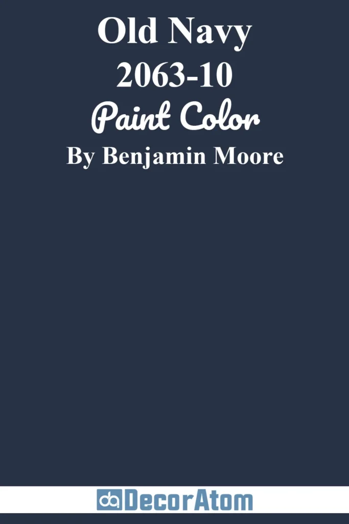
Old Navy is a deep blue, but it leans cooler than Naval and has stronger blue-purple tones in certain light. It’s definitely more of a “pure navy” in the traditional sense.
If Naval’s subtle gray-green undertone doesn’t work in your space, Old Navy offers a bolder, crisper alternative.
5. Benjamin Moore Polo Blue (2062-10)

Polo Blue is another gorgeous navy, but it has a bit more warmth and depth. Compared to Naval, Polo Blue can appear slightly softer and richer, almost like it’s been mellowed out a bit.
It’s a great option if you want something sophisticated but just a hair warmer and more inviting.
Colors that Go With Sherwin-Williams Naval SW 6244
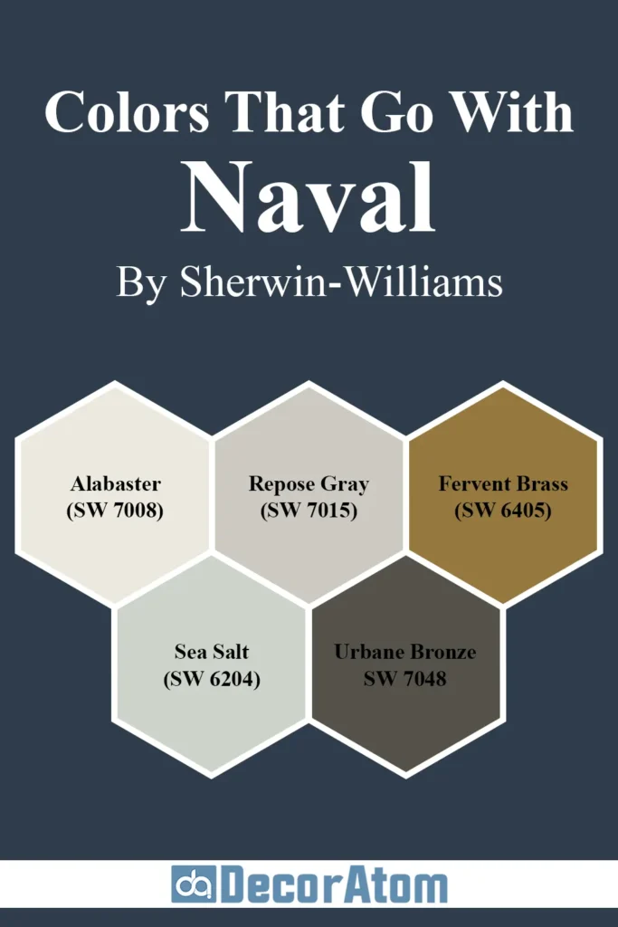
When it comes to pairing colors with Sherwin-Williams Naval SW 6244, there are so many creative directions you can go. Naval is a bold, grounded navy with cool undertones, which means it plays well with both crisp and cozy hues.
The key is finding colors that highlight its richness without competing for attention. Think of Naval as the star of the show—and the supporting colors should bring out its best side.
Here are five beautiful colors that pair effortlessly with Naval:
1. Sherwin-Williams Alabaster (SW 7008)
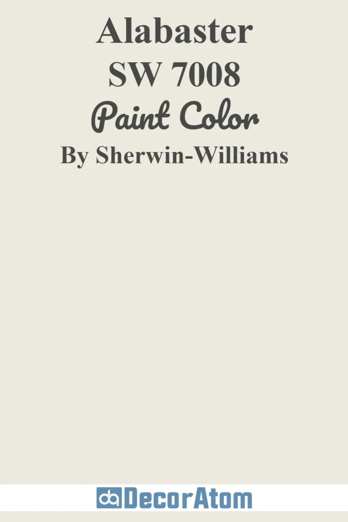
Alabaster is that soft, creamy white that instantly warms up a space. It balances Naval’s boldness with a gentle contrast. While some whites feel stark next to navy, Alabaster has just the right hint of warmth.
The two together create a timeless, high-contrast combo that still feels welcoming. Perfect for trim, ceilings, or even built-ins.
2. Sherwin-Williams Repose Gray (SW 7015)

If you’re going for a layered, modern look, Repose Gray is a fantastic match. It’s a light-to-medium gray with just a touch of warmth, and it softens the drama of Naval without clashing.
This combo works especially well in bedrooms and living rooms where you want depth but not darkness.
3. Sherwin-Williams Fervent Brass (SW 6405)
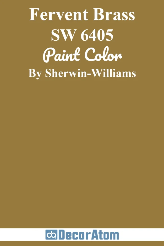
Pairing a deep navy with a muted gold like Brass Mesh creates a sophisticated, luxe feel. It’s like adding jewelry to an outfit—just enough to elevate the whole look.
Brass Mesh brings out the subtle green undertone in Naval, making both colors feel richer. This is a great pairing if you’re incorporating brass lighting, hardware, or accents.
4. Sherwin-Williams Sea Salt (SW 6204)
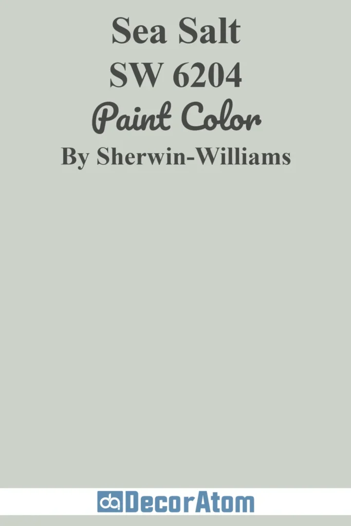
This soft green-gray shade feels almost spa-like, and when used with Naval, it creates a serene, coastal vibe. Sea Salt adds an airy freshness that balances out Naval’s depth.
I love this duo for bathrooms or any space where you want to feel relaxed and refreshed.
5. Sherwin-Williams Urbane Bronze (SW 7048)

For something moody and dramatic, Urbane Bronze offers a beautiful earth-toned contrast. It’s a deep brown-gray with warmth that complements Naval’s cool tone.
Used together, these two colors create a layered, masculine palette that works beautifully in dens, libraries, or modern industrial spaces.
Where to Use Sherwin-Williams Naval SW 6244?
Sherwin-Williams Naval SW 6244 is incredibly versatile. Even though it’s a bold, dramatic color, it can work beautifully in all kinds of spaces—you just need to be strategic about where and how you use it.
Whether you want an accent wall, painted cabinetry, or a full-room transformation, Naval can deliver that wow factor without feeling trendy or over-the-top.
Let’s explore how Naval shines in different parts of the home:
Sherwin Williams Naval in the Bedroom
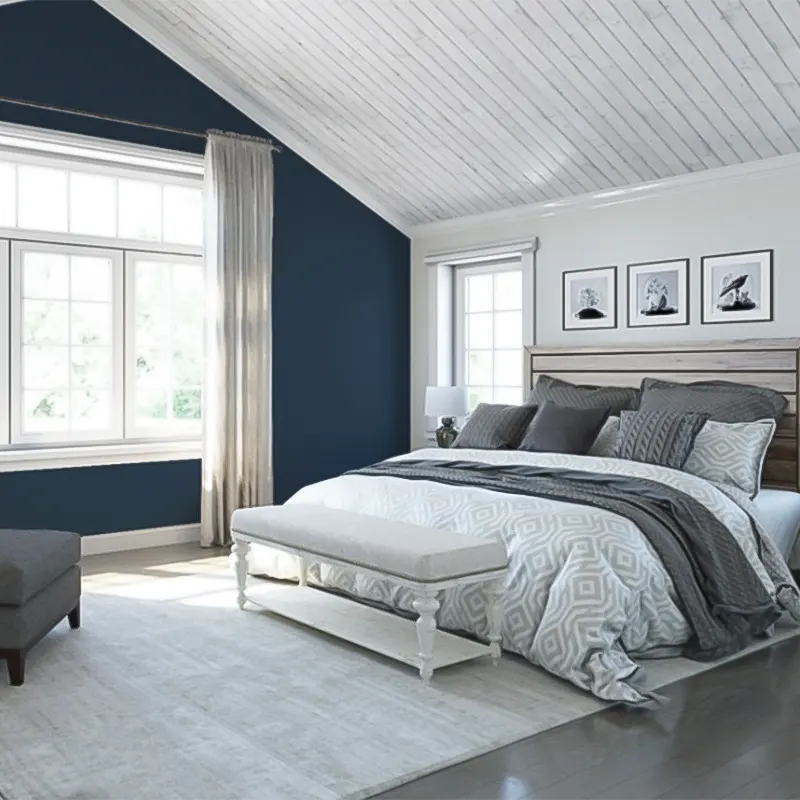
In a bedroom, Naval can feel luxurious, calming, and surprisingly cozy. It creates the perfect setting for rest and retreat.
Painting all four walls in Naval might sound bold, but in a space with good natural light, it wraps the room in warmth and richness.
Pair it with crisp white linens, natural wood nightstands, and soft metallic accents for a look that feels upscale and timeless.
If you’re hesitant to go all in, try using Naval on an accent wall behind the bed—it adds depth without overwhelming the space.
Sherwin Williams Naval in the Living Room
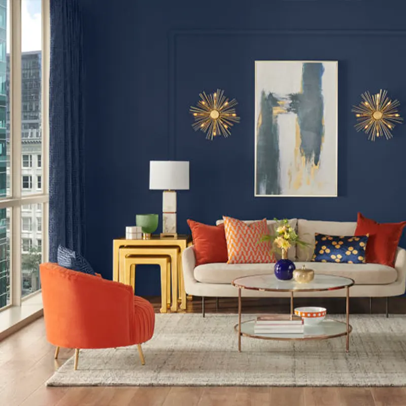
Naval can make a living room feel polished and grounded. It’s a strong backdrop for a variety of design styles—from traditional to modern farmhouse to coastal.
If your living room has large windows and gets good sunlight, don’t be afraid to use Naval on all the walls.
In a darker space, consider using it just on built-in bookcases, the fireplace wall, or even the ceiling for a dramatic twist.
It pairs beautifully with camel-colored leather, light gray upholstery, or crisp white trim.
Sherwin Williams Naval in the Bathroom
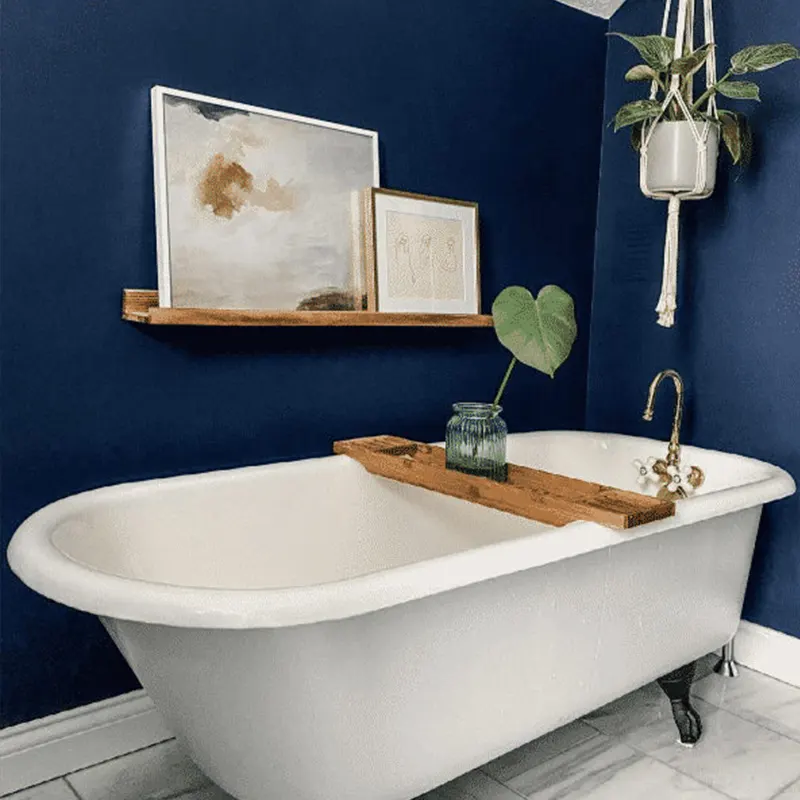
Bathrooms are the perfect place to play with deeper colors, and Naval adds just the right touch of elegance.
Use it on walls for a spa-like retreat, or keep it to vanity cabinets or accent pieces if your bathroom is small or lacks natural light.
Pair it with marble or white tile to keep the space feeling fresh and bright. Brass fixtures look especially stunning next to Naval—warm and modern all at once.
Sherwin Williams Naval in the Kitchen
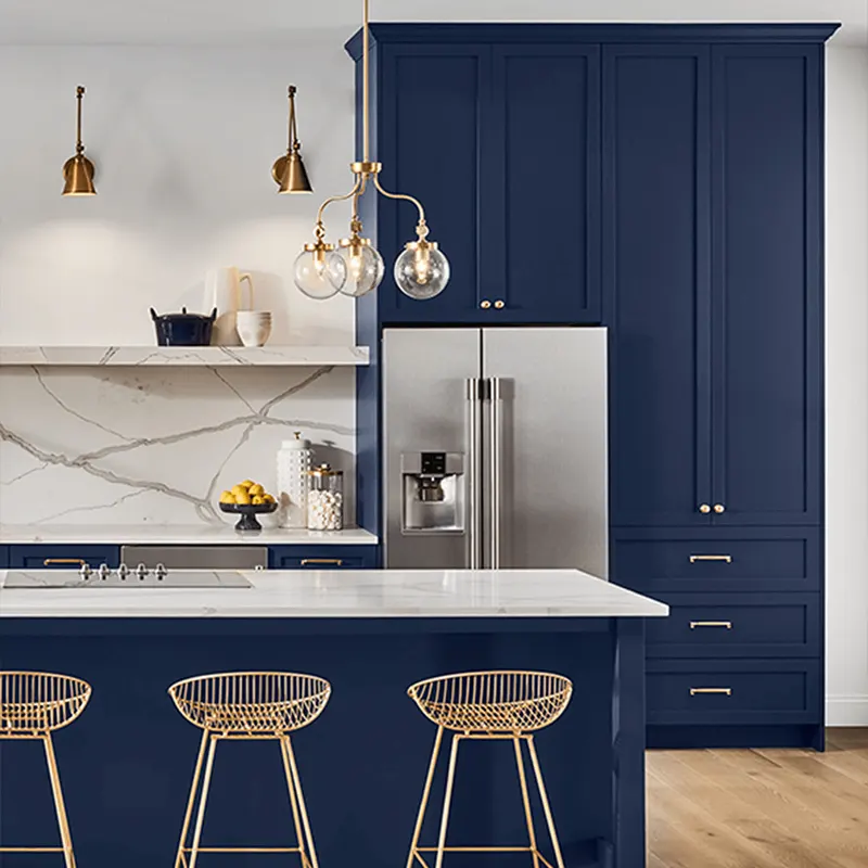
If you’re considering a bold kitchen move, Naval is a gorgeous choice for lower cabinets or even the whole set if you have light countertops and backsplash.
It brings a clean, dramatic touch that feels both high-end and inviting. Pair it with warm white uppers, natural wood accents, or brushed brass hardware for a striking kitchen that feels layered and custom.
It’s a shade that can anchor your space while still feeling timeless.
Sherwin Williams Naval for the Exterior

Naval on the exterior is a game-changer. It gives a home a bold, crisp curb appeal that stands out without being flashy.
It’s especially beautiful on colonial, cape cod, or modern farmhouse styles. Pair it with white trim and a natural wood front door for a balanced, elevated look.
It also plays well with stone, brick, and other natural textures. If you’re nervous about going too dark, try it on shutters, front doors, or garage doors for a bold accent instead.
Comparing Sherwin-Williams Naval SW 6244 With Other Colors
Comparing paint colors side by side can really help you narrow down the best choice for your space.
You might love Naval’s navy tone but want something a bit softer, more gray, or with a different undertone. Below are six helpful comparisons between Naval and other popular deep blues and neutrals.
Sherwin Williams Naval vs. Hale Navy (Benjamin Moore HC-154)
These two often compete for top navy status. Hale Navy is slightly more muted, with more of a gray undertone.
It leans more classic and conservative, while Naval is bolder and more vibrant.
If you’re working with lower light, Hale Navy might feel less intense. But if you want a color that stands out a little more and holds onto its blue identity, Naval is the better pick.
Sherwin Williams Naval vs. In the Navy (SW 9178)
In the Navy is deeper and has a touch more gray, making it feel slightly more serious and formal.
Naval has a cleaner, more versatile presence, with just a whisper of green that keeps it feeling grounded. If you want a navy that feels rich but still lively, Naval might be your winner.
Sherwin Williams Naval vs. Salty Dog (SW 9177)
This is where the personalities really differ. Salty Dog is brighter, more saturated, and almost electric in some lighting. Naval, by contrast, is smoother and more classic.
If you want your navy to feel punchy and youthful, Salty Dog delivers. But if you’re after timeless depth, Naval wins.
Sherwin Williams Naval vs. Cyberspace (SW 7076)

Cyberspace leans more charcoal than navy and has a definite gray-black base. It’s a great option if you want a moody wall color that’s darker than Naval.
But in side-by-side comparison, Naval offers more blue, more richness, and more color payoff, especially in well-lit rooms.
Sherwin Williams Naval vs. Blue Note (Benjamin Moore 2129-30)
Blue Note is a dramatic, moody blue-black. It feels sleek and contemporary—perfect for modern homes or bold accent walls. Compared to Naval, it has a cooler edge and reads almost like ink.
If you want something with more blue vibrancy and a classic navy tone, Naval is the better fit.
Sherwin Williams Naval vs. Gentleman’s Gray (Benjamin Moore 2062-20)
Despite the name, Gentleman’s Gray reads very blue and leans slightly teal in certain lighting. It has more green in it than Naval, which can give it a coastal or even jewel-toned look.
If you’re leaning toward a navy with a more noticeable green undertone, this might be a good alternative. But if you want something more solidly navy with just a whisper of gray-green, Naval holds steady.
Click here to get a Peel & Stick paint sample of Naval SW 6244
Final Thoughts
Sherwin-Williams Naval SW 6244 is one of those colors that just doesn’t go out of style. It’s rich and elegant, but not stuffy. Bold, but not overpowering.
It can lean traditional or contemporary depending on how you style it—and it always manages to feel grounded and confident.
Whether you’re painting a full room, an accent wall, cabinetry, or even the outside of your home, Naval has that reliable depth that instantly elevates a space.
It’s dramatic without being trendy, classic without being boring, and versatile enough to make its way into almost any room of the house.
If you’re craving a color that brings sophistication and calm to your space, I genuinely think Naval is worth considering. It’s one of those shades you fall deeper in love with the longer it’s on your walls.