
Beige is back—and not in a bland, boring way.
The new wave of beige paint colors is warmer, softer, and far more versatile than the beige we remember from early 2000s builder-grade homes.
Sherwin Williams has truly mastered the art of beige, offering a spectrum of shades that range from creamy off-whites to earthy, grounded taupes.
Whether you’re looking to warm up a stark white room or create a neutral backdrop that pairs effortlessly with both modern and traditional design, there’s a Sherwin Williams beige that can do exactly that.
I’ve personally gone through dozens of samples and swatches, and these 15 beige paint colors are the ones that really stand out for their beauty, versatility, and designer-approved appeal.
What are Beige Paint Colors?
Beige paint colors are warm neutrals that sit somewhere between white and brown on the color spectrum.
Most of them are created by blending yellow, brown, and a touch of red or gray—giving beige its soft, approachable warmth.
Beige can lean creamy, sandy, taupe-like, or even slightly pink or peachy, depending on its undertones.
Unlike stark whites or deep browns, beige has a soothing, in-between quality that works beautifully in nearly any space.
It’s a “quiet” color, but that doesn’t mean it’s boring—its subtlety is actually what makes it so timeless and adaptable.
Why Designers Love Beige Paint Colors?
Designers love beige for a simple reason: it’s the ultimate supporting actor.
It brings warmth and softness to a room without competing for attention, which makes it the perfect backdrop for layered interiors.
It pairs effortlessly with wood tones, metals, natural textiles, and almost every accent color—from bold navy and forest green to soft blush or warm charcoal.
Beige also has a way of adding depth and coziness without darkening a room too much.
Plus, it never goes out of style. Even as trends shift from gray to greige to earth tones, beige quietly remains a go-to for spaces that need a welcoming and timeless vibe.

Where to Use Beige Paint Colors?
Beige paint colors can be used just about anywhere in the home.
In living rooms and family spaces, beige creates an inviting, easygoing atmosphere that makes people feel at ease.
It’s also a top choice for bedrooms thanks to its calming, neutral presence.
In kitchens, beige looks beautiful on cabinets or walls—especially when paired with natural stone or warm-toned countertops.
Even bathrooms can benefit from a soft beige to create that spa-like, serene feeling.
And for open-concept homes, beige works wonders in tying multiple spaces together without feeling overly repetitive or flat.
Colors to Pair with Beige
Beige is one of the most flexible colors out there—it plays well with just about everything.
If you want a soft, tonal look, pair beige with creamy whites, warm taupes, or lighter tans.
For contrast, try deep navy, black, charcoal, or even olive green.
If you’re leaning more natural, beige also pairs beautifully with warm wood tones, brushed brass, terracotta, and soft greens or muted blues.
And for a modern, layered aesthetic, beige alongside grayish-greens or moody blues creates a high-end, curated look that still feels warm and approachable.
What Is The Most Popular Sherwin Williams Beige Paint Color For 2025?
For 2025, Accessible Beige (SW 7036) continues to top the list.
It’s that perfect blend of beige warmth with a whisper of gray undertone that gives it a slightly modern edge.
It doesn’t feel too yellow, too muddy, or too dated—just soft, warm, and incredibly livable.
It works in nearly every room of the house and plays nicely with a wide range of accent colors.
Whether you’re trying to modernize a traditional space or warm up a room that feels too cold, Accessible Beige is one of those can’t-go-wrong choices.
How To Choose The Best Beige Paint Colors?
Choosing the right beige paint color comes down to a few key factors: lighting, undertones, and overall mood.
Start by looking at your natural light.
North-facing rooms tend to make beige look cooler, so you may want something with a little extra warmth.
South-facing or sunlit rooms can handle deeper or more neutral beiges without them feeling washed out.
Next, consider undertones. Some beiges lean yellow or peachy, others have gray or even slight pink notes—compare samples side by side and observe them throughout the day.
Finally, think about the mood you’re trying to create. For something bright and breezy, go with a creamy light beige.
If you want cozy and grounded, look for richer tones or greige-infused shades.
And always sample before you commit—a color can look completely different on your wall than it does on a swatch.
Top 15 Sherwin Williams Beige Paint Colors
Here are my favorite Beige paint colors from Sherwin Williams to decorate with.
1. Divine White (SW 6105)
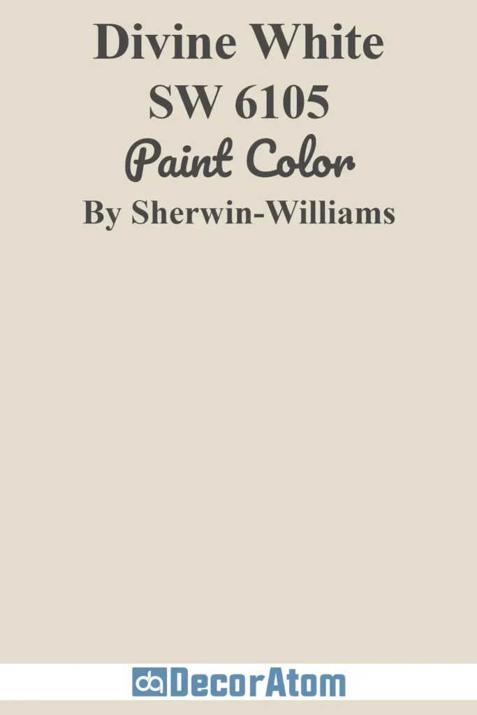
Divine White is one of those understated colors that can quietly transform a space.
At first glance, it looks like a soft off-white, but once it’s on the walls, you see its warm, creamy beige roots come through.
There’s a comforting softness to it—like the color of warm milk or antique linen.
It’s light enough to be used as a whole-home color, especially in spaces that lean traditional or farmhouse.
What I love most is that Divine White never feels too yellow or too pink; it’s neutral, but with just enough depth to keep it interesting.
2. Accessible Beige (SW 7036)

Accessible Beige has earned its reputation as a go-to beige for good reason.
It doesn’t scream “beige” in the old-school, builder-grade sense.
Instead, it has a gentle warmth and a subtle gray undertone that modernizes the whole feel.
It reads more greige than true beige, which makes it super versatile—you can pair it with crisp whites, deep blues, sage greens, or even black accents, and it still holds its own.
In north-facing rooms, it leans cozier and warmer; in bright, sunny spaces, it looks beautifully soft and balanced.
3. Agreeable Gray (SW 7029)
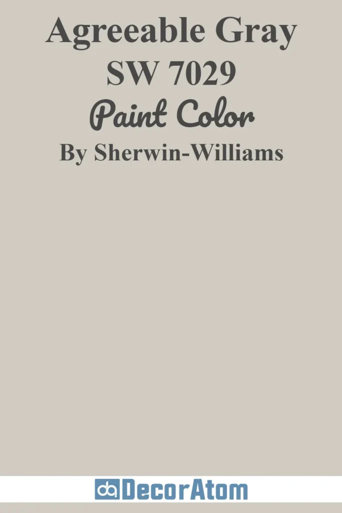
Yes, it has “gray” in the name, but don’t let that throw you off—Agreeable Gray lives right on the edge of beige and greige.
It’s a color chameleon that behaves differently depending on lighting and surroundings.
In homes with lots of natural light, it tends to soften into a warm greige that still feels airy and light.
In lower light or evening settings, you’ll notice its beige warmth show up even more.
It’s one of those rare shades that works in both cool and warm palettes, and that’s why it’s consistently a favorite for open floor plans.
4. Barcelona Beige (SW 7530)

Barcelona Beige is a true beige—warm, balanced, and classic.
It doesn’t lean gray or pink, and there’s no muddiness to it.
Instead, it’s a clean, sand-inspired neutral that brings a grounded warmth to any space.
This one feels especially at home in traditional interiors or Mediterranean-style homes, where beige tones feel intentional and rich.
Pair it with crisp white trim or earthy terracotta accessories, and it creates an inviting, sunbaked vibe.
5. Kilim Beige (SW 6106)

Kilim Beige has been around for a while, and it’s still a strong favorite.
Think of it as a slightly deeper, richer take on classic beige. It carries a subtle peachy warmth, which makes it feel cozy and welcoming, especially in living rooms and bedrooms.
In south-facing light, that warmth really shines through—almost like a gentle glow.
Kilim Beige can easily be used throughout an entire home without feeling overwhelming, especially if you’re leaning toward a warmer palette.
6. Worldly Gray (SW 7043)
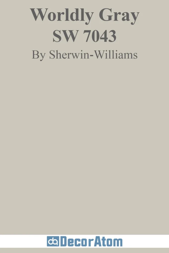
Worldly Gray is one of those beautiful in-between shades—part beige, part greige, with a slightly cool undertone that gives it a sophisticated edge.
It’s more muted than Accessible Beige, but still very livable and warm in the right lighting.
I love this color in rooms with big windows or lots of natural textures.
It works so well with stone, wood, and woven materials, creating that layered, earthy-modern aesthetic that’s been really popular lately.
7. Creamy (SW 7012)

Creamy is a warm, inviting off-white that flirts with beige just enough to give it a soft richness.
It doesn’t have the starkness of pure white, and it won’t feel sterile or cold.
Instead, it brings a milky smoothness to walls that can feel incredibly calming.
It’s light enough to use in smaller rooms or homes with limited natural light, where it will bounce light and still provide that gentle warmth.
Creamy pairs beautifully with wood tones, pale blues, and soft greens for a relaxed, timeless feel.
8. Shiitake (SW 9173)

Shiitake is a warm greige with subtle mushroom undertones—hence the name.
It’s more grounded than Agreeable Gray, but still leans neutral enough to play nicely with just about any color palette.
It has an earthy, organic vibe that feels effortlessly elegant. I think of Shiitake as the color version of a natural linen throw blanket—easy, classic, and always a good idea.
It’s especially gorgeous with matte black accents or natural wood cabinets.
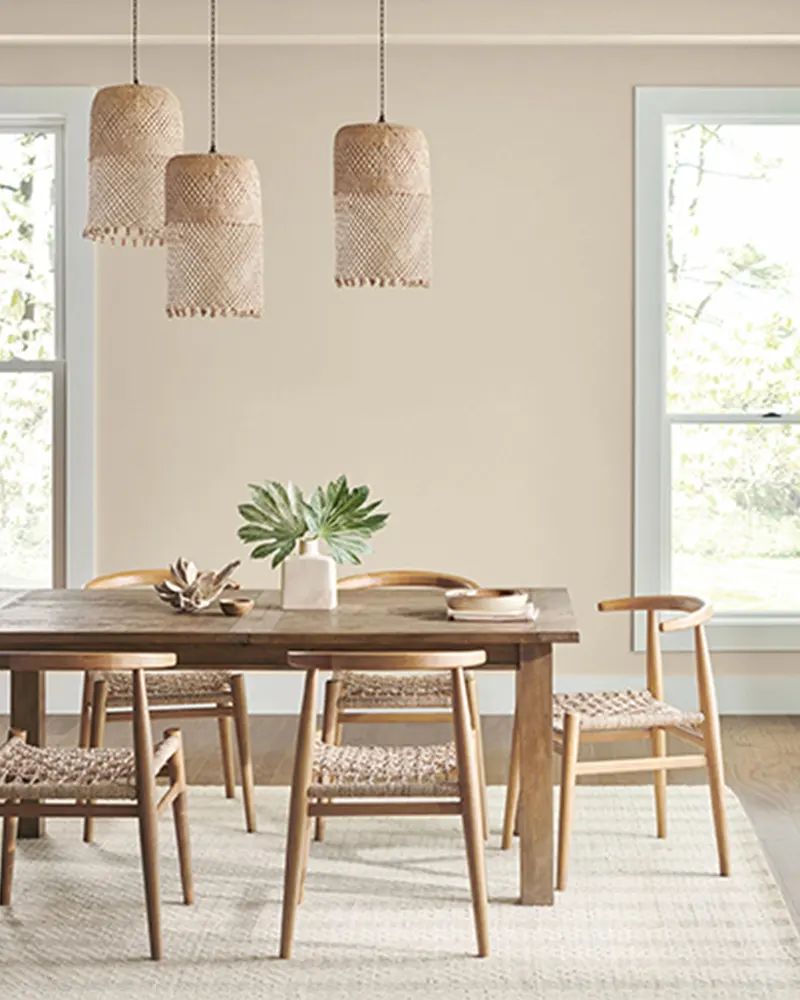
9. Natural Linen (SW 9109)

Natural Linen is a light beige with just a hint of warmth that feels breezy and casual.
It’s not overly creamy, nor is it washed out. It sits right in that sweet spot where it feels soft and neutral without being boring.
I love how it looks with creamy whites, soft pinks, and natural textures like jute or rattan.
It’s an especially good pick for bedrooms or guest rooms where you want that restful, sun-drenched feel.
10. Wool Skein (SW 6148)

Wool Skein is a warm, yellow-based beige that feels cozy without being heavy.
It reminds me of the soft underside of a wool sweater—gentle, neutral, but comforting.
There’s a softness to it that makes it feel right at home in both traditional and transitional spaces.
It’s a great alternative if you find shades like Kilim Beige or Barcelona Beige a little too deep.
Pair it with whites and soft blues for a timeless, calming palette.
11. Malabar (SW 9110)
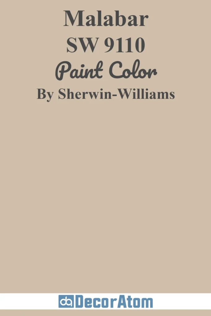
Malabar is one of those beiges that feels quietly rich—like a woven raffia texture or sun-drenched canvas.
It leans into its tan roots a little more than some of the others on this list, which gives it a subtle depth and earthiness.
There’s no gray in this one, so if you’re looking for a true warm beige that still feels refined and grounded, Malabar is a great option.
It has a slightly sandy undertone that makes it feel natural, especially when paired with natural wood, textured textiles, or warm white trim.
12. White Duck (SW 7010)
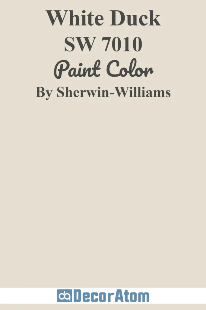
White Duck walks the line between soft white and creamy beige, and it does so with quiet elegance.
It doesn’t lean yellow, and it avoids that muddy look some warm neutrals can get in low light.
Instead, it brings this calm, chalky warmth that feels like a breath of fresh air.
In rooms with lots of light, it reads soft and creamy. In dimmer spaces, it shows off its warm beige undertones just enough to feel cozy, never dull.
It’s especially beautiful in homes where you want an airy look that still feels inviting.
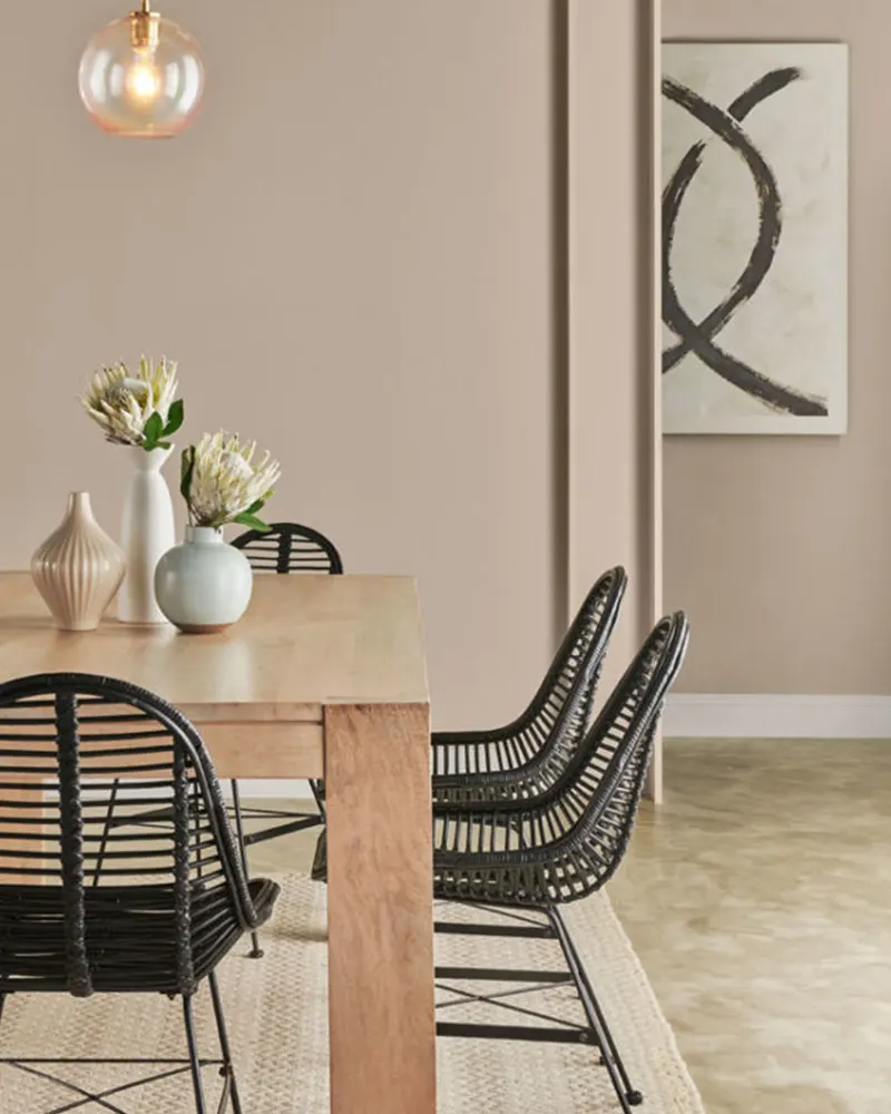
13. Nomadic Desert (SW 6107)

Nomadic Desert is rich, warm, and earthy—in the best way.
It has a deeper tone than many on this list, making it a solid choice for anyone wanting a bolder beige that still works as a neutral.
It leans slightly toward terracotta or clay in certain lighting, but never goes too far into orange. This one has real personality.
It looks incredible in homes with southwestern or rustic design elements, and it pairs beautifully with darker woods, iron finishes, and even creamy whites for contrast.
14. Softer Tan (SW 6141)

True to its name, Softer Tan is a mellow, approachable beige that brings the comfort of a classic tan with a lighter, more modern feel.
There’s a gentle golden warmth to it, but it doesn’t feel yellow or overwhelming.
Instead, it creates this soft, welcoming atmosphere that’s especially lovely in family rooms, hallways, or bedrooms.
It works well as a whole-home neutral if you want something a step warmer than gray, but without going full-on golden beige.
15. Mortar (SW 9165)
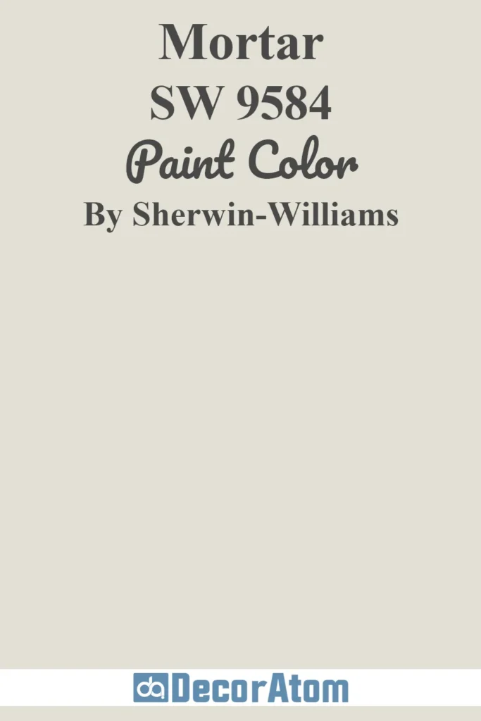
Mortar is the darkest and most grounded color in this lineup.
It’s a deep, earthy greige with strong beige undertones, and it brings a level of sophistication that makes it perfect for accent walls, cabinetry, or even moody, cozy living spaces.
Mortar has a slightly taupe-like richness that works beautifully with soft whites, warm wood tones, and black metal accents.
It’s the kind of color that can really anchor a room, adding depth and character without feeling heavy.
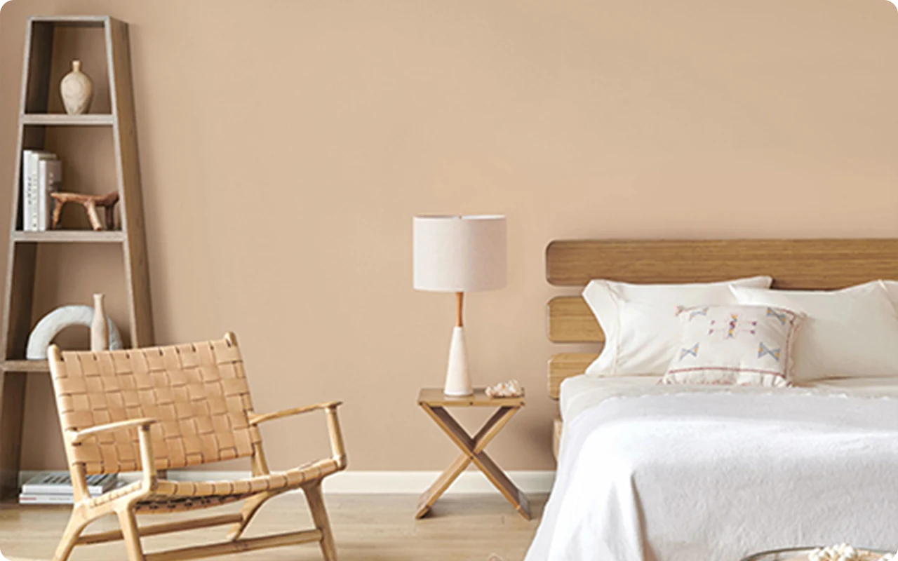
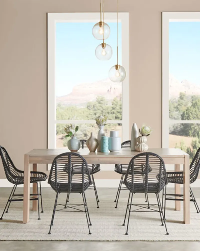
Hi can you tell me what color was used on the very first picture posted here. Right under the article title. Thank you
Hii Maria, That is Sherwin-Williams Practical Beige SW 6100.