
Benjamin Moore has some absolutely beautiful sage green paint colors, but let me tell you—finding the right one is more than just picking whatever looks good on a chip.
Undertones, lighting, depth… they all matter. Some sage greens lean cool and silvery, others feel warm and herbal.
And the right one can make your kitchen cabinets pop, turn a bedroom into a sanctuary, or give your living room that laid-back elegance you’ve been craving.
So I’ve put together this list of my favorite Benjamin Moore sage greens—the ones that stood out for their depth, softness, versatility, and that almost magical ability to work in just about any space.
What are Sage Green Paint Colors?
Sage green is one of those rare paint colors that manages to feel both grounded and refreshing at the same time.
At its core, sage green is a muted green with gray undertones—imagine the soft, dusty color of fresh sage leaves.
It’s a mid- to light-toned green that’s toned down just enough to act almost like a neutral, yet it still carries that organic, earthy character that green is known for.
What makes sage green so appealing is its versatility. It doesn’t scream for attention, but it doesn’t fade into the background either.
It’s soothing, subtle, and has a timeless quality that works in both modern and traditional spaces.
Depending on the depth and undertone, sage green can lean warmer (with hints of yellow or beige) or cooler (with hints of blue or gray), which makes it incredibly flexible for pairing with a variety of finishes, textures, and other paint colors.
It’s the kind of color that can make a room feel calm and connected to nature without trying too hard.
That’s probably why it’s having such a major design moment—and why it never really goes out of style.
Where to Use Sage Green Paint Colors
Sage green is the kind of color that works just about anywhere, but it really shines in spaces where you want to evoke a sense of calm, comfort, or understated elegance. Here’s where it tends to work especially well:
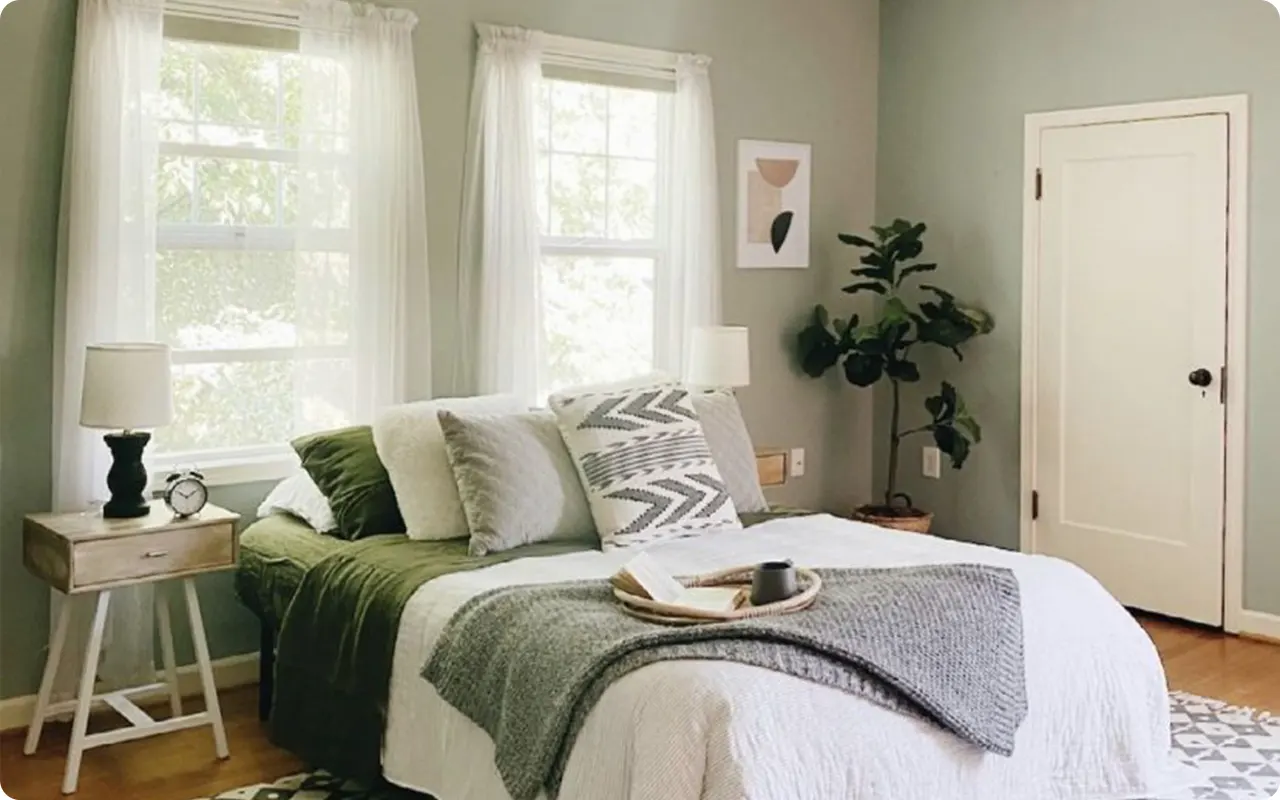
Living Rooms & Bedrooms
Sage green brings a serene energy to any space meant for rest or relaxation. Whether you go with a light sage for an airy, open feel or a deeper, moodier shade for a more cocoon-like vibe, it sets the tone for a peaceful retreat.
Kitchens & Cabinets
Sage green kitchen cabinets are having a huge moment, and for good reason. The color pairs beautifully with natural wood, brass, black hardware, and creamy countertops. It offers color without being loud and plays well in both farmhouse and contemporary kitchens.
Bathrooms
If you want a spa-like feel in your bathroom, sage green is your go-to. It works wonders on the walls or even just the vanity, especially when paired with soft whites, marble, or muted metallic finishes.
Entryways & Hallways
Sage green can make a stunning first impression when used in entryways or hallways. It feels welcoming and earthy, and it pairs well with natural textures like jute rugs, warm woods, or wainscoting.
Offices or Reading Nooks
Need a color that promotes focus without feeling sterile? A mid-tone sage green strikes that perfect balance between warm and cool, making it a great backdrop for productivity.

Colors to Pair with Sage Green
Sage green is so mellow and flexible that it plays well with a wide variety of other hues. The trick is to think about the vibe you’re going for—light and airy, moody and dramatic, earthy and grounded? Here are some pairing ideas that really bring sage green to life:
Soft Whites & Creams
Pairing sage green with whites like Benjamin Moore’s Simply White or Swiss Coffee helps highlight its natural softness. This combo feels fresh and clean, perfect for bathrooms, kitchens, or any room where you want light to bounce around.
Warm Neutrals
Think taupe, beige, or greige. These tones add warmth and texture next to sage green, creating a grounded, cozy palette. Ideal for living rooms or bedrooms that lean more traditional or rustic.
Dusty Blues & Muted Teals
If you want to play up the cooler undertones in sage green, pairing it with soft blues or blue-grays can create a beautiful, layered look. This works especially well in bedrooms or bathrooms for that spa-like feel.
Terracotta & Earthy Browns
For a more organic, nature-inspired palette, sage green and terracotta are a match made in design heaven. The muted green balances the richness of clay or rust tones, making the space feel curated and warm.
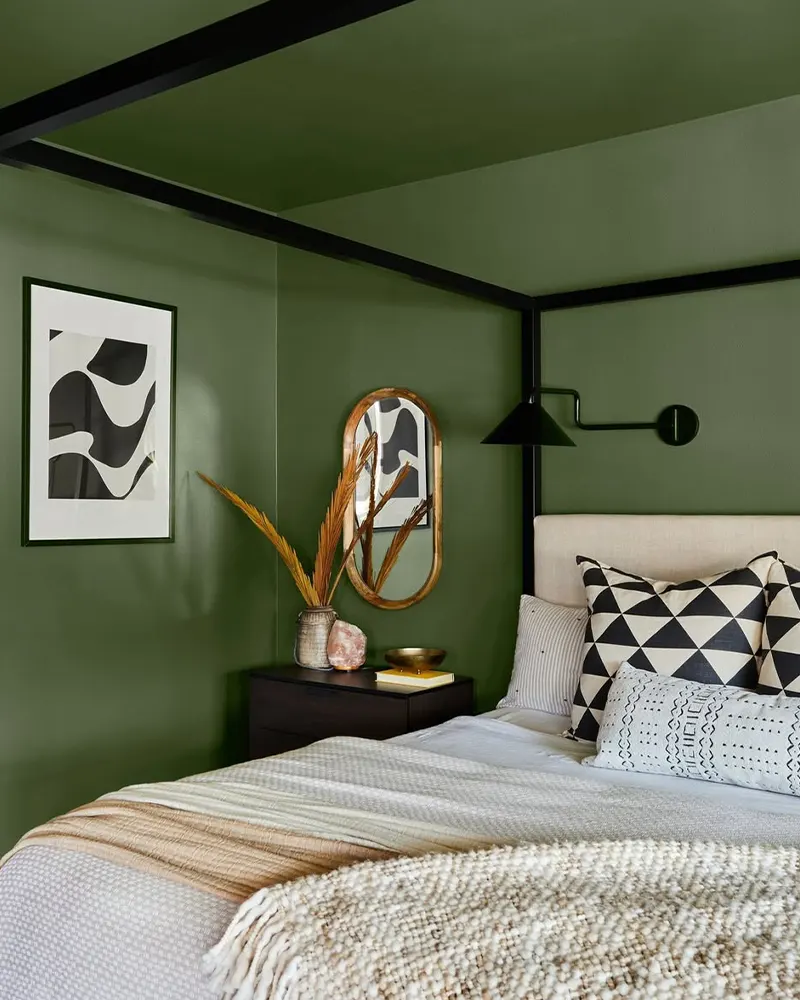
Black or Charcoal Accents
Adding contrast with black or deep charcoal can give sage green a modern, sophisticated edge. Think black cabinet hardware, matte black fixtures, or charcoal-colored furniture—it creates just enough contrast to make the green pop.
Soft Pinks or Mauves
Looking for something unexpected and romantic? Sage green and dusty blush or mauve tones can be incredibly pretty together. This combination works especially well in bedrooms or nurseries for a soft, charming feel.
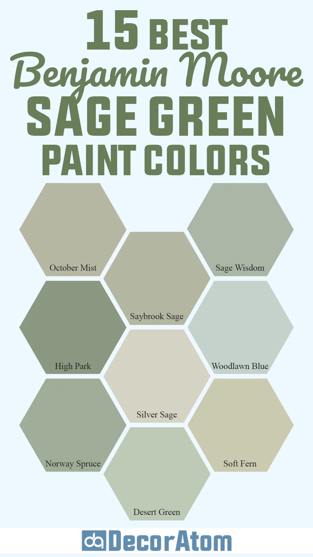
The Best Benjamin Moore Sage Green Paint Colors
Here are my favorite Sage Green paint colors from Benjamin Moore.
1. October Mist

This one had to top the list—it’s Benjamin Moore’s 2022 Color of the Year for a reason.
October Mist is that perfect balance between green and gray with just a whisper of warmth. It doesn’t feel cold or sterile like some muted greens can.
Instead, it gives off a dreamy, organic vibe that feels effortlessly calming.
What makes October Mist special is its versatility. It reads like a soft, silvery sage in bright light, but in lower light, it gains depth and leans slightly more green.
That chameleon quality is part of its charm—you can use it just about anywhere.
I especially love it in bedrooms, bathrooms, and even cabinetry for that gentle, airy effect without defaulting to plain gray.
2. Saybrook Sage

Saybrook Sage feels like a true classic. It’s a historic-looking sage green with subtle yellow undertones that give it a warm, inviting depth.
While some sage greens lean more gray or silvery, Saybrook Sage holds onto its green identity without being too bold or saturated. It’s refined and timeless.
This color works beautifully in traditional spaces or homes with natural wood tones.
Imagine it on kitchen cabinets paired with brass hardware or in a sunlit hallway with crisp white trim—it brings a comforting, nostalgic feel.
People love Saybrook Sage because it brings that sense of connection to the outdoors while still feeling polished. It’s not trendy—it’s enduring.
3. Hollingsworth Green

Hollingsworth Green brings something a little softer to the sage family. It’s a pale, misty green that has a noticeable blue-gray undertone.
This gives it a cooler, airier presence, almost like a soft breeze rolling through a coastal cottage.
It’s definitely on the lighter end of the spectrum, which makes it a lovely alternative to white or off-white if you want a hint of color without overpowering the space.
It’s ideal for bathrooms, guest bedrooms, or any spot where you want to create a calming, spa-like atmosphere.
4. Sage Wisdom

Sage Wisdom brings in a deeper, more rooted version of sage. It’s rich without being dark and has just enough gray in it to keep it from feeling too green or grassy.
There’s an earthy confidence to this color—it feels grounded, mature, and totally unpretentious.
What I love about Sage Wisdom is how beautifully it pairs with natural textures: wood, leather, stone, or even rattan.
It has that cozy, organic energy that makes a room feel lived-in and welcoming.
This one’s a great choice for dining rooms, home offices, or even a moody accent wall.
5. High Park

If you’re drawn to the idea of sage green but want something a little more saturated and bold, High Park is worth a serious look.
This color leans more into olive territory while still holding onto those classic sage roots.
It’s deeper and more dramatic than your average sage green, but not so dark that it feels heavy.
High Park’s undertones are warm and slightly yellow, giving it that comforting, nature-inspired feel.
It works beautifully in rooms with lots of natural light where you want the walls to make a quiet statement.
It’s also a showstopper on cabinetry or even front doors.
6. Night Train

Night Train is one of the moodier members of this sage green lineup, and that’s exactly what makes it so interesting.
It leans toward a smoky green-gray with cool blue undertones. This isn’t your airy, ethereal sage—it’s deeper, more dramatic, and has that cozy, cocooning vibe.
In rooms with low lighting or darker finishes, Night Train can really shine.
It creates a sophisticated backdrop, especially in spaces like libraries, offices, or even dramatic dining rooms.
7. Oil Cloth

Oil Cloth is one of those beautifully balanced mid-tone sage greens that shifts subtly between green, gray, and even a touch of taupe depending on the lighting.
It’s not flashy or overly colorful, but that’s the beauty of it—it’s subdued, versatile, and incredibly elegant.
There’s something tailored and sophisticated about Oil Cloth.
It works in modern spaces just as well as more traditional ones, and it pairs easily with warm or cool palettes.
It’s perfect for walls, trim, or even built-ins if you want a soft, neutral color that still feels like a design choice.
8. Texas Sage
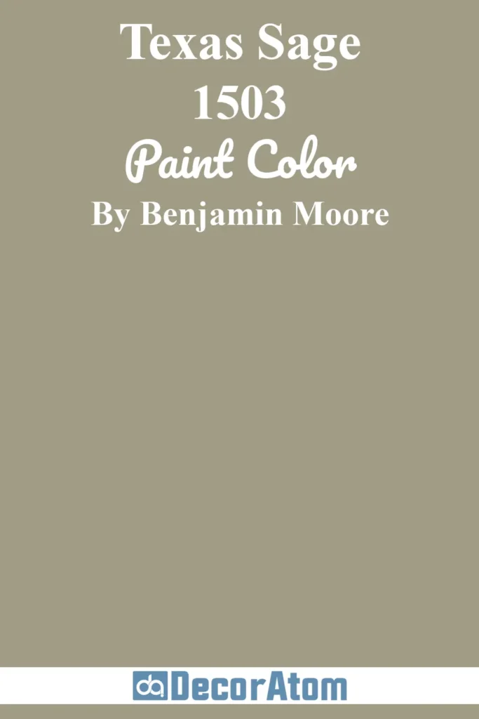
Texas Sage brings in a little more rustic charm. It’s a warm, earthy green with golden undertones that give it a sun-baked quality—almost like sagebrush in the wild.
This one has a little more personality and depth than a traditional sage, and it brings a subtle richness that feels welcoming and grounded.
It’s a fantastic choice for farmhouse-style homes or spaces with warm wood accents.
Texas Sage holds its own in larger rooms, especially when paired with creamy whites, aged brass, or terracotta tones.
9. Hillside Green

Hillside Green leans toward a deeper, piney version of sage that still feels soft and approachable.
It has muted blue and gray undertones, but it’s clearly green through and through.
If you’re looking for a sage that leans richer and more botanical without going too dark, this one is a great pick.
It brings a cozy elegance to any room—especially in spaces where you want a stronger color that still reads as natural.
I’ve seen Hillside Green used on accent walls, cabinets, and even entire rooms for a snug, comforting feel.
10. Silver Sage

Silver Sage is soft, airy, and full of light.
This color is what I like to call a “barely-there” sage—it’s that pale blend of green and gray with a silvery shimmer that makes rooms feel fresh and peaceful.
It works almost like a neutral, especially in rooms where you want a hint of color without committing to anything bold.
This is a beautiful choice for bedrooms, bathrooms, or open-concept living spaces.
It plays well with both warm and cool tones, which means it won’t clash with existing finishes.
What makes Silver Sage stand out is how effortlessly elegant it feels. It’s one of those colors that gives you just enough presence without ever feeling overwhelming.
11. Woodlawn Blue

I know, I know—“blue” is in the name, but don’t let that fool you.
Woodlawn Blue has that soft sage-like quality that makes it a beautiful crossover color.
It’s technically a blue-green with a touch of gray, and depending on the light, it can read more green than blue—especially in north-facing rooms or paired with warmer tones.
This is a go-to if you love the idea of sage green but want something with a slightly cooler edge.
It’s calm, fresh, and gives off this serene cottage vibe that works beautifully in bedrooms, bathrooms, and airy living spaces.
12. Norway Spruce
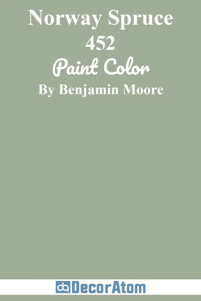
If you’re looking to bring a moodier, forest-inspired sage into your space, Norway Spruce is your answer.
This is the deepest, boldest green on the list, and while it might push past what some people think of as “sage,” it absolutely belongs here for its grounded, natural elegance.
There’s a richness to Norway Spruce that brings depth and drama without feeling overwhelming.
It leans into blue and charcoal undertones, which keeps it feeling sophisticated and moody—perfect for accent walls, cabinetry, or cozy spaces like a study or den.
13. Soft Fern

Soft Fern is one of those colors that makes a space feel instantly lighter and fresher.
It’s a pale, airy green with the slightest hint of yellow, giving it warmth and approachability.
Compared to some of the cooler-toned sage greens, Soft Fern feels almost sun-kissed.
It’s bright without being too pastel, and it has a peaceful, garden-like feel.
This one is perfect for bedrooms, nurseries, or any space where you want a whisper of nature without going deep or dramatic.
It plays beautifully with whites, creams, and wood tones, making it a very livable color.
14. Desert Green
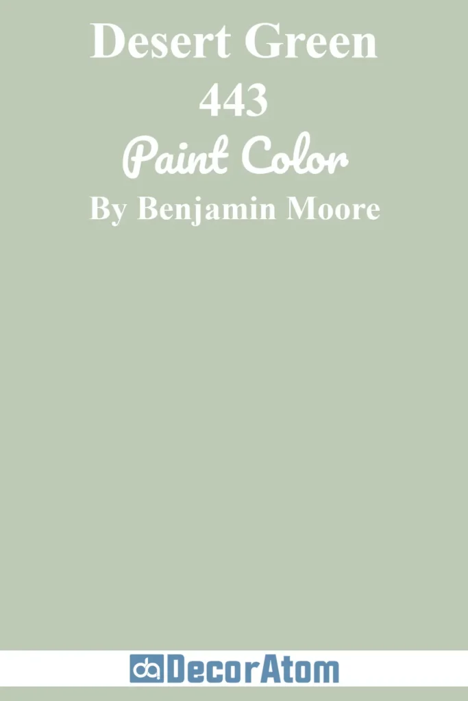
Desert Green lives in that earthy sweet spot—it’s a muted, dusty sage that has both gray and khaki-like undertones.
It feels a bit sun-warmed and rustic, like a desert plant catching golden hour light.
It’s not overly cool or sterile, and that hint of warmth gives it a grounded, comforting presence.
This color is especially gorgeous in southwest or boho-inspired interiors where you’re mixing texture, natural fibers, and warm woods.
It can also go more modern if paired with black or matte finishes.
15. Guilford Green
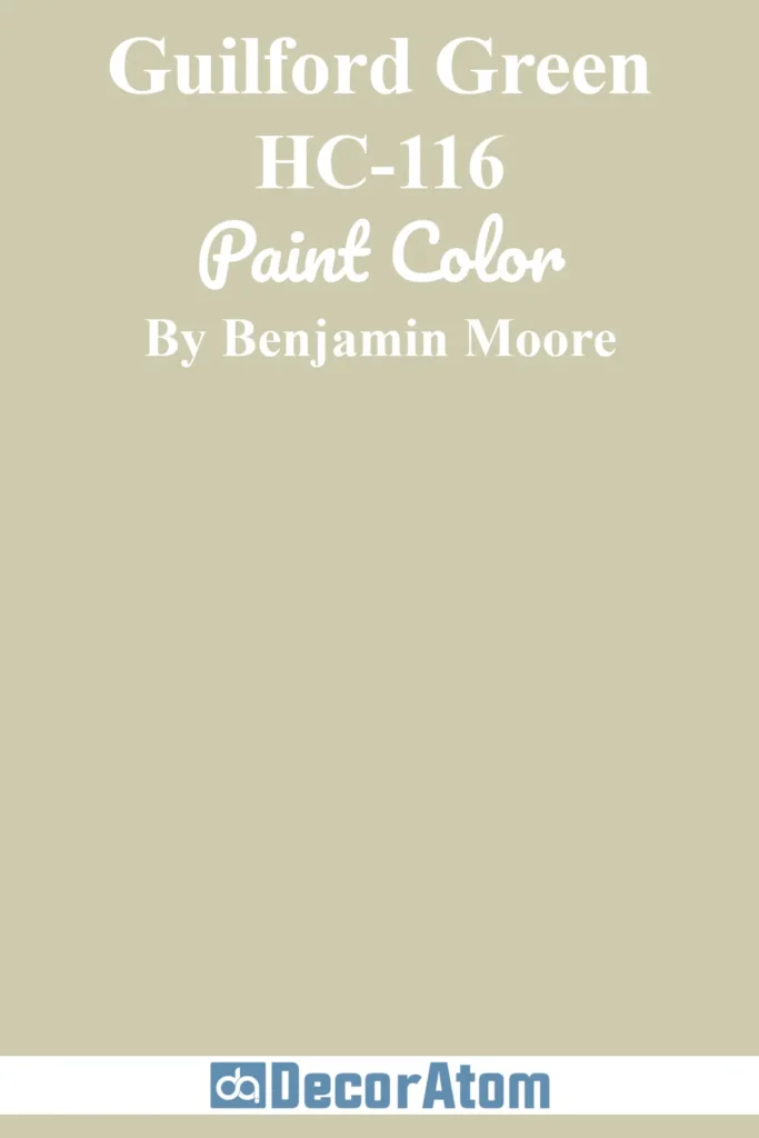
Last but definitely not least is Guilford Green. It’s soft, sophisticated, and has a timeless quality that makes it a standout in the sage family.
This was actually Benjamin Moore’s Color of the Year back in 2015, and it still holds its own years later.
Guilford Green has that perfect balance of green and gray with just a tiny drop of yellow to keep it from feeling too cold.
What makes Guilford Green so special is how well it adapts. It can feel airy and fresh in bright light or take on a richer, more muted tone in dimmer settings.
It’s one of those greens that fits just about anywhere—walls, cabinets, trim, even exteriors.