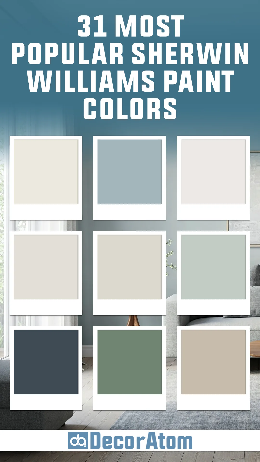
If you’re planning a home makeover or simply looking to freshen up your space, choosing the right paint color is essential. With so many shades to pick from, it can be overwhelming—especially when new trends are emerging each year.
That’s why we’re diving into the top 31 Sherwin Williams paint colors for 2025. These colors are more than just trendy—they’re timeless, versatile, and designed to make any room feel inviting and beautifully balanced.
Whether you’re drawn to soft neutrals, bold blues, or earthy greens, there’s something here to inspire your next painting project.
Let’s explore the hues that are making a statement in 2025 and find the perfect shade to bring your vision to life!
Alabaster (SW 7008)
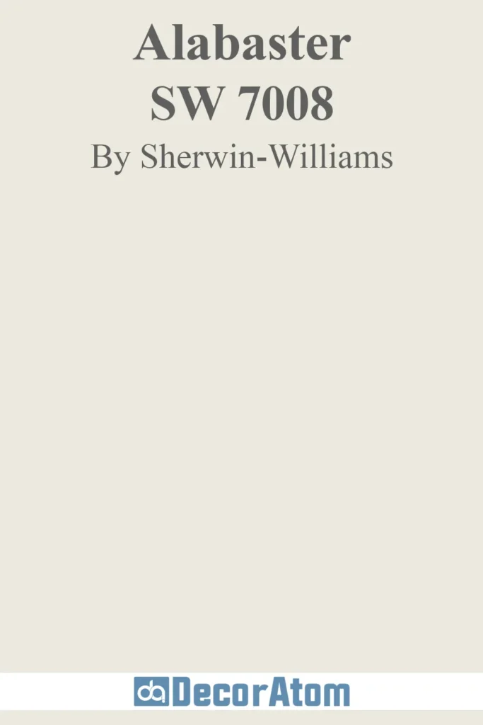
Alabaster is one of those whites that never goes out of style. It’s warm without being yellow, soft without looking dull, and just the right amount of creamy to feel inviting. If you’ve ever been turned off by stark, cold whites, Alabaster might be exactly what you need.
It’s no surprise this color is still going strong in 2025. Designers and homeowners are leaning into softer whites that feel livable, and Alabaster delivers.
It works beautifully with natural wood, blends seamlessly into both modern and classic interiors, and looks stunning in rooms with plenty of natural light.
Agreeable Gray (SW 7029)
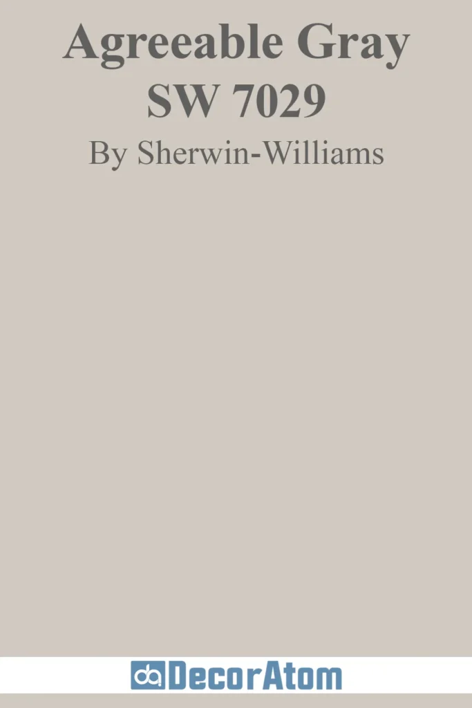
If you’re looking for the ultimate greige, Agreeable Gray is the one. It’s not too warm, not too cool—just a perfectly balanced, adaptable neutral.
This is one of those colors that can shift slightly depending on the lighting, sometimes reading as a warm gray and other times leaning beige. That versatility is exactly why it’s still a favorite for 2025.
One of the best things about Agreeable Gray? No weird undertones. Some greiges can pull pink or green, but this one stays neutral, making it an easy, foolproof choice. If you want a color that flows effortlessly from room to room without feeling repetitive, this is it.
Repose Gray (SW 7015)

💥🎁 Christmas & Year-End Deals On Amazon !
Don't miss out on the best discounts and top-rated products available right now!
*As an Amazon Associate, I earn from qualifying purchases.
Repose Gray is like the slightly cooler cousin of Agreeable Gray. It’s still a greige, but with a subtle blue undertone that gives it a crisper, more modern look. If you love neutrals but want something with a bit more depth, Repose Gray is a solid pick.
Why is it still trending in 2025? Because gray isn’t going anywhere, but the shift is toward softer, more inviting tones rather than stark, cold ones.
Repose Gray is right in that sweet spot—not too warm, not too cool, just polished and timeless. It pairs beautifully with white trim and works well in spaces with both natural and artificial lighting.
Sea Salt (SW 6204)
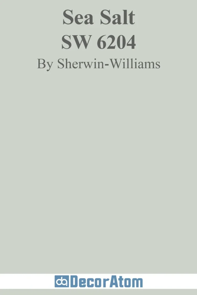
Sea Salt is one of those colors that instantly makes a space feel calm and serene. It’s a soft green-gray with a subtle blue undertone, giving it that breezy, coastal vibe. Depending on the lighting, it can lean more green or more gray, but it always feels fresh and relaxing.
This color is a top pick for 2025 because people are embracing nature-inspired hues, and Sea Salt is the perfect way to bring that peaceful, outdoorsy feel inside.
It’s especially great for bathrooms, bedrooms, and even kitchens if you want a touch of color without going bold.
Accessible Beige (SW 7036)

Beige is back—but not the dull, outdated beige you might be thinking of. Accessible Beige is modern, sophisticated, and has just enough gray in it to keep it feeling fresh.
What makes it so popular? It’s warm without being too golden and has a cozy, inviting feel that works in just about any space. If you love the idea of a warm neutral but don’t want anything too heavy or old-school, this is the one.
It’s a great alternative to greige if you want a touch more warmth while still feeling current.
Snowbound (SW 7004)

💥🎁 Christmas & Year-End Deals On Amazon !
Don't miss out on the best discounts and top-rated products available right now!
*As an Amazon Associate, I earn from qualifying purchases.
Snowbound is the perfect soft white for anyone who wants a clean, bright look without it feeling too stark. It has just a hint of gray to keep it balanced, so it never leans too warm or too cool.
White walls are still a huge trend in 2025, but the shift is toward whites that feel inviting rather than sterile. Snowbound is ideal for trim, walls, or ceilings, and it pairs well with both warm and cool color schemes.
If Extra White feels too crisp and Alabaster is too creamy, Snowbound is the perfect in-between.
Pure White (SW 7005)

If you need a white that works literally anywhere, Pure White is it. It’s not too bright, not too creamy—just a soft, clean white that’s incredibly versatile.
Why is it still a favorite in 2025? Because it’s one of the most reliable whites out there. Whether you’re painting walls, trim, or cabinetry, Pure White adapts effortlessly.
It’s a go-to for open-concept spaces since it flows beautifully from room to room without any jarring shifts in tone.
Mindful Gray (SW 7016)

Mindful Gray is one of those neutrals that just works. It’s a mid-tone gray with a balanced mix of warm and cool undertones, making it incredibly adaptable.
What makes it stand out in 2025? It has more depth than lighter grays like Repose Gray or Agreeable Gray, giving it a bit more presence without feeling dark.
It’s a fantastic choice for cabinetry, accent walls, or even exteriors. Plus, it doesn’t lean too blue or too green, so it pairs well with just about anything.
Dover White (SW 6385)

💥🎁 Christmas & Year-End Deals On Amazon !
Don't miss out on the best discounts and top-rated products available right now!
*As an Amazon Associate, I earn from qualifying purchases.
If you love warm whites but don’t want anything too yellow, Dover White is a fantastic option. It’s got just enough warmth to feel cozy, but it still reads as a soft, creamy white rather than a full-on beige.
Warm neutrals are trending in 2025, and Dover White fits right in. It’s great for walls, trim, and even cabinetry, especially in farmhouse and traditional-style homes.
Compared to Alabaster, it’s a little warmer and has a hint more creaminess. If you want a white that leans into warmth without feeling heavy, this is the one.
Tricorn Black (SW 6258)

Tricorn Black is the boldest, deepest black Sherwin Williams offers. It’s a pure black with no strong undertones, making it one of the most versatile dark shades you can choose.
Why is it a top pick in 2025? Because black walls, cabinets, and exteriors are having a moment. Whether you’re going for a moody accent wall, dramatic kitchen cabinets, or a striking front door, Tricorn Black delivers that high-end, sophisticated look.
Eider White (SW 7014)
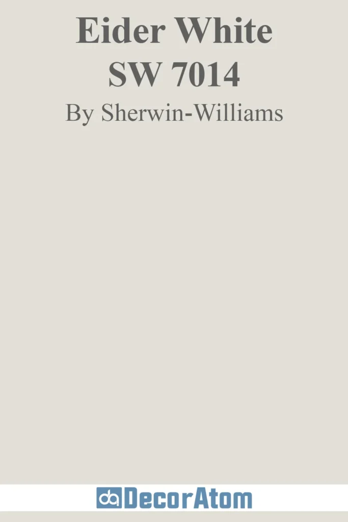
Eider White is a soft, warm-leaning white with a subtle gray undertone. It’s perfect if you want a crisp, clean look without going too bright or too creamy.
Why is it on the 2025 list? Because it’s one of those easy, foolproof whites that looks refined and effortless. It’s a great choice for whole-home use, especially in spaces with lots of natural light.
Oyster Bay (SW 6206)

💥🎁 Christmas & Year-End Deals On Amazon !
Don't miss out on the best discounts and top-rated products available right now!
*As an Amazon Associate, I earn from qualifying purchases.
Oyster Bay is a stunning mix of gray, green, and blue that creates a tranquil, nature-inspired atmosphere. If you love the soft, airy feel of Sea Salt but want something with a little more depth, this color is a fantastic choice.
It works beautifully in a variety of spaces—living rooms, bedrooms, and even kitchens—bringing a serene coastal touch. The way it shifts with the light is what makes it truly special. In rooms with plenty of natural sunlight, it leans more green, while in dimmer spaces, the gray tones become more pronounced.
Pair it with crisp whites like Extra White (SW 7006) for a fresh, modern contrast, or warm wood tones for a cozy, inviting feel.
Extra White (SW 7006)
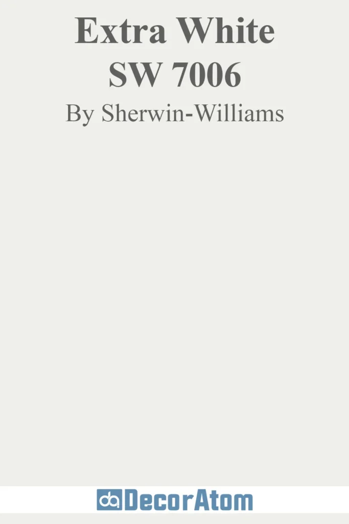
Extra White is the go-to choice for those who want a clean, bright white without any noticeable undertones. It’s a pure white that doesn’t lean too warm or cool, making it a fantastic choice for trim, ceilings, and walls.
If you’ve found other whites like Alabaster or Snowbound to be too warm or creamy, Extra White gives a sharper, more modern look. It enhances natural light, making rooms feel more open and airy.
This color pairs well with deep accent colors like Naval or Iron Ore for a bold contrast. If you want an all-white space with a crisp, gallery-like aesthetic, this is a perfect option.
Dorian Gray (SW 7017)

Dorian Gray is a warm, mid-tone gray with subtle taupe undertones that add just the right amount of softness. It’s a versatile neutral that works beautifully in both modern and traditional interiors.
Unlike cooler grays that can feel stark or industrial, Dorian Gray brings warmth without leaning too beige. It’s a great choice for living rooms, kitchens, and even exteriors where you want a color that feels balanced and inviting.
For trim and accents, pair it with whites like Pure White or Extra White. If you’re looking for a darker contrast, Iron Ore or Urbane Bronze make excellent choices.
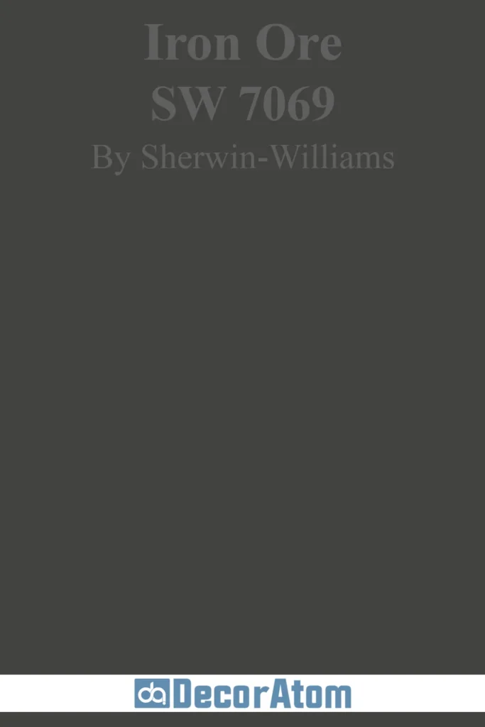
Iron Ore (SW 7069)
💥🎁 Christmas & Year-End Deals On Amazon !
Don't miss out on the best discounts and top-rated products available right now!
*As an Amazon Associate, I earn from qualifying purchases.
Iron Ore is a deep charcoal that delivers bold elegance without the harshness of a true black. It’s a dramatic yet versatile color that works well on kitchen cabinets, front doors, accent walls, and exteriors.
The beauty of Iron Ore is in its adaptability. In bright natural light, it reads as a rich, deep gray. In dim lighting, it takes on a more intense, moody feel. It pairs well with both warm and cool colors, making it easy to incorporate into various design styles.
If you love the dark and sophisticated look but find Tricorn Black too intense, Iron Ore is a fantastic alternative. It looks especially stunning when paired with warm wood tones and brass or gold accents.
Rainwashed (SW 6211)
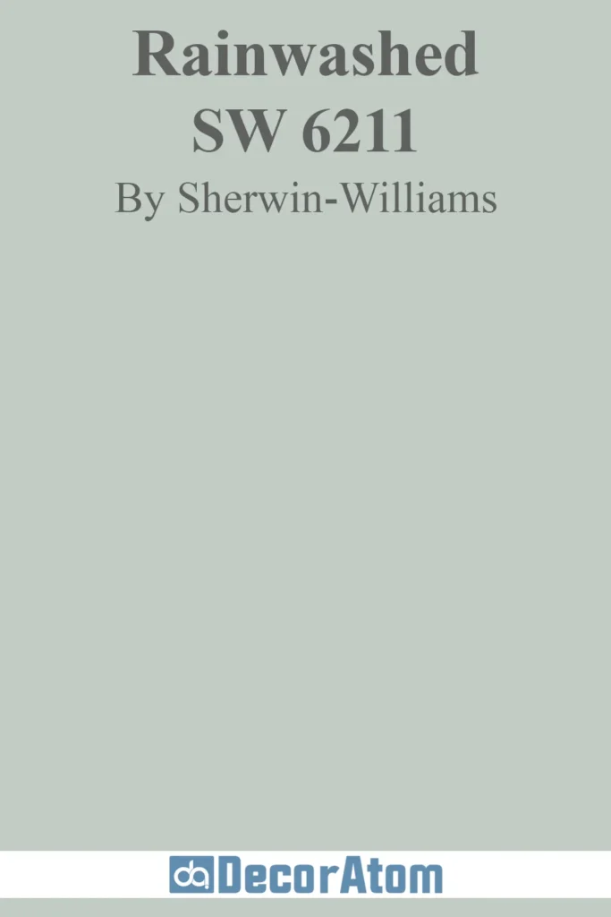
Rainwashed is a soft, airy blend of blue, green, and gray that brings a refreshing, spa-like feel to any space. It’s a fantastic choice for bedrooms, bathrooms, or even home offices where you want a calm, stress-free atmosphere.
This color works well in coastal or nature-inspired designs, giving a fresh and airy vibe without feeling overpowering. In bright spaces, it leans more toward a soft aqua, while in lower lighting, the gray undertones come through, making it feel more muted and sophisticated.
Pair it with crisp whites like Extra White for a clean, coastal look, or warm neutrals like Anew Gray for a more balanced, earthy feel.
Naval (SW 6244)

Naval is a deep navy that feels timeless and luxurious. It adds richness and depth without making a space feel too dark or heavy. This color is perfect for those who love a bold statement but still want a shade that feels sophisticated and classic.
It’s a fantastic option for kitchen cabinets, accent walls, and front doors. It pairs beautifully with brass or gold hardware, bringing out its rich undertones. For a modern contrast, try it with crisp whites like Extra White or Snowbound.
Naval is also a great alternative to black if you want a dark color with a bit more warmth and personality. It creates a moody yet inviting space, especially when used in a bedroom or study.
Drift of Mist (SW 9166)
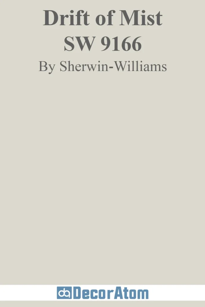
Drift of Mist is a light greige that strikes the perfect balance between gray and beige. It’s a fantastic alternative to stark whites, offering a soft, neutral backdrop that works in any space.
Because it has a subtle warmth, it pairs well with both cool and warm tones, making it an excellent choice for open-concept homes. It works especially well in living rooms, hallways, and kitchens where you want a color that flows seamlessly from one space to another.
For a modern look, pair it with deeper grays like Dorian Gray or warm, earthy tones like Urbane Bronze. It’s also a great choice for those who want a light neutral that won’t feel too cold or sterile.
Urbane Bronze (SW 7048)

Urbane Bronze is a deep, earthy charcoal with warm brown undertones, making it a bold yet inviting choice for interiors and exteriors. It was even named Sherwin Williams’ Color of the Year in 2021, thanks to its rich, organic feel.
This color pairs beautifully with natural elements like wood, stone, and greenery. Whether used on accent walls, cabinetry, or even front doors, it creates a cozy and sophisticated atmosphere.
For a high-contrast look, pair Urbane Bronze with crisp whites like Extra White. If you want to keep things warm and moody, try it with other earth tones like Anew Gray or Accessible Beige.
Anew Gray (SW 7030)
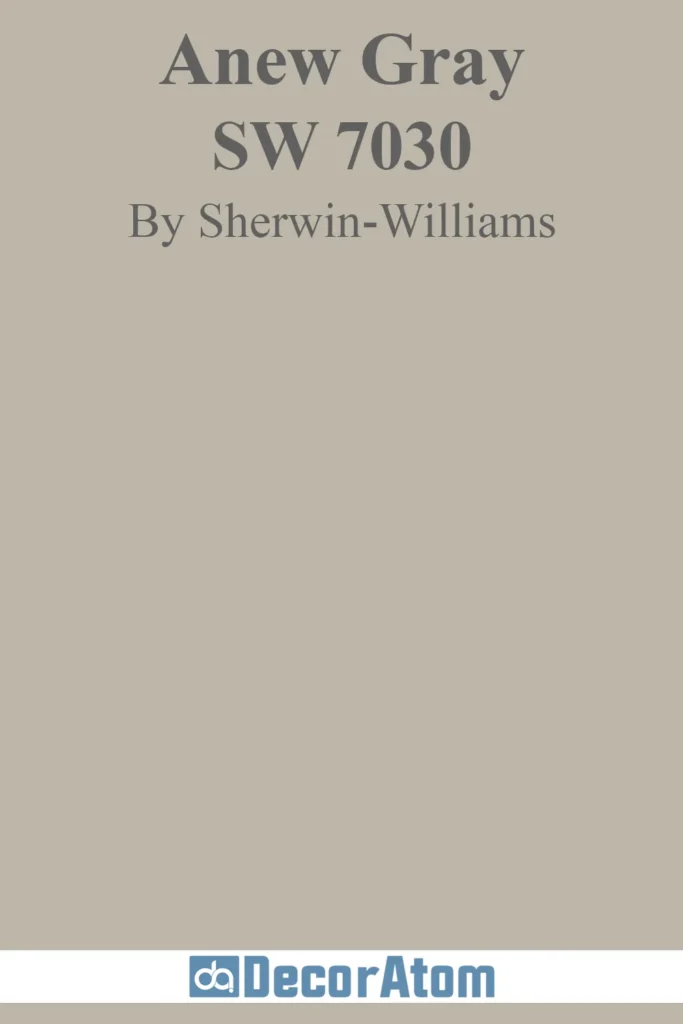
Anew Gray is a soft, warm greige that works well in both traditional and modern spaces. It has a perfect balance of beige and gray, making it an excellent neutral that adapts to different lighting conditions.
In bright spaces, Anew Gray looks lighter and more beige, while in dimmer rooms, its gray undertones come forward. This makes it a fantastic all-around color for living rooms, kitchens, and bedrooms.
For trim, pair it with a crisp white like Extra White. If you want a darker contrast, Dorian Gray or Urbane Bronze work beautifully.
Worldly Gray (SW 7043)
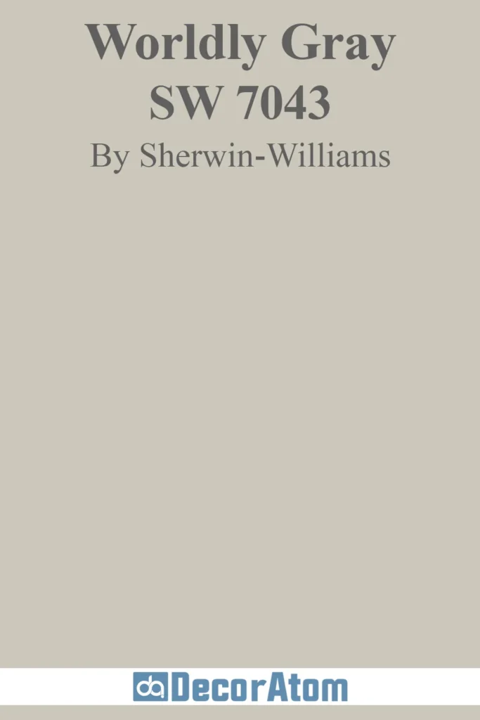
Worldly Gray is a versatile greige that leans slightly warmer than some other gray tones, making it a great choice for those who want a neutral that isn’t too cool or too beige.
It’s an excellent choice for open-concept spaces, as it blends seamlessly with a variety of decor styles. Whether paired with modern, farmhouse, or traditional elements, it provides a soft and welcoming backdrop.
If you want to highlight its warmth, pair it with wood tones and earthy colors. For a more modern feel, combine it with cooler grays or crisp whites.
Requisite Gray (SW 7023)

Requisite Gray is a rich, medium-toned gray with warm undertones that offers a balanced, neutral backdrop for any space. Its depth ensures it isn’t overly light, while the warmth prevents it from feeling cold or sterile, making it a versatile option for both contemporary and traditional interiors.
The color is ideal for living rooms, bedrooms, and even cabinetry, where a neutral tone with a bit of personality is desired. This paint color is popular for those seeking a sophisticated, timeless option that isn’t overpowering but still brings a sense of warmth and depth to a room.
Gossamer Veil (SW 9165)

Gossamer Veil is a soft greige that brings lightness and warmth to a room without overwhelming the space. The color changes subtly depending on lighting, sometimes appearing as a light gray or a warmer, sandy tone. Its natural, airy quality makes it an excellent choice for rooms that require a neutral palette with a touch of refinement.
Ideal for living rooms, bedrooms, or even kitchens, Gossamer Veil offers a versatile, easy-to-pair option that complements various decor styles, from modern minimalist to traditional. Its understated elegance and soft hues help create an inviting and serene environment.
Rocky River (SW 6215)

Rocky River is a deep, earthy blue-green that makes a bold yet balanced statement. With its rich undertones, this color exudes sophistication and depth without overwhelming a room. It works well as an accent wall or in areas where you want a strong, grounding presence, such as kitchens or feature walls.
The earthy quality of this shade makes it ideal for spaces designed to evoke a connection to nature and the outdoors. It can be used to create a calming and stylish atmosphere, offering a unique blend of natural inspiration with modern design sensibility.
Sea Serpent (SW 7615)

Sea Serpent is a deep, smoky blue with a slightly muted quality that delivers a sophisticated, dramatic vibe to any room. It’s a refined alternative to brighter blues, making it suitable for creating luxurious yet welcoming spaces.
Sea Serpent works particularly well on cabinetry, front doors, or feature walls where you want to establish a bold presence without the intensity of brighter blues.
The deep navy tone creates a serene yet impactful atmosphere, ideal for spaces where you want to introduce depth and a sense of refined elegance.
Upward (SW 6239)
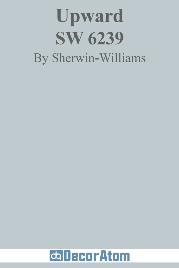
Upward is a soft, airy blue that invokes a sense of tranquility and openness. This light, cheerful color is perfect for creating a calm, serene atmosphere in bedrooms, bathrooms, or even as a ceiling color to mimic the sky.
Upward offers a refreshing, light quality that isn’t too bright, making it suitable for spaces that require an uplifting yet relaxed vibe.
The subtle nature of this hue allows it to pair well with various other colors, from crisp whites to muted neutrals, providing a versatile option for a wide range of interior design needs.
Outerspace (SW 6251)
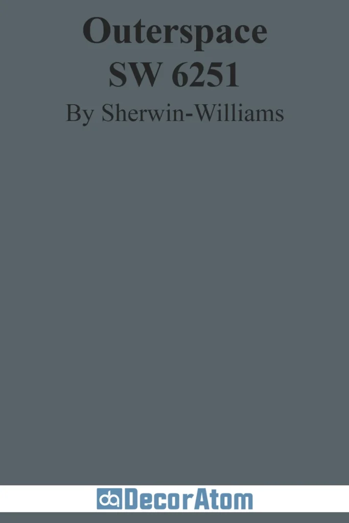
Outerspace is a sophisticated blue-gray with a cool undertone, giving it a moody yet refined quality. This color works well in spaces where you want to introduce an element of drama without overwhelming the room.
Ideal for accent walls, cabinetry, or exteriors, Outerspace adds a bold yet calming presence that is both contemporary and timeless. Its depth and neutral undertones make it a versatile color that pairs well with both light and dark tones, allowing for a variety of design possibilities.
The color brings a sense of calm and introspection to any space while still providing a strong visual impact.
Gallery Green (SW 0015)
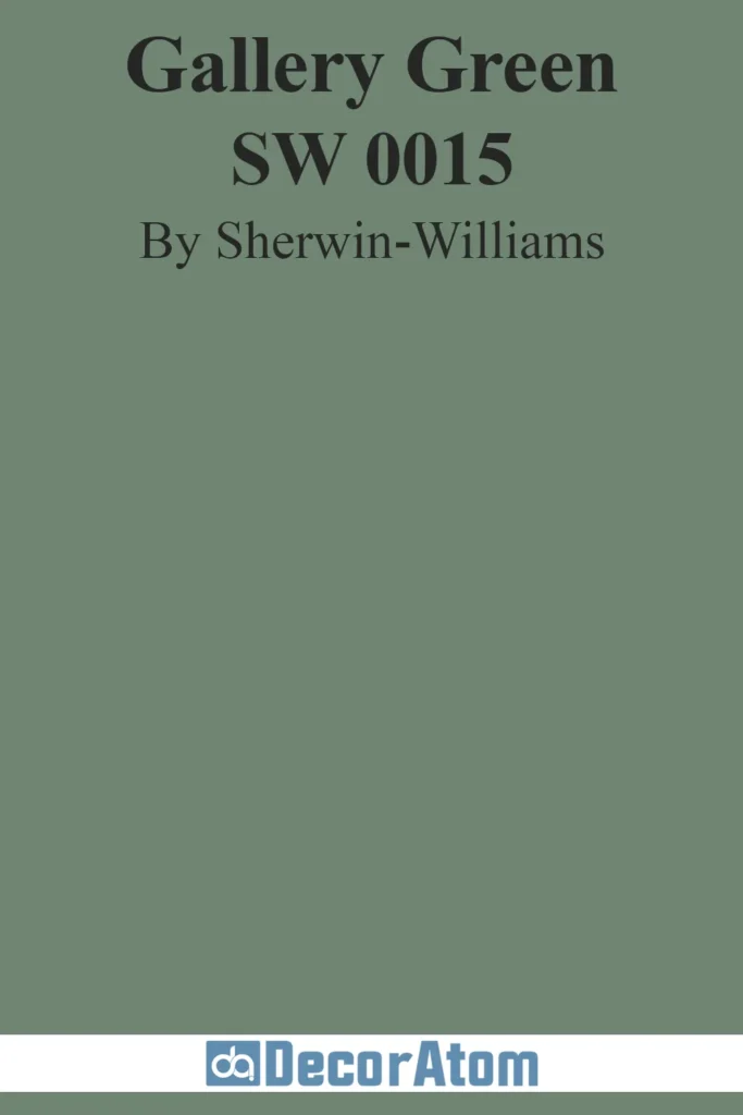
Gallery Green is a rich, earthy green that brings warmth and depth to any room. This color feels both traditional and contemporary, with its grounded, organic undertones providing a sense of stability and sophistication.
Perfect for spaces like dining rooms, libraries, or even cabinetry, Gallery Green creates an inviting, timeless atmosphere that complements a wide range of interior styles.
Its earthy quality makes it particularly well-suited for spaces where you want to evoke a natural, rustic, or vintage-inspired aesthetic, while still maintaining a modern touch.
Mexican Sand (SW 7519)

Mexican Sand is a warm, medium-toned beige with just the right amount of depth to make a space feel cozy and inviting. It has a sunbaked quality, providing a natural, earthy vibe that works well in a variety of settings.
This color is perfect for living rooms, kitchens, and entryways, where you want to introduce warmth without resorting to overly yellow or brown tones. The understated richness of Mexican Sand makes it an ideal neutral that pairs well with a range of other colors and materials, from wood accents to metal finishes.
It’s a classic, timeless option for those looking to embrace warmer, earthier tones in their interior design.
Studio Clay (SW 9172)

Studio Clay is a warm taupe that blends gray and brown undertones to create an organic, grounded presence in a room. It adds depth and sophistication to any space, making it an excellent choice for walls, exteriors, or even furniture.
The color is rich without being overpowering, and its natural, clay-inspired hue provides a calm, inviting atmosphere. Studio Clay works particularly well in modern or earthy design schemes, where you want a neutral with a little more character and warmth.
It pairs seamlessly with both bright and muted tones, making it versatile for various interior styles.
Shiitake (SW 9173)
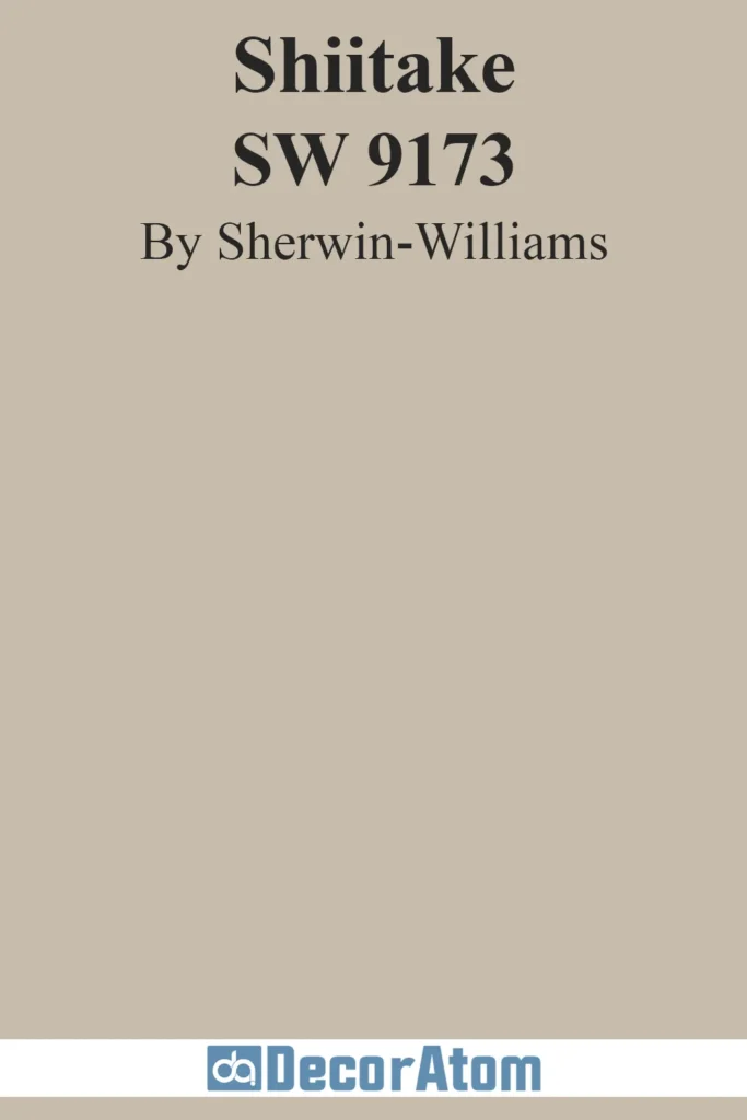
Shiitake is a soft, warm greige that offers a calming, balanced presence in any room. Its subtle depth makes it an ideal choice for whole-home applications or smaller spaces that require a neutral tone with a bit of personality.
Shiitake is the perfect blend of gray and beige, giving it the versatility to pair with various design styles and color schemes. Whether used in living rooms, kitchens, or bedrooms, this color provides a sophisticated, organic quality that complements a wide range of furniture and decor.
Its natural undertones make it a timeless option for those seeking warmth and balance in their interiors.
Influence of Color in Interior Design
Color plays a crucial role in shaping the look and feel of a space. It can enhance architectural features, set the mood, and even affect how spacious a room appears. Designers carefully choose color palettes to create balance and harmony, whether in a modern minimalist home or a cozy traditional setting.
Sherwin Williams has consistently provided high-quality paint colors that cater to different aesthetics, from timeless neutrals to bold statement shades.
In 2025, the trend continues with colors that promote comfort, sophistication, and a connection to nature.
Creating Mood and Atmosphere
Paint color isn’t just about aesthetics—it’s a powerful tool for influencing emotions. The psychology of color plays a huge role in home design:
- Soft blues and greens create a calming, relaxing environment, perfect for bedrooms and bathrooms.
- Warm neutrals like beige and greige promote a cozy and inviting feel, ideal for living spaces.
- Deep reds and mustard yellows add a touch of energy and warmth, making them great for dining rooms or accent walls.
- Darker shades like charcoal and navy bring depth and drama, especially in modern or industrial-style homes.
When choosing a Sherwin Williams paint color, think about the mood you want to evoke in each space. Do you want your home to feel airy and light or bold and dramatic?
Effect on Room Perception
Paint color can make a room feel larger, cozier, or more open, depending on the shades and finishes used. Some key effects include:
- Lighter colors (whites, soft grays, pastels) make small rooms appear more spacious by reflecting light.
- Darker tones (charcoal, deep blues, forest greens) create a cozy, intimate feel and work well in large spaces or as accent walls.
- Cool-toned colors (blues, greens, cool grays) help open up a space, making it feel airy and refreshing.
- Warm tones (earthy browns, beiges, yellows) add warmth and comfort, ideal for creating a welcoming environment.
The finish of the paint also affects perception—glossy finishes reflect more light, while matte finishes absorb it, altering the room’s overall feel.
Trends in Paint Colors
Every year, Sherwin Williams sets the tone for home design with its Color of the Year and trending palettes. The 2025 trends are heavily influenced by:
- Nature-inspired hues – Earthy greens, warm browns, and soft blues.
- Timeless neutrals – Classic beiges, grays, and whites that never go out of style.
- Bold statement colors – Rich jewel tones, moody blacks, and deep blues.
- Soft pastels – Subtle blush, muted sage, and airy lavender for a fresh, modern feel.
These trending colors are ideal for homeowners looking to refresh their space while keeping up with modern design aesthetics.
Contemporary Color Palettes
Modern color palettes emphasize versatility and sophistication. Here are some of the top Sherwin Williams color combinations for 2025:
- Warm & Earthy: Taupe, clay, and soft terracotta tones create a grounded, inviting atmosphere.
- Moody & Dramatic: Deep navy, charcoal gray, and emerald green for a luxurious touch.
- Light & Airy: Soft whites, pale blues, and creamy beiges for a fresh, open feel.
- Neutral & Modern: Greige, warm gray, and muted taupe provide timeless elegance.
- Pastel & Playful: Blush pink, misty lavender, and soft sage for a touch of personality.
These palettes can be used across entire rooms, accent walls, or furniture to create a cohesive design.
How to Choose the Right Paint Finish?
Choosing the perfect paint finish is just as important as selecting the color. Different finishes work better in different rooms depending on durability and the desired effect:
- Flat/Matte: Great for ceilings and low-traffic areas. It hides imperfections but isn’t very washable.
- Eggshell: Slightly more durable than matte, ideal for living rooms and bedrooms.
- Satin: A popular choice for high-traffic areas like hallways and kitchens.
- Semi-Gloss: Works well for doors, trim, and cabinets due to its durability and easy-to-clean surface.
- Gloss: The most reflective finish, best for trim and furniture but rarely used on walls.
For high-traffic spaces, opt for satin or semi-gloss. If you prefer a softer, elegant look, eggshell or matte may be the best choice.
Guidelines for Different Rooms
Each room in your home serves a different purpose, so choosing the right paint color is key to setting the right mood:
- Living Room: Warm neutrals (beige, greige, soft gray) create a welcoming atmosphere.
- Bedroom: Soft blues, greens, or warm taupes promote relaxation and restful sleep.
- Kitchen: Crisp whites, soft grays, or deep navy for a clean, sophisticated look.
- Bathroom: Light and airy tones (misty blue, sage green, warm white) enhance a spa-like feel.
- Dining Room: Rich, deep tones (burgundy, dark blue, emerald green) add drama and depth.
- Home Office: Soft greens, blues, and warm neutrals boost focus and productivity.
Following these guidelines ensures that your color choices align with the function and feel of each space.
Durability and Maintenance
A beautiful paint color is only as good as its longevity and maintenance. Sherwin Williams offers durable paint options suited for different areas:
- High-Traffic Areas: SuperPaint or Emerald – Washable, scuff-resistant, and long-lasting.
- Kitchens & Bathrooms: Duration Home or Satin Finishes – Moisture-resistant and easy to clean.
- Exterior Walls: Resilience or Latitude – UV-resistant and formulated to withstand weather conditions.
- Trim & Doors: Semi-gloss or gloss finishes – Protect against wear and tear.
To keep your paint looking fresh:
✔ Dust walls regularly to prevent dirt buildup.
✔ Wipe stains gently with a damp cloth (avoid harsh chemicals).
✔ Touch up paint when needed to maintain a polished look.
Sherwin Williams paints are designed to be long-lasting and durable, making them a reliable choice for homeowners who want both beauty and functionality.