
If you’ve ever stood in front of a wall of paint chips feeling totally overwhelmed, you’re not alone—especially when you’re looking for something that feels just right.
Light paint colors are beautiful, but sometimes they can feel a little too cool or sterile. That’s where these cozy, light tones come in.
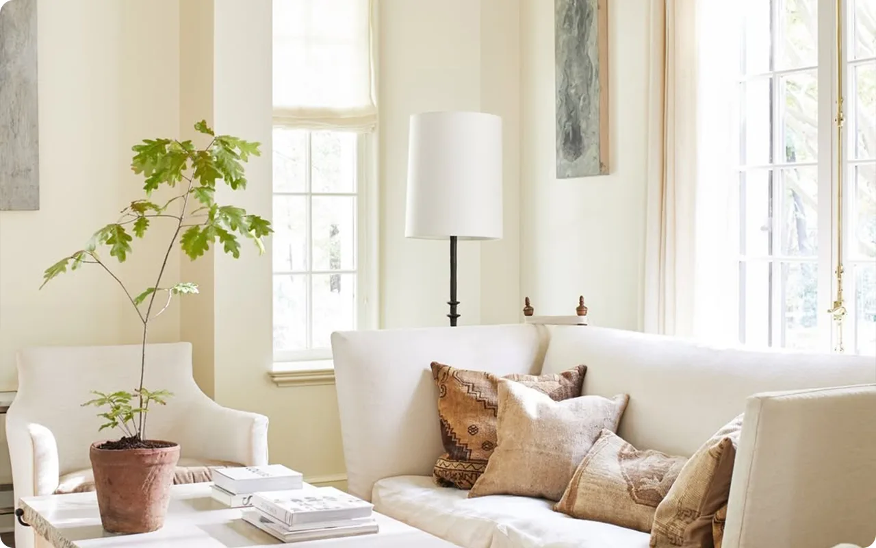
These are the kinds of shades that make a room feel bright and open, but still warm enough to feel like home.
They don’t scream for attention—they quietly set the mood, soften the edges, and make you want to curl up with a cup of tea or invite a friend to stay a little longer.
In this post, I’ve gathered some of my favorite light but cozy paint colors across a range of styles—from creamy off-whites and gentle earth tones to soft greens and muted peaches.
These are shades that can work beautifully in just about any room, especially if you’re going for that inviting, peaceful, lived-in feel.
I hope this list gives you the inspiration (and confidence!) to find the cozy light color that feels just right.
What Is The Most Popular Light But Cozy Paint Color For 2025?
If I had to pick just one paint color that seems to be popping up everywhere this year, both in designer circles and real-life homes, it’s Sherwin Williams Alabaster (SW 7008). It’s not just popular—it’s beloved. And honestly, it totally deserves the attention.
What makes Alabaster so appealing is that it hits that sweet spot between a warm white and a soft neutral. It’s not a stark, cold white—it has a touch of creamy warmth to it, almost like a blend of milk and sunlight.
But it still reads light and airy on the walls, which means it can make a room feel open and relaxed, even if you don’t get a ton of natural light.
The best part? It’s incredibly versatile. You can pair it with warm wood tones, cozy textiles, earthy accents, or even soft colors like sage, blush, or taupe.
It works beautifully in every room—from kitchens and bedrooms to entryways and living spaces. It’s cozy, but it doesn’t darken the room.
That’s a hard balance to strike, and Alabaster does it effortlessly.
So, if you’re after a color that feels gentle and soothing but still bright and breathable, this one’s a standout for 2025.
Tips for Choosing The Best Light But Cozy Paint Colors
Now, here’s where things get fun—choosing your perfect cozy-but-light paint color. It’s easy to get overwhelmed with all the options, so here are a few tips I always keep in mind (and share with friends who are deep in paint swatch territory):
1. Know Your Light
The same paint color can look totally different depending on the lighting in your space. North-facing rooms tend to cast cooler, bluish light, which can make warm tones feel more muted. South-facing rooms are flooded with warmer light and can really bring out golden or peachy undertones. So if you’re painting a room that doesn’t get much sun, lean into warm undertones to keep the space from feeling chilly.
2. Swatch, Swatch, Swatch
Seriously, I can’t stress this enough—sample the paint. Try at least two or three contenders on different walls and watch how they change throughout the day. Morning light, afternoon light, and nighttime artificial lighting all tell a different story. It’s the easiest way to avoid regret later.
3. Pay Attention to Undertones
Even a “neutral” color has undertones. Some off-whites lean yellow or beige, while others pick up hints of pink, gray, or green. Look at the color next to your flooring, trim, and furnishings. Does it bring out warmth? Does it clash? This will help you narrow things down fast.
4. Think About the Mood
Do you want the room to feel restful and serene? A soft sage or muted gray-beige might be your match. Want it to feel cheerful and sunny? Go for a buttery off-white or a muted yellow. The emotional tone matters just as much as the aesthetic.
5. Balance with Texture and Accents
Light cozy colors come to life when paired with the right materials. Think creamy white walls with a chunky knit throw, warm wood furniture, soft woven rugs, and linen curtains. The paint sets the mood, but the textures complete the vibe.
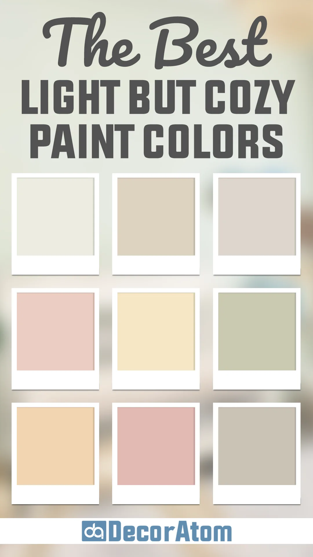
The Best Light But Cozy Paint Colors
Here are my favorite Light But Cozy Paint Colors to decorate with.
Creamy Off-Whites
Let’s start with the creamy whites—because nothing sets a soft, inviting tone quite like them. These aren’t your stark, sterile gallery whites. These are the ones that feel like warm milk, fresh linen, or the foam on a vanilla latte. They’re subtle, smooth, and full of charm.
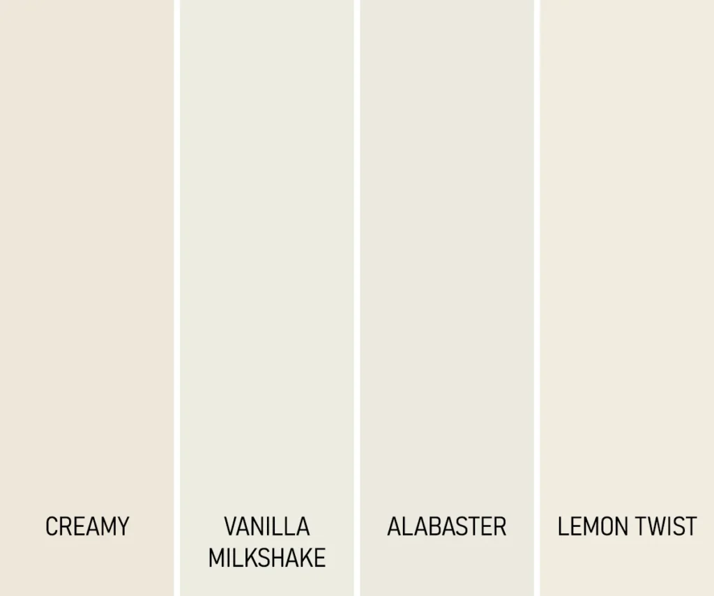
- Sherwin Williams Creamy – This one is such a favorite for a reason. It has that just-right balance between soft yellow undertones and a clean white feel. It’s not too bright, not too beige—just warm and creamy, like the name says. I love it in living rooms or hallways where you want light, but still crave a bit of warmth.
- Benjamin Moore Vanilla Milkshake – I mean, even the name feels cozy. This is a gentle off-white with a barely-there pink undertone, which gives it a slightly romantic, creamy look. It’s like your favorite cozy throw blanket in color form—still light and bright, but a little more soulful.
- Sherwin Williams Alabaster
This one is a crowd favorite for good reason. Alabaster is a soft, creamy white with just enough warmth to feel cozy but still fresh and clean. It doesn’t lean too yellow or too gray—it walks that fine line in the most elegant way. It’s the kind of color that works anywhere—walls, trim, ceilings, cabinets—you name it. - Behr Swiss Coffee – This is such a go-to warm white. It has just a touch of beige to soften the tone, but not so much that it starts feeling tan. I’ve seen it work beautifully in kitchens, bedrooms, even ceilings. It just has that timeless, cozy warmth.
Light Beiges and Tans
If you want something a little more grounded than white but still soft and airy, light beiges and tans are perfect. These colors bring that sunbaked, sandy warmth into a room—think oatmeal, soft parchment, or cozy wool sweaters.
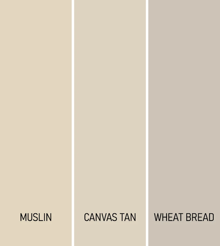
- Benjamin Moore Muslin – This one leans warm but doesn’t go yellow or muddy. It feels refined and casual at the same time. It’s the kind of beige that gives a space soul without overpowering it—great for living rooms or dining rooms that want to feel cozy but open.
- Sherwin Williams Canvas Tan – This is an understated tan with creamy undertones. It doesn’t scream for attention, but it adds a really comforting background to a space. I’ve seen it shine with warm wood floors or paired with black and white accents—it’s surprisingly flexible.
- Behr Wheat Bread – A bit deeper and toastier than the other two, Wheat Bread still feels light but adds a little more coziness. It’s a lived-in color in the best way—it makes a room feel immediately welcoming, like you’ve been there forever.
Soft Earth Tones
Now this category is where things start feeling even more layered and calm. Soft earth tones, especially those leaning into taupes and warm grays, bring a grounded serenity. These aren’t your cold grays—they have subtle undertones that keep things feeling cozy.
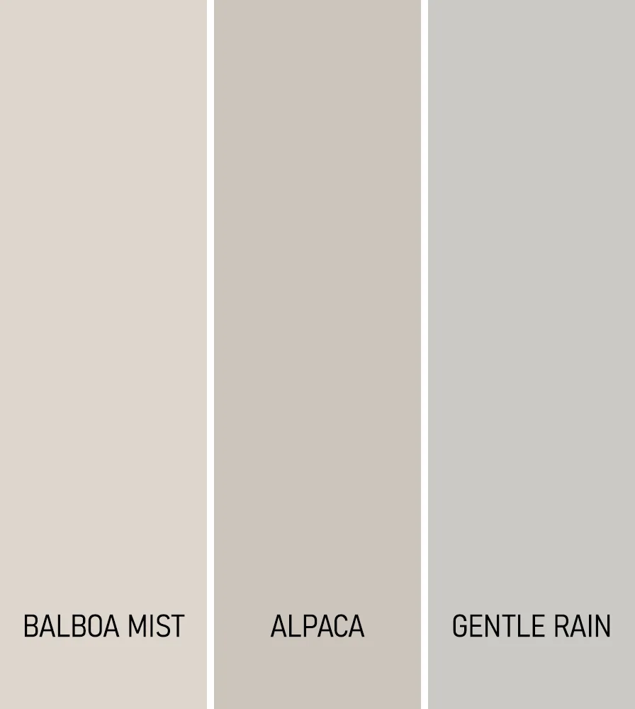
- Benjamin Moore Balboa Mist – A personal favorite of mine. It’s a very light greige with a warm, misty softness. There’s a touch of violet in the undertone that makes it feel more nuanced, more “designer,” but it still reads light and approachable.
- Sherwin Williams Alpaca – This one has that earthy, taupey-gray charm with a slight greige warmth. It’s great in rooms where you want a peaceful backdrop that still feels cozy—like bedrooms or even nurseries.
- Behr Gentle Rain – Aptly named, this is a calming soft gray with a hint of warmth that keeps it from feeling flat. It’s like a cloudy day in the best way—peaceful, muted, but still inviting.
Warm Peaches and Pinks
Let’s talk peaches and soft pinks. These colors add personality and warmth, but in a really gentle way. They’re perfect if you want to introduce color but still keep the overall look soft and snug.
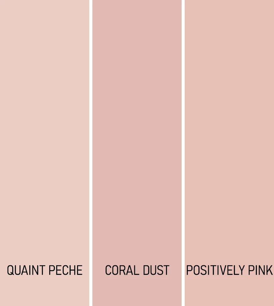
- Sherwin Williams Quaint Peche – I love how this feels like a whisper of peach rather than a punch. It’s delicate, slightly nostalgic, and pairs so well with creamy trim or soft wood tones.
- Benjamin Moore Coral Dust – This one adds a bit more color, but still in that muted, cozy way. It’s a warm, soft pink with coral undertones, and it brings a gentle energy to any space. I could see it working beautifully in a reading nook or a softly styled bedroom.
- Behr Positively Pink – Don’t let the name fool you—this isn’t a bright bubblegum pink. It’s actually soft and charming, with just enough warmth to feel grown-up and cozy rather than overly sweet.
Muted Yellows
Now, muted yellows can be a little tricky—but when you get the tone right, they bring the kind of light that feels like sunshine filtered through linen curtains. Not too bright, not too gold—just mellow and comforting.
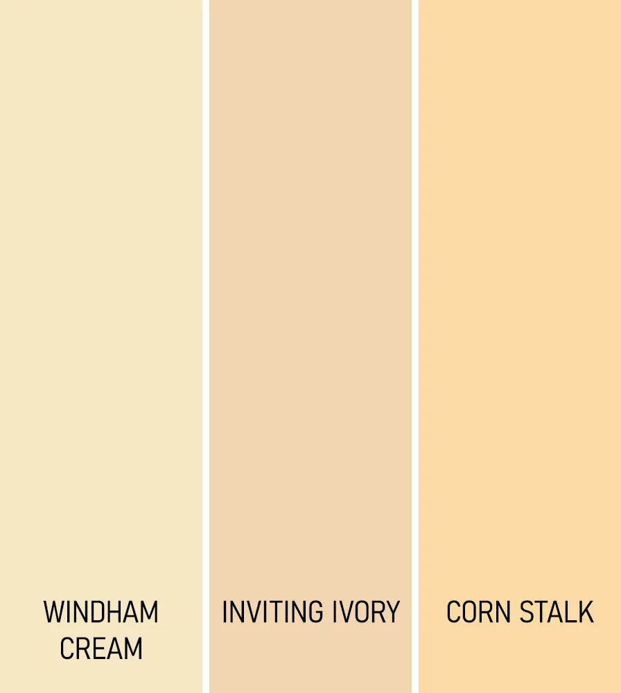
- Benjamin Moore Windham Cream – This is a soft, buttery yellow that feels both traditional and fresh. It has enough depth to warm up a room, but it still reflects a lot of light. Ideal for kitchens or anywhere you want that sun-warmed feel.
- Sherwin Williams Inviting Ivory – Think of this as a beige with a happy twist. There’s just enough yellow to make it cheerful, but it never crosses into loud or brassy territory. A great alternative to plain neutrals.
- Behr Corn Stalk – Slightly deeper and more golden, but still soft and subtle. It’s got a real rustic charm to it—almost like dried wheat or honeycomb. It’s the kind of color that makes a space feel grounded and homey.
Cozy Light Greens
And last but definitely not least, cozy greens. These are the soft sages and warm mints that bring a breath of nature inside. They soothe the senses, and when they’re light enough, they also keep things feeling fresh and airy.
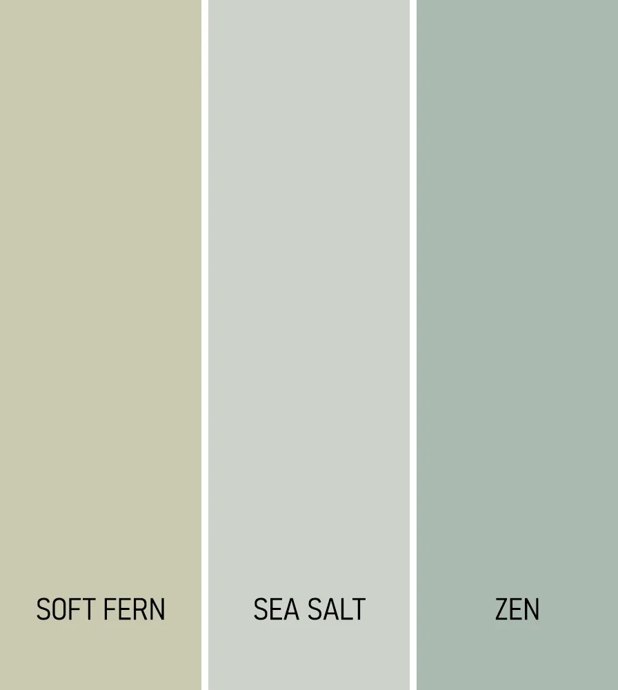
- Benjamin Moore Soft Fern – A pale, yellow-leaning green that feels like spring in the countryside. It’s calm, gentle, and plays so nicely with whites and warm wood tones. Ideal for a bedroom, bath, or quiet corner of the house.
- Sherwin Williams Sea Salt – This one has quite the fan club, and for good reason. It shifts between green, gray, and blue depending on the light, but always feels soft and tranquil. It’s like spa water in paint form.
- Behr Zen – The name says it all. This is a warm, muted sage that feels modern and cozy at the same time. It adds a hint of color without overwhelming a space, and it’s perfect if you want something that feels organic and calming.